Make PowerPoint Slides or Word Docs that Auto-Update Figures made in JMP
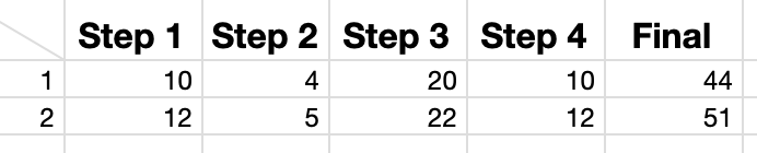
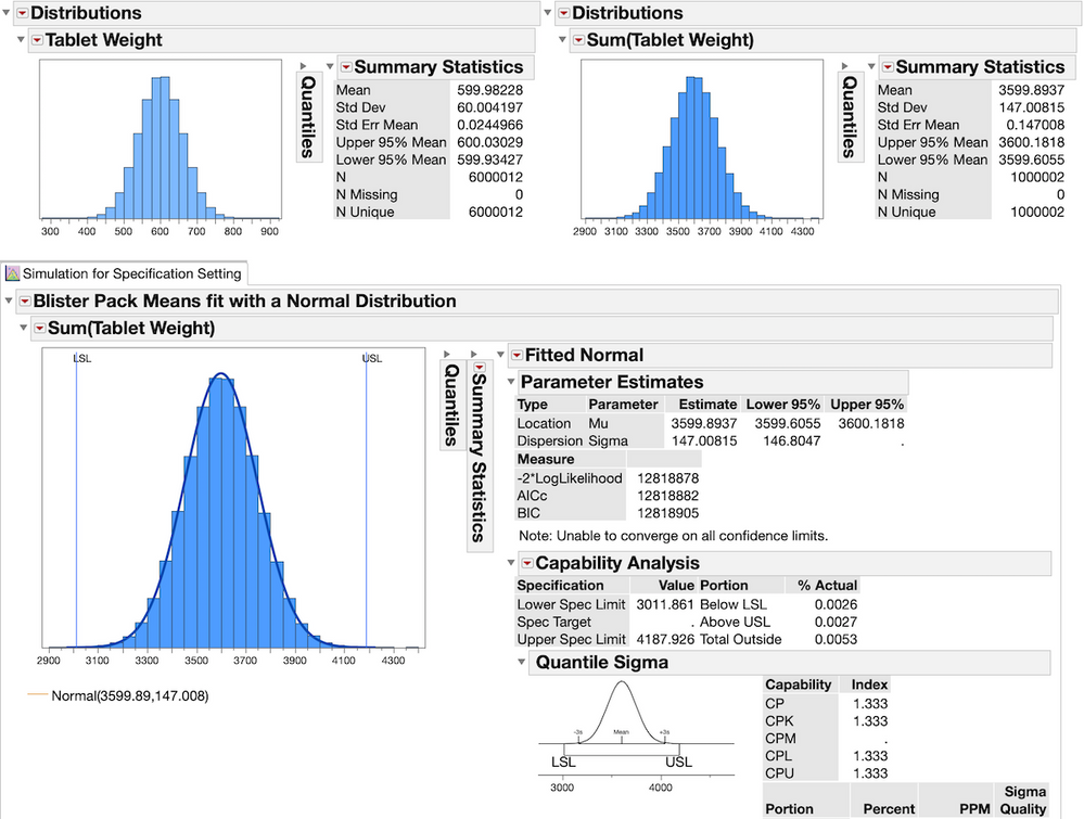
So, you've spent and hours writing up a report on an an experiment and copying in carefully formatted figures from JMP. Now a week later you have updated data and are absolutely thrilled at the prospect of deleting and replacing all the figures from last week with the new updated figures from this week. Wouldn't it be awesome if there were some way to just run the analysis in JMP from your saved ...
 Byron_JMP
305 views
|
1 replies