Event Lines and Comments on Control Charts
Annotating control charts with known events? I’m continuously running into situations where I need to add event lines to a graph. These are distinct from phases because I don’t need to recalculate the mean and control limits, I just need a marker to show that something happened. There are also cases where I need to label points on a graph in a convenient automated way. This blog covers a couple of scripts that can be added to control chart graphs that facilitate drawing event lines and adding comments to graphs.

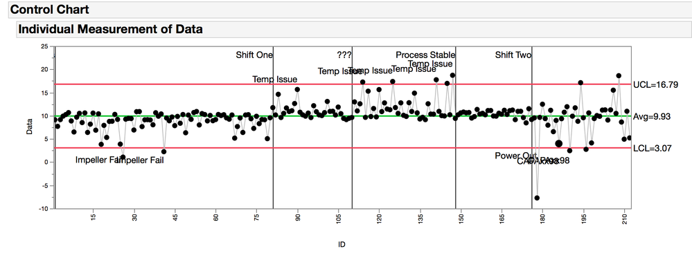
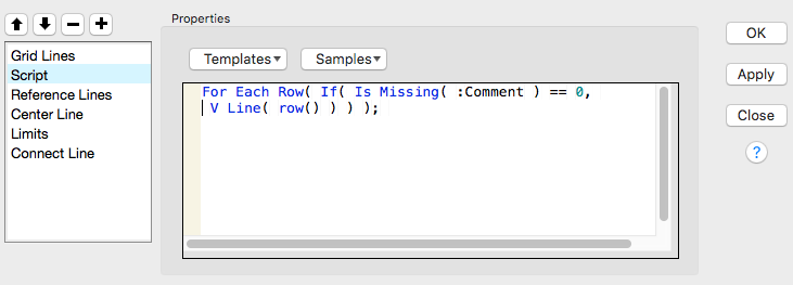
The first step to customizing a graph, is to right click inside the graph and select customize, and the Customize Graph dialog appears. Clicking the “+” icon on the top left will open a blank script and this is where you can paste the examples discussed below. This first example requires that you have a character column called “Comment” in your table. When there is a value in this column, it will cause a vertical line to be drawn on your graph like in the example above.

The second step is to look at a couple of custom scripts that can be added to this window. Each set of instructions, or argument must be glued together with a semicolon. A good place to learn about how to use these custom scripts in graph is the Samples and Templates drop down in the dialog window. Also, the Scripting Index, under the Help tab had details on each of the functions. Keep in mind that this little script window is kind of limited, so after you apply changes, consider saving the report script to the script window to continue editing. All of the custom scripts that are added to the graph will also show up in report objects script. This dialog makes it easy to add to the graph without having to know much JSL and how to manipulate the report object’s script.
Custom Graph Script 1: Adding a line
For Each Row( If( Is Missing( :Comment ) == 0, V Line( row() ) ) );
Explanation:
- For Each Row(): this makes the formula evaluate at each row rather than at the column level.
- Is Missing(): this function returns a “0” if the row is empty and a “1” if its not. If the row is not missing (i.e. = “0”) then the V Line gets evauated and a line is drawn.
- V Line(): check the scripting index for this one, there a lot of interesting options to use. In this case I’m only giving it one number, so it will draw a vertical line across the entire frame at that number. (there’s no number right?)
- Row(): this function returns the row number. I’m using this row number as the place where the vertical line is drawn through the frame.
Custom Graph Script 2: Adding labels to the lines
For Each Row( If( Is Missing( :Comment ) == 0, Text( Right Justified, {row(),
Col Maximum( :Data ) * 1.2},:Comment)));
Explanation:
- For Each Row(): this makes the formula evaluate at each row rather than at the column level.
- If(): This is a classic “If, Then, Else” function. If the condition is true then do the first thing, or else do the second thing. Except here there is no “else”, so if the condition is true, then the first thing happens or else nothing happens.
- Is Missing(): this function returns a “0” if the row is empty and a “1” if it’s not. Here, if the row is missing then nothing happens but if it’s not missing then the text function get evaluated.
- Text(): Again, check the scripting index for all the arguments that can be included here, as well a couple of good examples. Here we are going to put the text at the coordinates Y and X, and the text is in the :Comment column.
- Row() is the x-position, and y-position is the maximum (Col Maximum()) of the :Data column times 1.2. This makes the text show up a little above the data points.
Custom Graph Script 3: Adding labels to the data points.
It is probably better and easier to just use the column and row properties to label the data points, but in some cases a scripted solution like this is acceptably complex.
For Each Row(If( Is Missing( :Note ) == 0, If( :Data <= Col Mean( :Data ),
Text( Right Justified,{Row(),:Data-:Data*1.1}, :Note ),
Text( Right Justified,{Row(),:Data * 1.1}, :Note ))));
Explanation:
- This gets a little fancy. In this expression there is a nested If statement. If Note is not missing and :Data is less than or equal to the column mean of :Data, then make the text in :Note be below the data point, or else make the text in :Note be above the data point.
- It looks better in the graph this way, but in this example it starts to look a little more complicated than it needs to be.
- A simpler version would look like this:
For Each Row(If( Is Missing( :Note ) == 0, Text( Right Justified,{Row()+1,:Data}, :Note );
The “row()+1” moves the text to the right of the data point
Example Control Chart Script
The table for this script needs to have the following columns, An example table is attached.
- ID, sequential row numbers
- Data, a column with your data to trend
- Comments, A sparsely populated column of comments for vertical lines
- Notes, A sparsely populated column of notes for specific data points
This script generates the control chart in the figure above.
Control Chart(
	Sample Label( :ID ),
	Group Size( 1 ),
	KSigma( 3 ),
	Chart Col( :Data, Individual Measurement ),
	SendToReport(
		Dispatch(
			{"Individual Measurement of Data"},
			"IR Chart of IM",
			FrameBox,
			{Frame Size( 800, 200 ), Add Graphics Script(
				1,
				Description( "Script" ),
				For Each Row( If( Is Missing( :Comment ) == 0, V Line( Row() ) ) );
				For Each Row(
					If( Is Missing( :Comment ) == 0,
					Text( Right Justified, {Row(), Col Maximum( :Data ) * 1.2},:Comment ))
				);
				For Each Row(
					If( Is Missing( :Note ) == 0,
					If( :Data <= Col Mean( :Data ),
					Text( Right Justified,{Row(),:Data-:Data*1.1}, :Note ),
					Text( Right Justified,{Row(),:Data * 1.1}, :Note )))
				);
			), Grid Line Order( 2 ), Reference Line Order( 3 )}
		),
		Dispatch( {"Individual Measurement of Data"}, "IR Chart of IM", FrameBox( 2 ),
{Frame Size( 72,200)})))
Event Lines and Comments on Control Charts.jmp