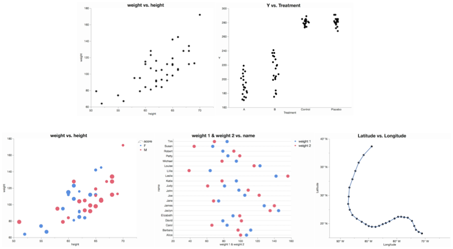
How to make a scatter plot in JMP
Take a look at these examples and sample code to get started.
juliagong
Are you interested in analyzing your data using R in JMP?
juliagong
Do you want to learn how to create a JMP Add-In using JSL? Do you need to automate that process?
juliagong
Learn about the add-in that lets you define and use custom JMP add-ins that execute R functions.
juliagong
See an animated GIF showing how to make a basic bar chart in JMP with some minor customizations.
Ever need to switch between Microsoft PowerPoint and JMP while showing results?
Every time, my colleague would say “You could do that with a script.”
Introducing a new JMP add-in to run all the scripts attached to your data tables, and generate tabbed, tiled or multi-window reports!
Two animated GIFs show two ways to make a clustered bar chart.
Watch two animations for creating a bullet chart with JMP Graph Builder.
See a list of articles and resources to get you started on building a UI.
juliagong
Statisticians from JMP are at JSM 2017 in Baltimore.
Export a JMP Data Table to Excel, and import the workbook back into JMP, while retaining all original column properties, table variables, and table scripts.
I recently posted an add-in to log each launch of JMP.
As I was developing it, I thought I was being clever by storing the logging information as an associative array.
Here's an example of what's in a single log file.
["Bitness" => "64-bit",
"Build Information" => "Jan 9 2017, 00:53:08, Release, JMP ",
"Date" => "06/06/2017 08:05:03 AM",
"Host" => "Windows",
"Hostname" => "computer1", ...
JMP offers spline fits to help represent the relationship between two continuous variables. Learn how a spline is generated.
Tutorial on using Minimize() and Maximize() JSL functions in JMP 13
XBar chart with phases and spec limits on each pahse With JMP Scripting Language (JSL), you can create the type of graph you want.