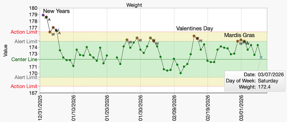
Master List – Pictures from the Gallery – Advanced Graph Building Series
Pictures from the Gallery – Advanced Graph Building Series Links, Snapshots, and Graphs Featured
In the world of sports, data of every conceivable variety is collected to measure and analyze performance. But it is often the visuals from this data that provide the most compelling stories. Let's take last year’s Super Bowl that proved to be a mostly one-sided affair, with the Philadelphia Eagles surprising many in their domination of the Kansas City Chiefs. Can we find a compelling graph th...
Editor’s Note: We revisited a blog from 2016 that seeks to tackle one of the biggest problems of dining out around Austin, Texas…mainly where is the best place to get your BBQ!
Have you ever wanted to go beyond standard Run, Bar and Pareto Charts to visualize performance over time? The great news is JMP 17 offers two ways to generate a Paynter Chart, both as options in the Pareto Plot and the Graph Builder platforms.
Parallel plots are a great way to show relationships within your data as they connect in a row across two or more variables. But is there a way to visually see both the inflow and outflow of your data, like your would if looking at fudning and expenditures in a budget? Jed and Scott will show you how to use to get this insight by using a Inflow Outflow Parallel Plots in JMP Graph Builder! Please...
In this latest blog entry, we will use the latest visualization methods to look at the question “Where in the world is my coffee?”
This blog by Scott Wise, JMP Technical Manager, seeks to use analytics to answer interesting questions that occur all around us. In this installment, we will use the latest text analytic methods to learn more about the differences in regional chili recipes and find out where my Grandma’s chili comes from!
In this installment, we will look at how “technology” changes in the game of Scrabble affected Expert Tournament users. By using the latest Graphing Advancements in JMP 14 (Two-Way Interval Error Bars), we will gain some insight into how our larger world adapts to new technology!
This blog by Scott Wise, JMP Technical Manager, seeks to use analytics to answer interesting questions that occur all around us. In this installment, we will use the latest text exploration methods to find out the truth about the Texas Bluebonnet Rattlesnake and help separate fact from fiction!
This blog by Scott Wise, JMP Global Enablement & Training Manager, seeks to use analytics to answer interesting questions that occur all around us. In this installment, we will use new graph types and dashboard views to answer the question “How Domestic is My Car?”
For our January/February blog we will ask the question, "What can volcanoes teach us about analyzing data?" Along the way we will feature some cool use of JMP visualizations and analytics to help answer our question.
Many customers have recently asked how to create Volcano Plots in JMP. The Volcano Plot is a popular graph that is utilized when screening many p values and mean comparisons between two conditions. The value of using a volcano plot it that it not only lets you quickly see the most significant p values of interest, but you can also get a sense of the direction and strength between the comparisons.
This blog by Scott Wise, JMP Global Enablement & Training Manager, seeks to use analytics to answer interesting questions that occur all around us. In this installment, we will use advanced graph exploration of US agricultural trends to answer the question “Soy What? Where is the Wheat?”
This blog by Scott Wise, JMP Global Enablement & Training Manager, seeks to use analytics to answer interesting questions that occur all around us. In this installment, I got some help from my daughter Sami to try out some new JMP graphing features to answer the question “Are UFO sightings increasing and what does this mean for Texan BBQ and Boots?”
Can new JMP graphing features answer the question “Is Godzilla Really Growing”?
In this final Tornado Trend Challenge, we will answer the question: “Do you believe that tornadoes in the US are shifting location?”
In the second part of our Tornado Trend Challenge, we will answer the question: “Do you believe that tornadoes in the US are getting more destructive?”
Question 1: “Do you believe the total number of yearly tornadoes in the US is increasing?”. Many like me would say yes, but what does critical thinking in three dimensions tell us?
Does the hose length and diameter make a difference in the water pressure you will get at the end of your hose? We can answer this question with using physical formulas in JMP that can be further visualized using JMP Graph Builder to better explore and compare options!
Help spur action to address the effects of global sea level rise on coastal flooding!