Scott Wise's Blog
- JMP User Community
- :
- Blogs
- :
- Scott Wise
- :
- What Can Volcanoes Teach Us About Analyzing Data?
- Subscribe to RSS Feed
- Mark as New
- Mark as Read
- Bookmark
- Subscribe
- Printer Friendly Page
- Report Inappropriate Content
By Scott Wise & Chris Kirchberg – JMP Global Enablement Team
Editor’s Note: This bi-monthly blog seeks to find interesting uses of statistical discovery to solve deep questions dealing with business, economics, sports, health, food, history and psychology. For our January/February blog we will ask the question, "What can volcanoes teach us about analyzing data?" Along the way we will feature some cool use of JMP visualizations and analytics to help answer our question.
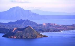
As U2 sings in their 2014 song named “Volcano” - “You don’t wanna, you don’t wanna know…something in you wants to blow.” One of the inescapable truths of being in the Philippines is the fact that you are never very far from a potentially active volcano no matter where you are in the country. Positioned right along the Pacific “Ring of Fire”, the very birth of the beautiful island chain is due to ancient volcanic activity. The volcano pictured below is the active Taal volcano, which is only about twenty-three miles from our home town of San Pablo City in Southern Luzon and last erupted in the late 1970s.
In fact, our town is physically located within the San Pablo Volcanic Field (Active but Dormant) and surrounded by the following volcanoes: Mt. Banahaw (Active and maybe Extinct), Mt. Maquiling (Active but just Dormant), and the Taal Volcano (Very Active!). This past, present and potentially future volcanic activity does mean that it is a great place to grow some of the best tropical fruit on the planet (as volcanic ash makes for wonderful soil). However, as home to our tropical fruit farm and winery operations, the very fact that one of these “sleeping giant” could erupt at any time is an unsettling thought. But the ongoing study of volcanos has inspired greatly the field of statistics and can help us even better focus when analyzing lots of data in both health and industrial settings.
In the study of volcanoes, a common measure is VEI (Volcanic Explosivity Index). Created by Volcanologists in 1982, this metric allows the indexing of eruptions based on “how much volcanic material is thrown out, to what height, and how long the eruption lasts.” (Source: Wikipedia). Listed below is a map visual showing Average VEI over the last 2,000 years for volcanoes with known eruptions within 600 miles of our home location (green asterisk).
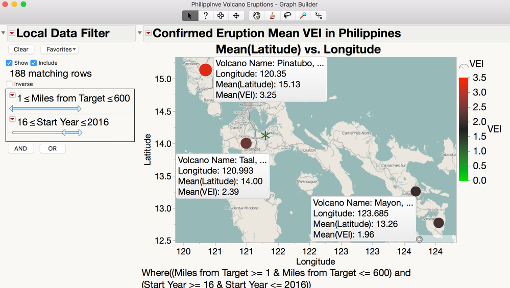
The actual leading causes of short term death during an eruption are most often due to Pyroclastic Flows (super-hot waves of gas) and Lahars (a volcanic type of mudflow). To make matters worse, whether your town would be effected by dangers from a nearby eruption depends largely on many factors, such as location, topography, atmospheric conditions, the volcano type/makeup, among others. A good discussion on this can be found on Oregon State University’s Volcano World website (http://volcano.oregonstate.edu/how-do-volcanoes-affect-people). But the one thing that is clear is that the direction of the eruption and strength of the blast matters a lot to your town's survival! Modern Volcanologist study many measurements (ranging from volcanic gas releases, to seismic activity, to topography, to ground deformation studies) from many different locations on active volcanoes to understand the threat of eruption and the possible effects on surrounding communities. This near-time volcano monitoring has improved forecasting and disaster preparation before eruptions, but still is reliant on Volcanologists paying attention to the right indicator measurements among the many being collected. See the USGS Volcano Monitoring site for a good overview (https://volcanoes.usgs.gov/vhp/monitoring.html).
Turns out this is a good analogy to the challenges we have with analyzing modern data. Often we have lots of data measurements available to monitor our key processes and designs. However, we too need to know what are the most significant measures to view. As well we need to know what are the strength and direction of these measures. Only then can we make accurate predictions on what to do to improve and head off potential eruptions of poor performance. Volcanoes again come to our aid as they inspired a popular statistical graph, called appropriately Volcano Plot, due to the way it visualizes data!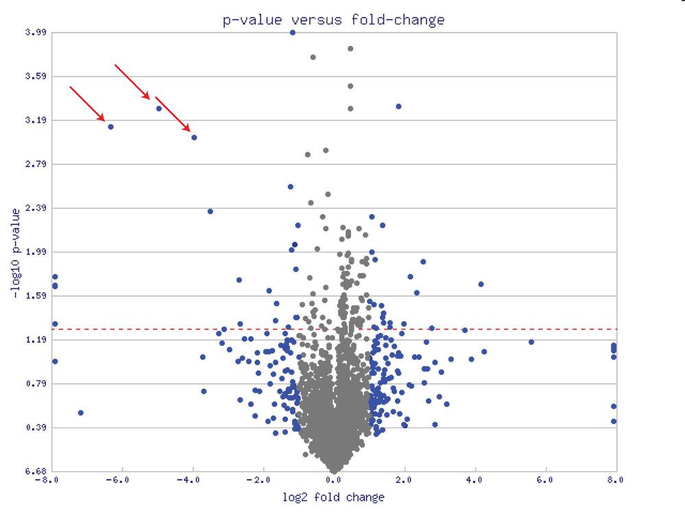
The Volcano Plot is a popular statistical graph that is utilized when screening many mean comparisons between two conditions. Used heavily in clinical and genomic research, it is also a very strong screening tool in industrial settings where many parameters are measured. The value of using a Volcano Plot is that it not only lets you quickly see the most significant values of interest, but you can also get a sense of the direction and strength between the comparisons. In the example Volcano Plot below, each point is an indicator of a mean comparison between two conditions (let’s say A & B). The pattern of all the points on the graph does seem to resemble the spewing of material from an erupting volcano. Looking at the points highlighted by the red arrows. They have negative log p-values on the Y Axis, which is a statistical measure of the significance. In fact, all the points above the dashed red line on the Y Axis have more than 95% significance. But these indicated points are also far to the left of the X Axis, which shows a strong negative difference between the A & B mean comparison. So on Volcano Plots, points that surface to the high right and left corners of the chart will be the ones with the highest significance and differences. You’ll also notice that the graph takes advantage of log transformations which help us better graph these mean comparisons on a chart.
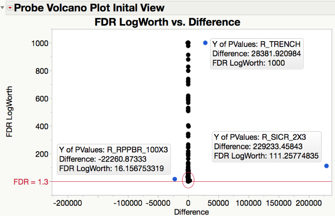
A companion blog has been created ("How to Build a Volcano Plot in JMP") that will give you more details about how Volcano Plots work, including step by step instructions on how to easily construct your own. For the remainder of our blog, we will show how a Volcano Plot can greatly help us with analyzing some common industrial situation where we have many comparisons to sift through. First we opened a data set called Probe (from the JMP Help Files) that represents many microarray probe measures (394 measurement columns worth). Then we ran a Process Screening analysis in JMP that provides mean comparison pair statistics by Process Level (Old and New) against all the measurement columns. The resulting tables that get generated contain all the info we need to generate a Volcano Plot. However, the first chart we generated looking at all 394 mean comparison pairs results in a chart that doesn’t seem to look like our example Volcano Plot above (See below).
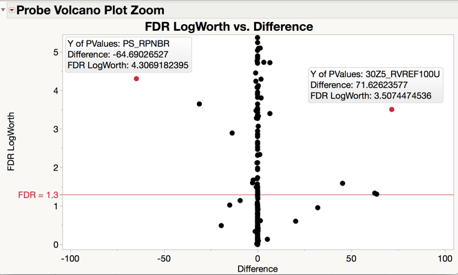
In this Probe Volcano plot we chose to utilize the FDR Logworth on the Y Axis (which is a more conservative measure of comparison significance than the Negative Log of the P Value and is used to help control false discovery rate). From looking at the chart above, there are many things significant (over the red FDR LogWorth = 1.3 Line which is our 95% confidence mark). Also, there are three points in blue that have huge differences, overly compressing the closer difference points into the middle of the X Axis. As well the scale of the significant FDR Values was rather large for many of the factors. Therefore, it was decided to zoom in to see just the points in the FDR LogWorth range from 0 to 5, and Difference between -100 and 100 (the red circled area). Using our graphing zoom tool, we easily can easily drill down and get the desired graph view below.
Now we are better able to see interesting points in the Probe data that might warrant our attention. While there are still many points amassed around the Difference of 0, if we look to the upper left-hand corner, we see PS_RPNBR with a Difference of -64.69 (meaning that the mean of A is less than the mean of B) and FDR LogWorth of 4.3 (highly significant). Likewise, if we look at the upper right-hand corner we see 30Z5_RVREF100U with a Difference of 71.63 (meaning that mean of A is greater than the mean of B) and FDR Logworth of 3.5 (highly significant).
So, our Volcano plot is doing a good job of surfacing the comparison points that most warrant our attention giving us great insight into significance, strength and direction of these comparisons. Hopefully this will help you as well the next time you need to compare a lot of measurements and want a good graphic to help you make the best decisions. And we owe it all to our friend the Volcano and I rest easier thinking somewhere out there on the top of one of my nearby volcanoes, a Volcanologist is collecting data that might end up being shown in a Volcano Plot about volcano monitoring sensor data! But for the meantime I will ask if we can sacrifice a few mangos to the volcano gods to hedge our odds and keeping these impressive volcanoes dormant and happily sleeping in the sun! Otherwise I might end up “All Shook Up” like The King (Elvis Presley”) who sang “She touched my hand, what a chill I got...Her lips are like a volcano that's hot...I'm proud to say she's my buttercup...I'm in love...I'm all shook up”
- © 2026 JMP Statistical Discovery LLC. All Rights Reserved.
- Terms of Use
- Privacy Statement
- Contact Us

You must be a registered user to add a comment. If you've already registered, sign in. Otherwise, register and sign in.