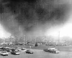
F5 Tornado – Xenia, OH – 1974
In the second part of our Tornado Trend Challenge, we will answer the question: “Do you believe that tornadoes in the US are getting more destructive?” In the first part of our blog, we used better graph and filtering interactions to “see in three dimensions” and find the truth that “there is no strong statistical evidence that the number of tornadoes in the US is increasing year over year”. You can revisit our first part blog here: https://community.jmp.com/t5/Scott-Wise-s-Blog/Tornado-Trend-Challenge-Critical-Thinking-in-Three-Di.... But even if tornadoes aren’t increasing in number, we may still feel that tornadoes are getting even more damaging, especially if we lived in an area that was recently impacted by these random and impactful events.
Again, we will use the excellent data from the NOAA Storm Events Database, filtered for all US tornado incidents from 1950 to 2022. You can find this public data at the following link: (https://www.ncdc.noaa.gov/stormevents/ftp.jsp). In this excellent data repository, we had lots of information about the strength of tornadoes, including the Extended Fujitsu Rating (F Scale), the Estimated Damage Costs, and the Number of Injuries and Deaths caused. We will also use the JMP Graph Builder platform to make interactive visuals that can provide solutions to our questions.
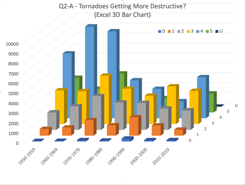
We decided to focus on the Total Injuries and Deaths by Fujitsu Scale as the best tornado destructive strength measure, and not factor in recorded damage costs. While Damage Costs do indeed seem to be increasing over the decades, this can easily be explained by population growth moving out further into previously less densely populated urban areas where more infrastructure is at risk of loss. Our first graph is a an often-used 3D Bar Chart built in Excel. However, this graph type often confuses viewers when trying to look naturally from left to right and top to bottom. While the Decades on the X Axis and Count of Total Injuries and Deaths on the Y Axis are easily seen, breaking out the bar by F Scale Type (in the Z depth axis) makes it very hard to discover trends. For example, if we really want to see if Total Injuries and Deaths are going up for a stronger F Scale tornado type (like a F-3, F-4 or F-5), their respective bars are all pretty well covered up by the lower F Scale types in front of the graph.

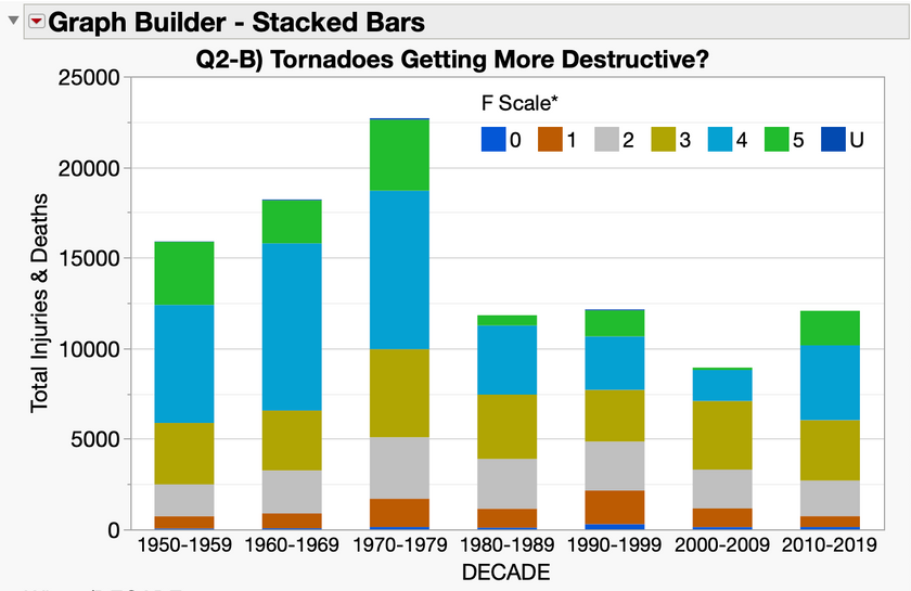
We next used JMP Graph Builder to better handle the three dimensions of our data, starting with a Stacked Bar chart. Here we get a little better view into the breakdown of each bar’s Total Injuries and Deaths by F Scale over the Decades within the stacking sections of each bar. However, direct F Scale comparisons are hard to make unless there are obvious differences.

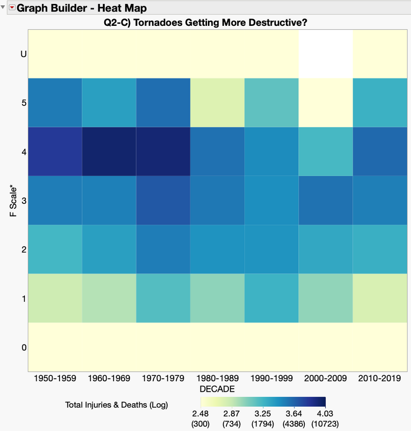
A better graph choice is a Heat Map which offers us an ability to line everything up, both horizontally and vertically for better comparisons. Here we colored each square by a Log of the Total Injuries and Deaths to enable a better comparison by F Scale and Decade via a helpful Color gradient. While we can see that there may be a possible case to be made for F Scale 4 tornadoes decreasing in Total Injuries and Deaths over the decades, no other trends can really be seen in the other F Scale types. From our earlier post, we talked about the improvements in tornado detection that came with the advent of Doppler Radar starting in the 1980s. This may explain why we see no evidence that tornados are getting more destructive. Despite our increasing urbanization putting much more of the population at risk of tornado impact, we may be seeing less Tornado Injuries and Deaths due to better Doppler Radar driven Tornado/Storm Predictions and Alerts (Watches and Warnings). Even modern cell phone text alerts have helped phase out outdated and less effective land-based tornado sirens in many parts of the country.

So, our second-best practice for “seeing in the third dimension” is don’t confuse your viewers left to right, and up to down scanning when presenting data in graphs. See the following Tornado Trend Challenge JMP Public link if you would like to view/interact with these graphs and data yourself: https://public.jmp.com/packages/XyMCFvqxR9Dftkqhvvt6l
In our next blog we will address Question 3: “Do you believe that tornadoes are shifting location?”.