In the world of sports, data of every conceivable variety is collected to measure and analyze performance. But it is often the visuals from this data that provide the most compelling stories. Let’s take last year’s Super Bowl that proved to be a mostly one-sided affair, with the Philadelphia Eagles surprising many in their domination of the Kansas City Chiefs. Can we find a compelling graph that lets us see reasons for this outcome?
New in JMP 19 is the ability to create Vector Field Graphics without the need for custom scripting. Also sometime called arrow charts, these views are useful in showing the direction, distance and strength of many measurements over time. Increasingly used in sports infographics, these charts can be used to show patterns of many useful measurements like baseball hits, soccer kicks, and football pass location and distance.
To create this chart within JMP Statistical Discovery software, we collected last year’s Super Bowl game pass data, making sure to get the ending X and Y location and result for each pass thrown in the game. This data also assumes each pass starts from a set throwing point that is a ten yard drop behind the line of scrimmage. Setup in JMP’s Graph Builder platform just requires putting the pass starting coordinates on the X and Y axes, and then the pass ending coordinates on the interval landing zone. Then by using the new arrow line feature we can show the direction and distance of each pass. Lastly, using the overlay landing zone allows us to show by line color on whether the pass resulted in a completion, incompletion, interception, or touch down!

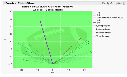
Let’s next see this graph for the winning Quarter Back, Jalen Hurts of the Philadelphia Eagles. If we look at the performance from the graph below, we can see a balanced throwing performance where Jalen Hurts threw many 10 to 20 yards pass completions to both sides of the field with few pass incompletions. This was helped by the success of the Eagles rushing attack, which always helps propel a team’s passing game success.

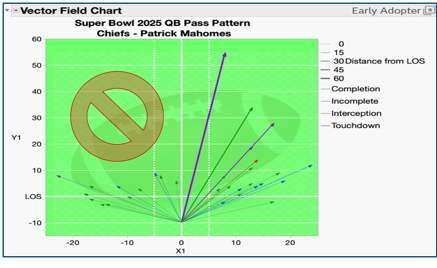
However, when looking at the Kansas City Chief’s starting Quarter Back Patrick Mahomes, you can see a very different pattern. There is an obvious lack of passing beyond 10 yards on the left side of the field, which showed just how good the Eagles defense was in pressuring and limiting Patrick Mahome’s ability to throw across the entire field. Most of his success came on the right had side of the field but also was where he had his mostly costly interception.

So, we can see that the Vector Field Plot is a powerful visual tool can help get more information out of your graphs. And examples go beyond just sports data to any key measurements where you want to show direct, distance, and even strength over time in a compelling way. Then, like as Curtis Mayfield sang in his 1970’s hit song, you can also “just move on up, towards your destination.”