This periodic blog by Scott Wise, JMP Technical Manager, seeks to use analytics to answer interesting questions that occur all around our world. In this installment, we will look at how “technology” changes happening in the game Scrabble were taken advantage of by Expert and Non-Expert Tournament users. By using the latest Graphing Advancements in JMP 14 (Two-Way Interval Error Bars), we will gain some insight into how our larger world adapts to new technology!

Oliver Roeder at the excellent statistical website FiveThirtyEight wrote an intriguing article titled “How “Qi” and “Za” Changed Scrabble” (https://fivethirtyeight.com/features/how-qi-and-za-changed-scrabble/). The author was looking for proof of an economic theory that states when new technology becomes available, this will cause a wider gap in economic inequality, as the higher-skilled and higher-earning (the “1 Percenters”) will be quicker to take advantage of the new technology at the expense of the rest. In looking for a population of data in which to test this out, the author turned to tournament results from the popular word tile game Scrabble to see if average scores increased at a higher rate for the elite players when “technology” changes were introduced into the game.
The key technology change mentioned in the article happened around 2006. First, they added 11,000 new allowable words to the Scrabble Dictionary, including two letter combinations such as “Qi” and “Za” that offer up big points. Also at about this time, many training study and artificial intelligence tools went digital, offering up better ways for tourney competitors to practice and hone their skills. However, while the data allowed the author to see that the new technology created almost a ten-point increase in all average player scores, he couldn’t seem to see evidence that it took place more for experienced versus inexperienced players. Luckily, he provided the source for access to the data from cross-tables.com and made it available on Github.com (https://github.com/fivethirtyeight/data/tree/master/scrabble-games) and put out the challenge for others to investigate it further!
Once we got the data our first step was to “clean” the data. There were many games that had zero scores and therefore added no information (assuming that these were forfeits that occurred during the tournament). Also, there was an expansion of divisions and tournament games starting in the late 1990s. Therefore, we subset our data to look just at games with scores with a minimal score of 200 or higher across the top six divisions starting in the 1990s. We then summarized the data so we could see the mean scores by year for each division. Lastly, we additionally broke the years into three six-year periods:
- 2000-2005 – right before technological change
- 2006-2011 – right after technological change, and
- 2012-2017 – time when the technological change has become the norm
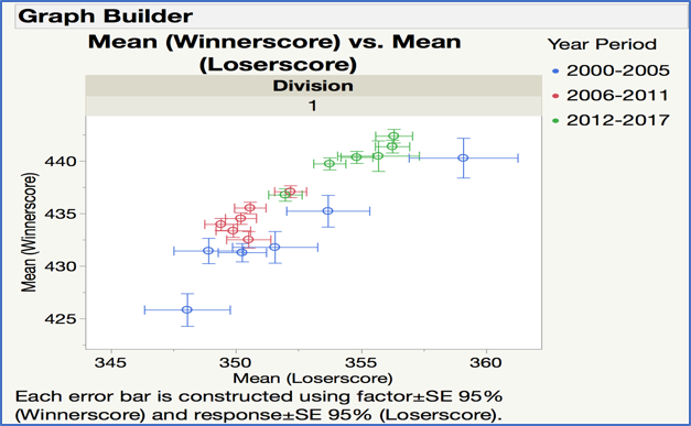
Now we are ready to visually analyze this data! Plotting this “means by year” data can be risky, as sample sizes can vary from year to year, and division to division. Also, the popularity of tournaments in increasing over time, meaning higher amounts of available data each year. Therefore, we calculated the standard error of the mean so we could then build 95% confidence intervals around the means to make for easier mean to mean comparisons of significance. To show this on the graph we can take advantage of a new feature in JMP 14 Graph Builder that allows for Two-Way Interval Error Bar views.

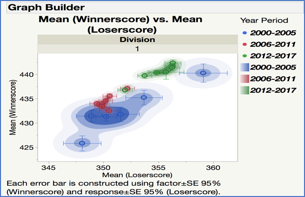
The graph for the very top tournament level of Division 1 seems to show the elusive technological change our author was looking for. The cluster of points before the technological change period (blue points for 2000-2005) are much lower than for the others after the. technological change periods (red points for 2006-2011 and green points for 2012-2017). Also, it is noticeable that the error bars (cross hairs) for the 95% confidence interval around the mean for points in the year periods after the technology change have gotten smaller are more tightly clustered. Lastly, we added density contour plots to the graph to get a sense where the bulk of the data resides.

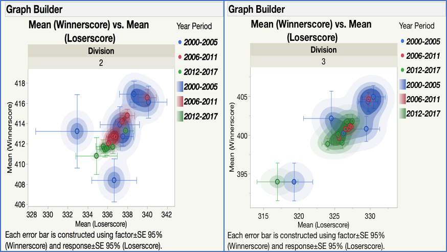
Looking at the next Division 2 and 3, we see less of a concrete story among the Divisions. While more consistency among the years are seen in the periods after the technological changes (tighter red and green points), we don’t see the big separation among the year periods that we did with Division 1. Could this be proof showing that the top players were faster to adapt the technology at a more rapid pace than those in the lower divisions?

While this is not a definitive view and subject to the way we chose to summarize and display the data, this does give food to thought on how technology can uplift some more than others. If you would like to see more information on how to build the new “Two-Way Interval Error Bars” and other compelling views in JMP 14 Graph Builder, please see the material in the new JMP Community Blog “New and Advanced Views in JMP 14 Graph Builder” by Xan Gregg and Scott Wise as shown at Discovery Europe 2018: ( https://community.jmp.com/t5/Discovery-Summit-Europe-2018/New-and-Advanced-Views-in-JMP-nbsp-14-Grap.... The “cleaned” data set we utilized (converted to a JMP datatable with graphs scripts attached) can be found at the following link on the JMP Community File Exchange: ( https://community.jmp.com/t5/JMP-Sample-Data/Scrabble-Tourney-Data-for-Two-Way-Error-Interval-Bars/t... ).