New JMP 19 Graph Builder features in action
 XanGregg

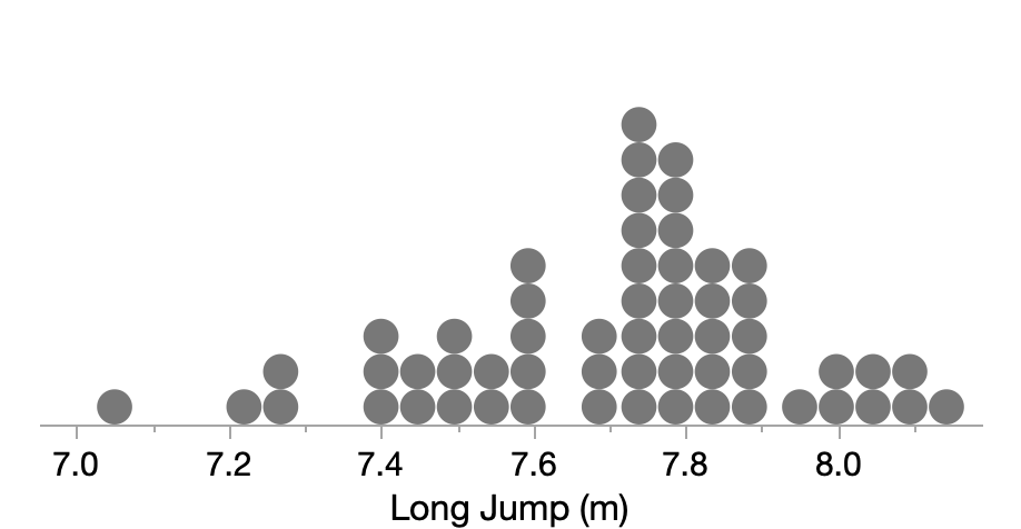
The name “dot plot” can refer to a variety of different graph types. For analytic use, the two most prominent types are what we might call the Wilkinson dot plot and the Cleveland dot plot.
 XanGregg
How to use the axis custom label format to get superscripted scientific notation (and more!)
 XanGregg
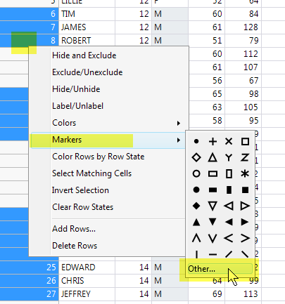
Someone recently asked me about using letters instead of built-in symbols in JMP scatter plots. In case others are wondering the same thing, here's the long answer.In addition to the 32 built-in symbols you can use any character as a marker for a scatter plot.The easiest way to set a letter as the symbol for a row is with the "Other..." item in the Marker submenu. Here's an example with Big Class....
 XanGregg
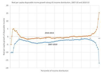
Kaiser Fung recently critiqued this chart of changes in disposable income.He put forth the idea of using categorized slope graphs instead:How do we do something like that in JMP? We can do paneling and lines with variable color in Graph Builder; we just need to get the data into the right form. As usual, a key step in making a slope graph in Graph Builder is using Table > Stack to get the two data...
 XanGregg
The Wall Street Journal recently published a nice, interactive graphic piece called "Battling Infectious Diseases in the 20th Century: The Impact of Vaccines" which contains a series of graphs showing the incidence of selected infectious diseased by state and year. Here's the one for measles.My first impression was, "Wow, it looks like the country had the measles and the vaccine cleared it up." To...
 XanGregg
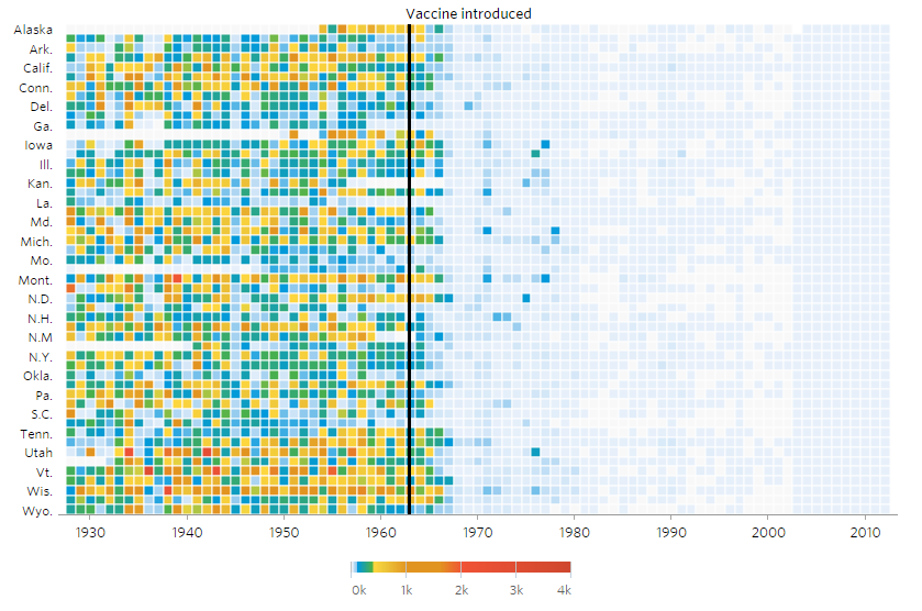
Someone in the SAS Communities forum asked this. They wanted to write a script that created a Graph Builder report without knowing in advance how many variables there would be. That is, they wouldn't how many variables there were when they were writing the script, but the script would know how many at run-time.The original attempt contained a Graph Builder script inside a loop over the columns, bu...
 XanGregg

I saw the following post recently on Twitter:Eric Jonas @stochastician Mar 16There’s basically never a reason to start the y-axis of your comparison graph anywhere besides zero.It generated several dissenting replies, including one from me. Coincidentally, I had just re-read part of John Tukey's classic book "Exploratory Data Analysis" (1977) in which he shows a good counter-example to that guid...
 XanGregg
