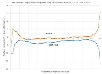
Kaiser Fung recently critiqued this chart of changes in disposable income.

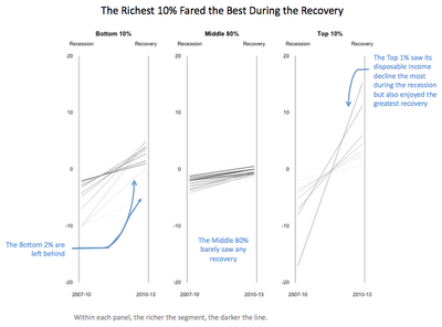
He put forth the idea of using categorized slope graphs instead:

How do we do something like that in JMP? We can do paneling and lines with variable color in Graph Builder; we just need to get the data into the right form. As usual, a key step in making a slope graph in Graph Builder is using Table > Stack to get the two data columns into a column of labels and a column of data. Then the label column goes on the X axis and the data column goes on the Y axis.
First we need to get the data. Sometimes when I'm doing a quick remake, the simplest thing to do is the read the data right off the graph. There are programs and web sites to help with that. This time, I used the online app, Web Plot Digitizer, which produced a separate CSV file for each series. The values are only estimates of the original values, of course.
After opening the two CSV files and setting the column names to "x" and "y" I wrote the following script to combine them and calculate some derived values.
dt1 = Data Table( "data" );
dt2 = Data Table( "data (1)" );
dt = New Table( "changes",
  New Column( "Percentile", Format( "Percent", 8, 0 ), Set Values( (1 :: 100) / 100 ) ),
  New Column( "Base", Format( "Percent", 8, 1 ) ),
  New Column( "Change2010", Format( "Percent", 8, 1 ) ),
  New Column( "Change2013", Format( "Percent", 8, 1 ) ),
  New Column( "Net2010", Format( "Percent", 8, 1 ) ),
  New Column( "Net2013", Format( "Percent", 8, 1 ) ),
  New Column( "Group", Character ),
  New Column( "Rank" )
);
For Each Row(
  dt,
  dt:Base = 1.0;
  dt:Change2010 = Interpolate( dt:Percentile, dt2:x << Get Values(), dt2:y << Get Values );
  dt:Change2013 = Interpolate( dt:Percentile, dt1:x << Get Values(), dt1:y << Get Values );
  dt:Net2010 = dt:Base * (1 + dt:Change2010);
  dt:Net2013 = dt:Net2010 * (1 + dt:Change2013);
  dt:Group = If(
    dt:Percentile <= 0.1, "Bottom 10%",
    dt:Percentile <= 0.9, "Middle 80%",
    "Top 10%"
  );
  dt:Rank = If(
    dt:Percentile <= 0.1, dt:Percentile / .1,
    dt:Percentile <= 0.9, (dt:Percentile - .1) / .8,
    (dt:Percentile - .9) / .1
  );
);
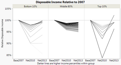
The interpolation is to align the "x" values on even percentile values. The Group and Rank are to control how we group and color in Graph Builder. The Base and Net values are because I wanted to try something a little different than what Kaiser did. Just seeing loss and gain percentages is not enough to see the net effect, so I explicitly compute the net effect and graph those instead.
After stacking the three columns, Base2007, Net2010, and Net2013, I can create the lines chart. I put Group into the Group X role and Rank into the Color role, added a reference line at 100% and updated the labels.

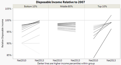
I just realized that even though I need the base value for the calculations, I don't actually need to show them. After using a Local Data Filter to exclude Base2007 and following Kaiser's example to thin out the middle group, I get:

The final data table is attached.
Update: As Kaiser points out in the Twitter conversation, it's not necessarily correct to compute the net values because we don't know if the same people are in each percentile group for each period. Fortunately, the changes are largely uniform so the percentiles don't likely change too much, but the chart becomes even more of an approximation than it already was.