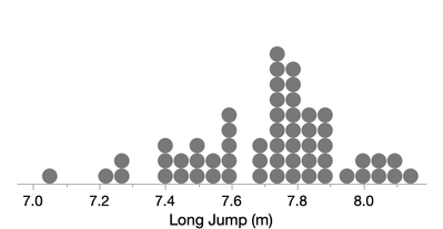
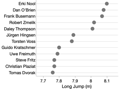
The name “dot plot” can refer to a variety of different graph types. For analytic use, the two most prominent types are what we might call the Wilkinson dot plot and the Cleveland dot plot.
A Wilkinson dot plot displays a distribution of continuous data, like a histogram, but shows individual data points instead of bin counts.

Though variations of such plots have been around for more than 100 years, Leland Wilkinson’s seminal paper “Dot Plots” largely standardized the form. By Wilkinson's rules, the stacks aren't necessarily evenly spaced, so that the dots can be placed more precisely in sparse areas, such as for outliers.
You can make a Wilkinson dot plot in JMP Graph Builder by using the Points element (the default) with a single variable on the X and changing the Jitter option in the side panel from "Auto" to "Positive Grid". Then adjust the dot size from the legend and the dot plot will automatically adjust to accommodate the size.
A Cleveland dot plot is featured in William S. Cleveland’s book Elements of Graphing Data and displays a continuous variable versus a categorical variable.

This kind of dot plot is conceptually similar to a bar chart, but instead of using length to encode the data values, it uses position. As a result, the dot plot does not need to start its data axis at zero, can use a log axis and is more flexible for overlaying multiple variables. Cleveland breaks down the estimation aspect of graph perception into three parts: discrimination, ranking and ratioing. In general, dot plots help with the first two at the expense of the third, making relative proportions less accessible. For instance, it’s easier to see when one bar in a bar chart is twice as long as another without consulting the axis.
Cleveland’s books, along with Wilkinson’s The Grammar of Graphics, were influential in the creation of Graph Builder, and as a result, the Points element is the default view in Graph Builder for both continuous and categorical data.
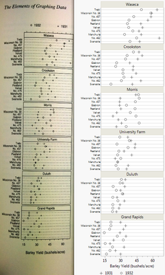
Below is a Graph Builder recreation of a Cleveland’s display of barley yields . A challenge: Can you spot the odd feature of the data?

Cleveland's use of dotted lines is presumably a constraint of black and white printing, and it’s now more common to see faint gray lines in dot plots. Beyond the usual drag-and-drop of variables into roles, the Graph Builder steps to make the dot plot above are:
- Add a Value Ordering property for the Variety column (on the Y axis) to match Cleveland's order.
- Put the Site variable in the Group Wrap role and set the number of columns to be 1.
- Turn off Show Title for Site.
- Turn on grid lines for the Y axis.
- Change the legend position to the bottom.
And now the answer to the challenge: The odd feature of the data is that the 1931 values are generally greater than the 1932 values for all sites except Morris, and Cleveland suspected the Morris values had been swapped.
For more discussion of Cleveland dot plots, see the article “Dot Plots: A Useful Alternative to Bar Charts” by Naomi Robbins.
You must be a registered user to add a comment. If you've already registered, sign in. Otherwise, register and sign in.