cancel
Showing results for 
Show  only  | Search instead for 
Did you mean: 
New to using JMP? Hit the ground running with the Early User Edition of Discovery Summit. Register now, free of charge.
Register for our Discovery Summit 2024 conference, Oct. 21-24, where you’ll learn, connect, and be inspired.
%3CLINGO-SUB%20id%3D%22lingo-sub-383263%22%20slang%3D%22en-US%22%20mode%3D%22NONE%22%3EWhat's%20your%20favorite%20(visually%20appealing)%20way%20to%20graphically%20show%20a%20particle%20size%20distribution%20(PSD)%3F%20(or%20similar%20discrete%20data%20across%20different%20levels)%3C%2FLINGO-SUB%3E%3CLINGO-BODY%20id%3D%22lingo-body-383263%22%20slang%3D%22en-US%22%20mode%3D%22NONE%22%3E%3CP%3EHi%20JMP%20Community%2C%3C%2FP%3E%3CP%3E%26nbsp%3B%3C%2FP%3E%3CP%3E%26nbsp%3B%20I%20had%20a%20colleague%20ask%20me%20today%2C%20%22What's%20the%20best%20way%20to%20graphically%20represent%20PSD%3F%22%3C%2FP%3E%3CP%3E%26nbsp%3B%3C%2FP%3E%3CP%3E%26nbsp%3B%20This%20is%20a%20tough%20one%2C%20and%20there%20are%20different%20ways%20one%20can%20go%20about%20it%20(several%20are%20shown%20below).%20One%20of%20the%20challenges%20with%20PSDs%20is%20that%20many%20of%20the%20ways%20that%20measure%20PSD%20don't%20measure%20it%20as%20a%20continuous%20%22spectrum%22%2C%20but%20rather%20as%20values%20forming%20discrete%20levels%20according%20to%20the%20average%20size%20of%20the%20particle%20(usually%20on%20a%20mesh).%20The%20other%20problem%20is%20the%20constraint%20that%20all%20values%20must%20add%20to%20100%25%20--%20i.e.%20all%20the%20mass%20of%20the%20test%20sample%20that%20is%20sieved%20(or%20sent%20through%20your%20particle%20analyzer)%20must%20add%20up%20to%20the%20total%20mass%20you%20used%2C%20so%20each%20level%20in%20the%20PSD%20represents%20a%20percentage%20of%20that%20total%20mass.%3C%2FP%3E%3CP%3E%26nbsp%3B%3C%2FP%3E%3CP%3E%26nbsp%3B%20Typically%2C%20we%20might%20use%20a%20bar%20chart%20(first%20image)%20to%20show%20the%20PSD%20that%20was%20tested.%20Other%20options%20might%20be%20the%20line%20graph%20(second%20image)%20or%20filled%20line%20graph%20(third%20image)%2C%20which%20depending%20on%20preferences%20might%20be%20better%20to%20show%20differences%20in%20sample%20PSDs.%20Each%20of%20these%20can%20be%20cumbersome%20when%20there%20are%20many%20such%20PSDs%20to%20consider%20--%20here%20I'm%20only%20considering%20three.%20One%20very%20strange%20one%20that%20came%20to%20mind%20was%20a%20parallel%20plot%20(last%20example)%2C%20but%20this%20is%20very%20unappealing%20in%20my%20opinion%20--%20too%20cluttered%20and%20doesn't%20help%20to%20also%20show%20the%20overall%20shape%20of%20the%20PSD%2C%20which%20is%20also%20often%20of%20interest.%3C%2FP%3E%3CP%3E%3CSPAN%20class%3D%22lia-inline-image-display-wrapper%20lia-image-align-inline%22%20image-alt%3D%22DiedrichSchmidt_3-1620402545637.png%22%20style%3D%22width%3A%20400px%3B%22%3E%3CSPAN%20class%3D%22lia-inline-image-display-wrapper%22%20image-alt%3D%22DiedrichSchmidt_3-1620402545637.png%22%20style%3D%22width%3A%20400px%3B%22%3E%3Cspan%20class%3D%22lia-inline-image-display-wrapper%22%20image-alt%3D%22DiedrichSchmidt_3-1620402545637.png%22%20style%3D%22width%3A%20400px%3B%22%3E%3Cimg%20src%3D%22https%3A%2F%2Fcommunity.jmp.com%2Ft5%2Fimage%2Fserverpage%2Fimage-id%2F32671i2E0D2ADE9BE977BD%2Fimage-size%2Fmedium%3Fv%3Dv2%26amp%3Bpx%3D400%22%20role%3D%22button%22%20title%3D%22DiedrichSchmidt_3-1620402545637.png%22%20alt%3D%22DiedrichSchmidt_3-1620402545637.png%22%20%2F%3E%3C%2Fspan%3E%3C%2FSPAN%3E%3C%2FSPAN%3E%3C%2FP%3E%3CP%3E%3CSPAN%20class%3D%22lia-inline-image-display-wrapper%20lia-image-align-inline%22%20image-alt%3D%22DiedrichSchmidt_4-1620402573136.png%22%20style%3D%22width%3A%20400px%3B%22%3E%3CSPAN%20class%3D%22lia-inline-image-display-wrapper%22%20image-alt%3D%22DiedrichSchmidt_4-1620402573136.png%22%20style%3D%22width%3A%20400px%3B%22%3E%3Cspan%20class%3D%22lia-inline-image-display-wrapper%22%20image-alt%3D%22DiedrichSchmidt_4-1620402573136.png%22%20style%3D%22width%3A%20400px%3B%22%3E%3Cimg%20src%3D%22https%3A%2F%2Fcommunity.jmp.com%2Ft5%2Fimage%2Fserverpage%2Fimage-id%2F32672iFE7EC25A7272B45B%2Fimage-size%2Fmedium%3Fv%3Dv2%26amp%3Bpx%3D400%22%20role%3D%22button%22%20title%3D%22DiedrichSchmidt_4-1620402573136.png%22%20alt%3D%22DiedrichSchmidt_4-1620402573136.png%22%20%2F%3E%3C%2Fspan%3E%3C%2FSPAN%3E%3C%2FSPAN%3E%3C%2FP%3E%3CP%3E%3CSPAN%20class%3D%22lia-inline-image-display-wrapper%20lia-image-align-inline%22%20image-alt%3D%22DiedrichSchmidt_5-1620402602019.png%22%20style%3D%22width%3A%20400px%3B%22%3E%3CSPAN%20class%3D%22lia-inline-image-display-wrapper%22%20image-alt%3D%22DiedrichSchmidt_5-1620402602019.png%22%20style%3D%22width%3A%20400px%3B%22%3E%3Cspan%20class%3D%22lia-inline-image-display-wrapper%22%20image-alt%3D%22DiedrichSchmidt_5-1620402602019.png%22%20style%3D%22width%3A%20400px%3B%22%3E%3Cimg%20src%3D%22https%3A%2F%2Fcommunity.jmp.com%2Ft5%2Fimage%2Fserverpage%2Fimage-id%2F32673i99FE290ADB7A93ED%2Fimage-size%2Fmedium%3Fv%3Dv2%26amp%3Bpx%3D400%22%20role%3D%22button%22%20title%3D%22DiedrichSchmidt_5-1620402602019.png%22%20alt%3D%22DiedrichSchmidt_5-1620402602019.png%22%20%2F%3E%3C%2Fspan%3E%3C%2FSPAN%3E%3C%2FSPAN%3E%3C%2FP%3E%3CP%3E%3CSPAN%20class%3D%22lia-inline-image-display-wrapper%20lia-image-align-inline%22%20image-alt%3D%22DiedrichSchmidt_6-1620402711593.png%22%20style%3D%22width%3A%20400px%3B%22%3E%3CSPAN%20class%3D%22lia-inline-image-display-wrapper%22%20image-alt%3D%22DiedrichSchmidt_6-1620402711593.png%22%20style%3D%22width%3A%20400px%3B%22%3E%3Cspan%20class%3D%22lia-inline-image-display-wrapper%22%20image-alt%3D%22DiedrichSchmidt_6-1620402711593.png%22%20style%3D%22width%3A%20400px%3B%22%3E%3Cimg%20src%3D%22https%3A%2F%2Fcommunity.jmp.com%2Ft5%2Fimage%2Fserverpage%2Fimage-id%2F32674i2C6C75A1E3F96B02%2Fimage-size%2Fmedium%3Fv%3Dv2%26amp%3Bpx%3D400%22%20role%3D%22button%22%20title%3D%22DiedrichSchmidt_6-1620402711593.png%22%20alt%3D%22DiedrichSchmidt_6-1620402711593.png%22%20%2F%3E%3C%2Fspan%3E%3C%2FSPAN%3E%3C%2FSPAN%3E%3C%2FP%3E%3CP%3E%26nbsp%3B%3C%2FP%3E%3CP%3E%26nbsp%3B%20All%20of%20this%20is%20to%20prompt%20the%20question%20in%20the%20title%20of%20the%20post%3A%20what%20is%20your%20preferred%20method%20to%20represent%20discrete%20values%20across%20different%20levels%3F%20Do%20you%20work%20with%20similar%20kinds%20of%20data%20and%20need%20to%20graphically%20show%20the%20results%3F%20What%20have%20you%20found%20is%20the%20most%20%22pleasing%22%20for%20the%20audience%20to%20look%20at%20and%20understand%20the%20message%3F%3C%2FP%3E%3CP%3E%26nbsp%3B%3C%2FP%3E%3CP%3E%26nbsp%3B%20There%20is%20of%20course%20no%20%22right%22%20answer%20to%20these%20questions%2C%20but%20my%20colleague's%20question%20prompted%20me%20to%20consider%20what%20are%20some%20better%20options%2C%20and%20if%20so%2C%20can%20the%20answer%20be%20crowd-sourced%20from%20the%20JMP%20community.%3C%2FP%3E%3CP%3E%26nbsp%3B%3C%2FP%3E%3CP%3EThanks%20for%20your%20feedback!%2C%3C%2FP%3E%3CP%3EDS%3C%2FP%3E%3CP%3E%26nbsp%3B%3C%2FP%3E%3CP%3EPS%20-%20I've%20attached%20a%20mock-up%20data%20table%20of%20what%20some%20different%20PSDs%20might%20look%20like.%3C%2FP%3E%3C%2FLINGO-BODY%3E%3CLINGO-LABS%20id%3D%22lingo-labs-383263%22%20slang%3D%22en-US%22%20mode%3D%22NONE%22%3E%3CLINGO-LABEL%3EData%20Exploration%20and%20Visualization%3C%2FLINGO-LABEL%3E%3CLINGO-LABEL%3EMass%20Customization%3C%2FLINGO-LABEL%3E%3C%2FLINGO-LABS%3E%3CLINGO-SUB%20id%3D%22lingo-sub-383374%22%20slang%3D%22en-US%22%20mode%3D%22NONE%22%3ERe%3A%20What's%20your%20favorite%20(visually%20appealing)%20way%20to%20graphically%20show%20a%20particle%20size%20distribution%20(PSD)%3F%20(or%20similar%20discrete%20data%20across%20different%20levels)%3C%2FLINGO-SUB%3E%3CLINGO-BODY%20id%3D%22lingo-body-383374%22%20slang%3D%22en-US%22%20mode%3D%22NONE%22%3E%3CP%3EThis%20one%20is%20always%20a%20challenge%2C%20especially%20when%20the%20bins%20are%20of%20varying%20widths.%3C%2FP%3E%3CP%3E%3CBR%20%2F%3ETo%20me%20it%20comes%20down%20to%20whether%20or%20not%20the%20bin%20widths%20can%20be%20tied%20directly%20to%20specs%20I%20am%20interested%20in.%26nbsp%3B%20If%20I%20can%20point%20that%20bin%20population%20directly%20to%20a%20product%20line%20or%20spec%20then%20ok%20I'm%20good%20with%20it%2C%20and%20I%20would%20just%20go%20for%20the%20histogram%20at%20the%20top.%20I%20generally%20would%20avoid%20the%20line%20graphs%20as%20they%20give%20you%20the%20false%20impression%20that%20the%20x-axis%20is%20interval%20in%20nature%20when%20it%20is%20not.%26nbsp%3B%20So%20for%20instance%20your%20overlapping%20line-graphs%20can%20be%20interpreted%20as%20having%20deltas%20in%20their%20areas%20that%20are%20meaningful%2C%20but%20they%20are%20not%20as%20the%20area%20of%20the%20delta%20is%20dependent%20on%20the%20scale%20of%20the%20x-axis%2C%20which%20is%20not%20constant.%3C%2FP%3E%3CP%3E%26nbsp%3B%3C%2FP%3E%3CP%3EBut%20if%20I%20need%20to%20interpolate%20then%20I%20wouldn't%20really%20want%20any%20of%20those.%26nbsp%3B%20At%20that%20point%20I%20would%20make%20some%20assumptions%20about%20the%20distribution%20within%20the%20bin%2C%20for%20instance%20just%20assume%20that%20they%20are%20uniformly%20distributed%20in%20size%2C%20and%20then%20identify%20the%20centerpoint%20on%20each%20bin.%26nbsp%3B%20Plot%20that%20as%20a%20cumulative%20S-curve%20with%20a%20proper%20interval%20x-scale%20(so%20size%20on%20the%20x-axis%2C%20and%20cumulative%20%25%20on%20the%20y-axis).%26nbsp%3B%20At%20that%20point%20you%20can%20either%20just%20do%20straight%20lines%2C%20which%20assumes%20a%20constant%20distribution%2C%20or%20you%20can%20use%20a%20spline%20or%20something%20like%20that%20and%20hope%20it's%20making%20a%20better%20guess%20than%20that.%26nbsp%3B%20The%20splining%20choice%20to%20me%20really%20depends%20on%20how%20far%20apart%20my%20bins%20are.%3C%2FP%3E%3CP%3E%26nbsp%3B%3C%2FP%3E%3CP%3EOnce%20you%20either%20have%20the%20Lines%20or%20Splines%20drawn%20on%20a%20cumulative%20y-scale%20with%20an%20interval%20x-scale%20it's%20extremely%20easy%20to%20interpolate%20any%20value%20you%20want%2C%20you%20can%20do%20it%20by%20eye.%26nbsp%3B%20You%20can%20go%20a%20step%20further%20and%20the%20differentiate%20your%20cumulative%20solution%20and%20solve%20for%20the%20full%20differential%20curve.%26nbsp%3B%20In%20the%20Line%20version%20it%20would%20look%20pretty%20much%20the%20same%20as%20the%20line%20graph%20you%20put%20out%20below%20but%20the%20x-axis%20would%20be%20interval.%26nbsp%3B%20The%20spline%20version%20will%20be%20prettier%2C%20but%20I%20don't%20know%20how%20you%20would%20generate%20that%20in%20JMP.%3C%2FP%3E%3CP%3E%26nbsp%3B%3C%2FP%3E%3CP%3EThe%20other%20advantage%20of%20this%20kind%20of%20a%20setup%20though%20is%20that%20you%20can%20plop%20it%20directly%20into%20the%20Function%20Data%20Explorer.%26nbsp%3B%20And%20at%20that%20point%20there's%20all%20SORTS%20of%20fun%20stuff%20you%20can%20do.%26nbsp%3B%20Will%20work%20with%20either%20the%20cumulative%20or%20differential%20curve%2C%20but%20you%20need%20to%20get%20your%20x-axis%20to%20interval%20first%20or%20it%20will%20give%20you%20some%20wonky%20results.%26nbsp%3B%20You%20get%20your%20PSD's%20represented%20as%20FPCs%20and%20then%20you%20can%20look%20at%20100s%20of%20them%20simultaneously.%26nbsp%3B%20I%20think%20you'll%20be%20shocked%20how%20informative%20it%20will%20become.%3C%2FP%3E%3C%2FLINGO-BODY%3E%3CLINGO-SUB%20id%3D%22lingo-sub-383361%22%20slang%3D%22en-US%22%20mode%3D%22NONE%22%3ERe%3A%20What's%20your%20favorite%20(visually%20appealing)%20way%20to%20graphically%20show%20a%20particle%20size%20distribution%20(PSD)%3F%20(or%20similar%20discrete%20data%20across%20different%20levels)%3C%2FLINGO-SUB%3E%3CLINGO-BODY%20id%3D%22lingo-body-383361%22%20slang%3D%22en-US%22%20mode%3D%22NONE%22%3E%3CP%3EHi%2C%3C%2FP%3E%0A%3CP%3EInteresting%20question.%20What%20about%20this%20representation%3A%3C%2FP%3E%0A%3CP%3E%3CSPAN%20class%3D%22lia-inline-image-display-wrapper%20lia-image-align-inline%22%20image-alt%3D%22Thierry_S_0-1620420584312.png%22%20style%3D%22width%3A%20400px%3B%22%3E%3CSPAN%20class%3D%22lia-inline-image-display-wrapper%22%20image-alt%3D%22Thierry_S_0-1620420584312.png%22%20style%3D%22width%3A%20400px%3B%22%3E%3Cspan%20class%3D%22lia-inline-image-display-wrapper%22%20image-alt%3D%22Thierry_S_0-1620420584312.png%22%20style%3D%22width%3A%20400px%3B%22%3E%3Cimg%20src%3D%22https%3A%2F%2Fcommunity.jmp.com%2Ft5%2Fimage%2Fserverpage%2Fimage-id%2F32686i77939115B23FB409%2Fimage-size%2Fmedium%3Fv%3Dv2%26amp%3Bpx%3D400%22%20role%3D%22button%22%20title%3D%22Thierry_S_0-1620420584312.png%22%20alt%3D%22Thierry_S_0-1620420584312.png%22%20%2F%3E%3C%2Fspan%3E%3C%2FSPAN%3E%3C%2FSPAN%3E%3C%2FP%3E%0A%3COL%3E%0A%3CLI%3EStacked%20the%20PSD%20columns%3C%2FLI%3E%0A%3CLI%3EAssigned%20the%20stacked%20data%20as%20Frequencies%3C%2FLI%3E%0A%3CLI%3EAssigned%20the%20Mesh%20variable%20as%20X%3C%2FLI%3E%0A%3CLI%3EAssigned%20the%20Label%20variable%20as%20Overlay%3C%2FLI%3E%0A%3C%2FOL%3E%0A%3CP%3EBest%2C%3C%2FP%3E%0A%3CP%3ETS%3C%2FP%3E%3C%2FLINGO-BODY%3E
Choose Language Hide Translation Bar
SDF1
Super User

What's your favorite (visually appealing) way to graphically show a particle size distribution (PSD)? (or similar discrete data across different levels)

Hi JMP Community,


  I had a colleague ask me today, "What's the best way to graphically represent PSD?"


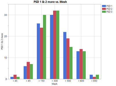
  This is a tough one, and there are different ways one can go about it (several are shown below). One of the challenges with PSDs is that many of the ways that measure PSD don't measure it as a continuous "spectrum", but rather as values forming discrete levels according to the average size of the particle (usually on a mesh). The other problem is the constraint that all values must add to 100% -- i.e. all the mass of the test sample that is sieved (or sent through your particle analyzer) must add up to the total mass you used, so each level in the PSD represents a percentage of that total mass.


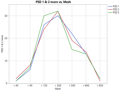
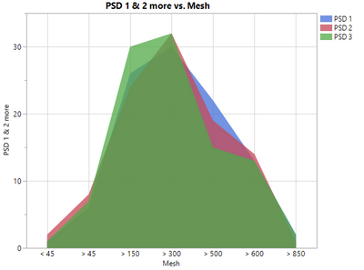
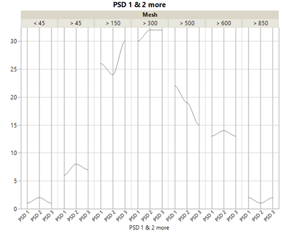
  Typically, we might use a bar chart (first image) to show the PSD that was tested. Other options might be the line graph (second image) or filled line graph (third image), which depending on preferences might be better to show differences in sample PSDs. Each of these can be cumbersome when there are many such PSDs to consider -- here I'm only considering three. One very strange one that came to mind was a parallel plot (last example), but this is very unappealing in my opinion -- too cluttered and doesn't help to also show the overall shape of the PSD, which is also often of interest.

DiedrichSchmidt_3-1620402545637.png

DiedrichSchmidt_4-1620402573136.png

DiedrichSchmidt_5-1620402602019.png

DiedrichSchmidt_6-1620402711593.png


  All of this is to prompt the question in the title of the post: what is your preferred method to represent discrete values across different levels? Do you work with similar kinds of data and need to graphically show the results? What have you found is the most "pleasing" for the audience to look at and understand the message?


  There is of course no "right" answer to these questions, but my colleague's question prompted me to consider what are some better options, and if so, can the answer be crowd-sourced from the JMP community.


Thanks for your feedback!,

DS


PS - I've attached a mock-up data table of what some different PSDs might look like.

2 REPLIES 2
Thierry_S
Super User

Re: What's your favorite (visually appealing) way to graphically show a particle size distribution (PSD)? (or similar discrete data across different levels)

Hi,

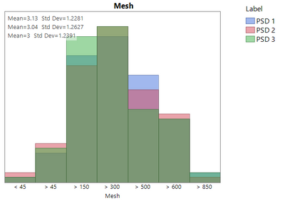
Interesting question. What about this representation:

Thierry_S_0-1620420584312.png

  1. Stacked the PSD columns
  2. Assigned the stacked data as Frequencies
  3. Assigned the Mesh variable as X
  4. Assigned the Label variable as Overlay

Best,

TS

Thierry R. Sornasse
Evan_Morris
Level IV

Re: What's your favorite (visually appealing) way to graphically show a particle size distribution (PSD)? (or similar discrete data across different levels)

This one is always a challenge, especially when the bins are of varying widths.


To me it comes down to whether or not the bin widths can be tied directly to specs I am interested in.  If I can point that bin population directly to a product line or spec then ok I'm good with it, and I would just go for the histogram at the top. I generally would avoid the line graphs as they give you the false impression that the x-axis is interval in nature when it is not.  So for instance your overlapping line-graphs can be interpreted as having deltas in their areas that are meaningful, but they are not as the area of the delta is dependent on the scale of the x-axis, which is not constant.


But if I need to interpolate then I wouldn't really want any of those.  At that point I would make some assumptions about the distribution within the bin, for instance just assume that they are uniformly distributed in size, and then identify the centerpoint on each bin.  Plot that as a cumulative S-curve with a proper interval x-scale (so size on the x-axis, and cumulative % on the y-axis).  At that point you can either just do straight lines, which assumes a constant distribution, or you can use a spline or something like that and hope it's making a better guess than that.  The splining choice to me really depends on how far apart my bins are.


Once you either have the Lines or Splines drawn on a cumulative y-scale with an interval x-scale it's extremely easy to interpolate any value you want, you can do it by eye.  You can go a step further and the differentiate your cumulative solution and solve for the full differential curve.  In the Line version it would look pretty much the same as the line graph you put out below but the x-axis would be interval.  The spline version will be prettier, but I don't know how you would generate that in JMP.


The other advantage of this kind of a setup though is that you can plop it directly into the Function Data Explorer.  And at that point there's all SORTS of fun stuff you can do.  Will work with either the cumulative or differential curve, but you need to get your x-axis to interval first or it will give you some wonky results.  You get your PSD's represented as FPCs and then you can look at 100s of them simultaneously.  I think you'll be shocked how informative it will become.