- New to JMP? Let the Data Analysis Director guide you through selecting an analysis task, an analysis goal, and a data type. Available now in the JMP Marketplace!
- See how to install JMP Marketplace extensions to customize and enhance JMP.
- Subscribe to RSS Feed
- Mark Topic as New
- Mark Topic as Read
- Float this Topic for Current User
- Bookmark
- Subscribe
- Mute
- Printer Friendly Page
Discussions
Solve problems, and share tips and tricks with other JMP users.- JMP User Community
- :
- Discussions
- :
- Re: Stacked Pareto
- Mark as New
- Bookmark
- Subscribe
- Mute
- Subscribe to RSS Feed
- Get Direct Link
- Report Inappropriate Content
Stacked Pareto
Hello,
I am hoping someone can help me figure out how to make a stacked pareto chart.
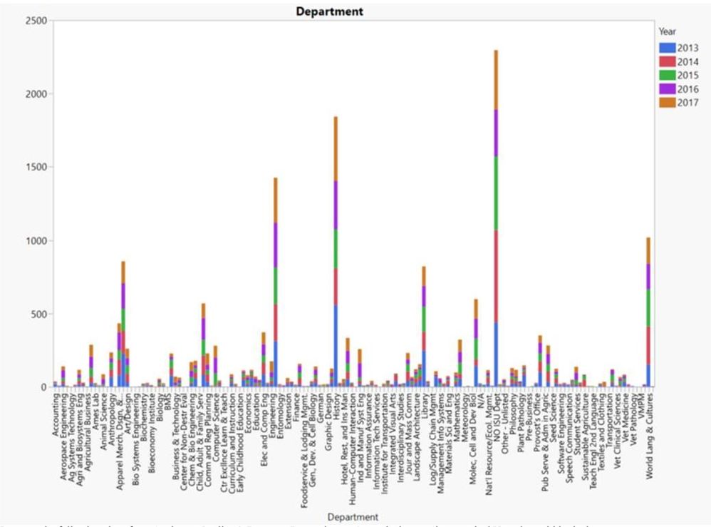
I have data on requests made by department over a 5-year period. I would like to build a chart that shows the number of requests by department, with each departmental bar stacked with yearly data.
I can make the following chart in Graph Builder, but can’t get the x-axis to reorder Ascending->Descending by bar height:
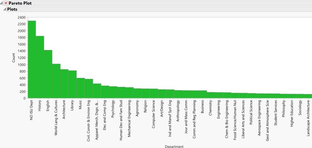
I can get this chart from Analyze->Quality & Process->Pareto, but can’t get the bars to show stacked Year data within the bars.
Is there a way to combine these two? I’ve explored the JMP user discussion boards but couldn’t find an answer.
I did see the similar post at https://community.jmp.com/t5/Discussions/How-to-create-a-stacked-pareto-chart/m-p/6506#M6500 but it didn't answer my question as to *how* to make it. The accepted solution doesn't look sorted by any discernable value, and all stack to 100% which is not what I want.
Accepted Solutions
- Mark as New
- Bookmark
- Subscribe
- Mute
- Subscribe to RSS Feed
- Get Direct Link
- Report Inappropriate Content
Re: Stacked Pareto
- Mark as New
- Bookmark
- Subscribe
- Mute
- Subscribe to RSS Feed
- Get Direct Link
- Report Inappropriate Content
Re: Stacked Pareto
Recommended Articles
- © 2026 JMP Statistical Discovery LLC. All Rights Reserved.
- Terms of Use
- Privacy Statement
- Contact Us

