- Learn how to build custom Python data connectors and further customize JMP’s Data Connector Framework with the Python Data Connector Demo, available now in the JMP Marketplace!
- See how to create experiments to support product design and ID useful product features. Register for June 12 webinar, 2pm US Eastern Time.
- Subscribe to RSS Feed
- Mark Topic as New
- Mark Topic as Read
- Float this Topic for Current User
- Bookmark
- Subscribe
- Mute
- Printer Friendly Page
Discussions
Solve problems, and share tips and tricks with other JMP users.- JMP User Community
- :
- Discussions
- :
- Re: How to perform mean separation (Tukey's procedure) for sub categories / Repe...

- Mark as New
- Bookmark
- Subscribe
- Mute
- Subscribe to RSS Feed
- Get Direct Link
- Report Inappropriate Content
How to perform mean separation (Tukey's procedure) for sub categories / Repeated Measures Analysis?
I've performed Repeated Measures Analysis (Mixed Model) for my data [I've 3 groups (Control, 1mM treatment, 2mM treatment), Each group has two replications (R1 & R2) and I take measurements at 4 time points (0d,1d, 3d,5d). Each replication has six samples (subsampling) and same sample use for all the time points (repeated measures)]. (file attached)
--------------------------------------------------------------------------------------------------
This is how I perform the analysis:
Analyze > Fir Model
EG1 to Y
Group, Rep, Time added to Construct model
Then, Rep(Group) & Random (by changing attributes to Random effect)
Method: REML
Run!
--------------------------------------------------------------------------------------------------
Results output looks like:


I want to draw a graph like below and denote significance difference at each tim epoint?

I want to get the mean separation for each time point separately, and denote in the graph?
Time"0": what is the mean separation of Control /1mm/2mM
Time "1": etc.
And please tell me how did you create this graph in JMP and meanseparation for eachtime point separately?
Thank you for your kind support
Accepted Solutions

- Mark as New
- Bookmark
- Subscribe
- Mute
- Subscribe to RSS Feed
- Get Direct Link
- Report Inappropriate Content
Re: How to perform mean separation (Tukey's procedure) for sub categories / Repeated Measures Analys
Hi Kynda,
The graph I created in Graph Builder is really just a couple of drags for you data. Your data is set up nicely in a stack. Drag EG1 to the Y axis, Drag Time to the X axis. Drag Group to Color by on the right and then drag Group to Overlay on the right.
On the left side of the set control window under Bar is where you can change the view by bar style, summary and error bars. For the graph shown below I have chosen Side by side, Auto, Mean, Standard Deviation, and Label by Variable.

Hope this helps.
Bill

- Mark as New
- Bookmark
- Subscribe
- Mute
- Subscribe to RSS Feed
- Get Direct Link
- Report Inappropriate Content
Re: How to perform mean separation (Tukey's procedure) for sub categories / Repeated Measures Analys
Hi, Kynda!
I took the dataset you attached and added some scripts to it.
The first one analyzes the data as a replicated repeated measures experiment. Warning: I know next-to-nothing about the design you ran to gather these data, about how the data were gathered, or basically anything about your experiment. The model doesn't converge well, and throws a warning about it.
Under the Little Inverted Red Triangle (LIRT) next to the Fit Mixed header in the Analysis window, choose Model Dialog, and you can review how I set up the model.
Look down in the analysis, and find the output on the Multiple Comparison:

Note the Quantile and the Adjusted DF.
In a new datatable, enter this formula:

...this is how I got the weird confidence interval number (0.9888777717).
The analysis window gives the Pairwise Differences...I think this is what you're calling the "mean separation".
Run the second script, and you get the graph:

If you right-click on the scripts and edit them, you can review the platforms and set-up for performing the analysis and the graph with a point-and-click interface.
Good luck!
- Mark as New
- Bookmark
- Subscribe
- Mute
- Subscribe to RSS Feed
- Get Direct Link
- Report Inappropriate Content
Re: How to perform mean separation (Tukey's procedure) for sub categories / Repeated Measures Analys
Hello,
I created the graph below in Graph Builder. The colors can be changed as needed or wanted.

- Mark as New
- Bookmark
- Subscribe
- Mute
- Subscribe to RSS Feed
- Get Direct Link
- Report Inappropriate Content
Re: How to perform mean separation (Tukey's procedure) for sub categories / Repeated Measures Analys
Thank you @Bill_Worley Appreciated.
I want to get the mean separation (Tukey test) for each time point separately by JMP, and denote in the graph?
Time"0": what is the mean separation of Control /1mm/2mM
Time "1": etc.
And please tell me how did you create this graph in JMP and meanseparation for eachtime point separately?
- Mark as New
- Bookmark
- Subscribe
- Mute
- Subscribe to RSS Feed
- Get Direct Link
- Report Inappropriate Content
Re: How to perform mean separation (Tukey's procedure) for sub categories / Repeated Measures Analys
Hi Kynda,
The graph I created in Graph Builder is really just a couple of drags for you data. Your data is set up nicely in a stack. Drag EG1 to the Y axis, Drag Time to the X axis. Drag Group to Color by on the right and then drag Group to Overlay on the right.
On the left side of the set control window under Bar is where you can change the view by bar style, summary and error bars. For the graph shown below I have chosen Side by side, Auto, Mean, Standard Deviation, and Label by Variable.
Hope this helps.
Bill
- Mark as New
- Bookmark
- Subscribe
- Mute
- Subscribe to RSS Feed
- Get Direct Link
- Report Inappropriate Content
Re: How to perform mean separation (Tukey's procedure) for sub categories / Repeated Measures Analys
- Mark as New
- Bookmark
- Subscribe
- Mute
- Subscribe to RSS Feed
- Get Direct Link
- Report Inappropriate Content
Re: How to perform mean separation (Tukey's procedure) for sub categories / Repeated Measures Analys
Thank you very much @Bill_Worley those steps help a lot.
I am sorry, if my English makes you confuse.
My interest is to perform the Tukey test (multiple comparision /mean separation) for each time point separately by JMP and denote in the graph.
As shown in these below bar charts, I want to show significant difference between each bar at each time points.
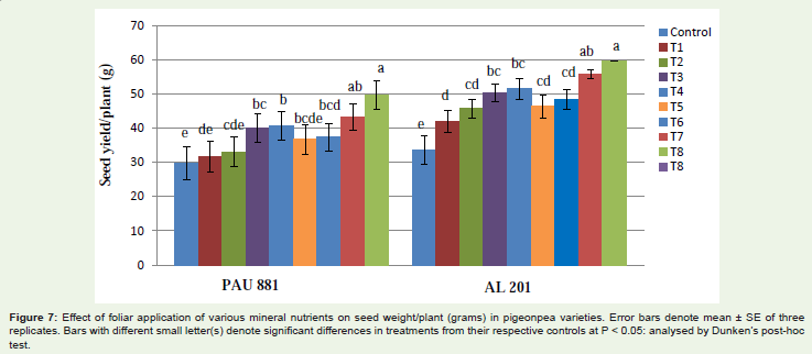
For this I have to get connecting letters report for each time point (e.g. below image)

So my exact question is, after perform Repeated Measures Analysis (Mixed Model) ANOVA, (assume my data is normal distributed for this question), How can I perfrom multiple comparision in JMP for different time points?
Is this possible in JMP?
When I do this I get mean separation as whole, not for different time points.
Could you please help me witht his.
Thank you.
- Mark as New
- Bookmark
- Subscribe
- Mute
- Subscribe to RSS Feed
- Get Direct Link
- Report Inappropriate Content
Re: How to perform mean separation (Tukey's procedure) for sub categories / Repeated Measures Analys
Hi Kynda,
I cannot come up with a quick and easy way to do what you are asking. You can run your ANOVA and then right click on the connected letters report and either click Make into a Data Table or control click and select Make a Combined Data Table. You then have to wrangle the data little more by combining the different letter columns, but it still doesn't give you or get you everything you want or need to see.
Another option to try is use Fit Model, build the model to predict EG1 and then click the red hot spot by Response at the top. From there go to Estimates > Multiple Comparisons. From this option you can choose which factor you want to make the Tukey pairwise comparisons for, but you will not get a connecting letters report.
Maybe someone out there has a better solution for you.
Best,
Bill
- Mark as New
- Bookmark
- Subscribe
- Mute
- Subscribe to RSS Feed
- Get Direct Link
- Report Inappropriate Content
Re: How to perform mean separation (Tukey's procedure) for sub categories / Repeated Measures Analys
Hi, Kynda!
I took the dataset you attached and added some scripts to it.
The first one analyzes the data as a replicated repeated measures experiment. Warning: I know next-to-nothing about the design you ran to gather these data, about how the data were gathered, or basically anything about your experiment. The model doesn't converge well, and throws a warning about it.
Under the Little Inverted Red Triangle (LIRT) next to the Fit Mixed header in the Analysis window, choose Model Dialog, and you can review how I set up the model.
Look down in the analysis, and find the output on the Multiple Comparison:
Note the Quantile and the Adjusted DF.
In a new datatable, enter this formula:
...this is how I got the weird confidence interval number (0.9888777717).
The analysis window gives the Pairwise Differences...I think this is what you're calling the "mean separation".
Run the second script, and you get the graph:
If you right-click on the scripts and edit them, you can review the platforms and set-up for performing the analysis and the graph with a point-and-click interface.
Good luck!
- Mark as New
- Bookmark
- Subscribe
- Mute
- Subscribe to RSS Feed
- Get Direct Link
- Report Inappropriate Content
Re: How to perform mean separation (Tukey's procedure) for sub categories / Repeated Measures Analys
Thank you @Kevin_Anderson and @Bill_Worley taking your time to help me.
As you've noted,

I can not find this in the file you've attached. My file looks like below image;

I got told from statistician, as I am taking 6 samples at each time point I have to include Rep*Time(Group)&Random then. That’s really my experimental error term. To do the analysis that I want, I have to include the interaction between Group and Time. Doing Tukey comparisons in this way will be overwhelming since it will consider all 12 choose 2 combinations of group and time. The only way around this in JMP is to do some scripting myself.
Recommended Articles
- © 2026 JMP Statistical Discovery LLC. All Rights Reserved.
- Terms of Use
- Privacy Statement
- Contact Us