- New to JMP? Let the Data Analysis Director guide you through selecting an analysis task, an analysis goal, and a data type. Available now in the JMP Marketplace!
- See how to install JMP Marketplace extensions to customize and enhance JMP.
- Subscribe to RSS Feed
- Mark Topic as New
- Mark Topic as Read
- Float this Topic for Current User
- Bookmark
- Subscribe
- Mute
- Printer Friendly Page
Discussions
Solve problems, and share tips and tricks with other JMP users.- JMP User Community
- :
- Discussions
- :
- Re: How to overlay line plot on top of side-by-side bar chart?
- Mark as New
- Bookmark
- Subscribe
- Mute
- Subscribe to RSS Feed
- Get Direct Link
- Report Inappropriate Content
How to overlay line plot on top of side-by-side bar chart?
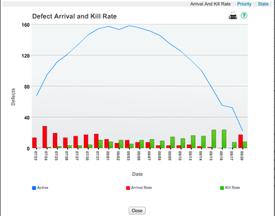
I'd like to be able to create a chart like this
Accepted Solutions
- Mark as New
- Bookmark
- Subscribe
- Mute
- Subscribe to RSS Feed
- Get Direct Link
- Report Inappropriate Content
Re: How to overlay line plot on top of side-by-side bar chart?
- Mark as New
- Bookmark
- Subscribe
- Mute
- Subscribe to RSS Feed
- Get Direct Link
- Report Inappropriate Content
Re: How to overlay line plot on top of side-by-side bar chart?
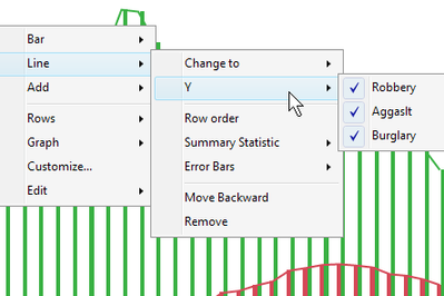
In Graph Builder use Date as X and use Active, Arrival, and Kill as Y. Then turn on both the Bar element and the Line element. Now you'll have three sets of bars and three lines. Right-click in the graphs and under each element's submenu use the Y menu to turn off the Ys that don't apply to that element.
- Mark as New
- Bookmark
- Subscribe
- Mute
- Subscribe to RSS Feed
- Get Direct Link
- Report Inappropriate Content
Re: How to overlay line plot on top of side-by-side bar chart?
xan --- thanks for the help ---- I'm still having trouble producing the graph ---- perhaps my datatable is not setup properly?
Could you provide a very brief table that would produce the chart?
In my table I have a date column, and a column for the number of defects that 'arrived' for each date and a column for the number of defects 'killed' for each data....
- Mark as New
- Bookmark
- Subscribe
- Mute
- Subscribe to RSS Feed
- Get Direct Link
- Report Inappropriate Content
Re: How to overlay line plot on top of side-by-side bar chart?
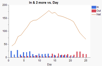
Here's a quick example DT.
- Mark as New
- Bookmark
- Subscribe
- Mute
- Subscribe to RSS Feed
- Get Direct Link
- Report Inappropriate Content
Re: How to overlay line plot on top of side-by-side bar chart?
Xan,
Thanks ---- this made it clear ---- I was dragging In/out/Net to the right Y-axis and couldn't get it to work ---- but dragging to the left Y-axis worked....
Recommended Articles
- © 2026 JMP Statistical Discovery LLC. All Rights Reserved.
- Terms of Use
- Privacy Statement
- Contact Us


