- New to JMP? Let the Data Analysis Director guide you through selecting an analysis task, an analysis goal, and a data type. Available now in the JMP Marketplace!
- See how to install JMP Marketplace extensions to customize and enhance JMP.
- Subscribe to RSS Feed
- Mark Topic as New
- Mark Topic as Read
- Float this Topic for Current User
- Bookmark
- Subscribe
- Mute
- Printer Friendly Page
Discussions
Solve problems, and share tips and tricks with other JMP users.- JMP User Community
- :
- Discussions
- :
- How to insert X axis break in graph builder?
- Mark as New
- Bookmark
- Subscribe
- Mute
- Subscribe to RSS Feed
- Get Direct Link
- Report Inappropriate Content
How to insert X axis break in graph builder?
Hi everyone,
I am trying to insert a simple X axis break in JMP, but can't find the option for it in the Graph Builder.
In Origin Lab for example this was easily achievable using x axis breaks. I am quite new to JMP, so any help would be much appreciated!
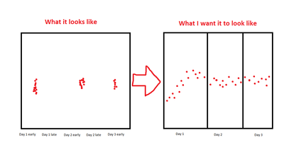
My X axis data are timestamps, spread over multiple days, but on a single day they are only in the range of up to one hours. If I put all timestamps as X, the trend of the data during a single day gets lost, because the distance to the next day is so much larger.
I want to only display the X data on each day during the time where measurements were taken. I have added a small graphic to hopefully better explain the problem.
Thank you!
Accepted Solutions
- Mark as New
- Bookmark
- Subscribe
- Mute
- Subscribe to RSS Feed
- Get Direct Link
- Report Inappropriate Content
Re: How to insert X axis break in graph builder?
Thanks for all the suggestions so far Jemster, jthi and ih.
If I understand it correctly, this is not done quickly and easily, and especially not if I want to make changes to the display or data. I will still try to make one of the solutions work.
I also think this should be implemented in JMP - I will see if I can add it to the Wish List.
Greetings Paul
Edit
wish list - https://community.jmp.com/t5/JMP-Wish-List/Add-easily-configurable-axis-breaks-to-the-Graph-Builder/...
- Mark as New
- Bookmark
- Subscribe
- Mute
- Subscribe to RSS Feed
- Get Direct Link
- Report Inappropriate Content
Re: How to insert X axis break in graph builder?
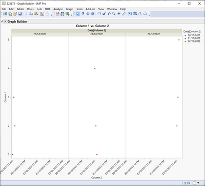
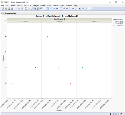
Group X could be what you want. Based on your description you may want to use a Local Data Filter, found using the red triangle next to "Graph Builder" in the graph builder window, to exclude timestamps where data doesn't exist
- Mark as New
- Bookmark
- Subscribe
- Mute
- Subscribe to RSS Feed
- Get Direct Link
- Report Inappropriate Content
Re: How to insert X axis break in graph builder?
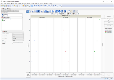
One option you could try setting your timestamp to Ordinal (or Nominal) and use your grouping variable as Overlay. You could possibly also add Date as additional grouping column
I have also attached data table with table script
- Mark as New
- Bookmark
- Subscribe
- Mute
- Subscribe to RSS Feed
- Get Direct Link
- Report Inappropriate Content
Re: How to insert X axis break in graph builder?
On several occasions I resorted to making three separate tall and skinny graphs and then copy-pasted them together, for times when group x or ordinal axes didn't do quite what I was looking for. This would be a good wish list item if nobody else comes up with a solution for a continuous variable.
- Mark as New
- Bookmark
- Subscribe
- Mute
- Subscribe to RSS Feed
- Get Direct Link
- Report Inappropriate Content
Re: How to insert X axis break in graph builder?
I think it could be a good wish list item that JMP would have an option to scale X-axis automatically where you are using X-grouping and have continuous X-axis. Currently JMP will just show "empty space". You cannot even scale them separately
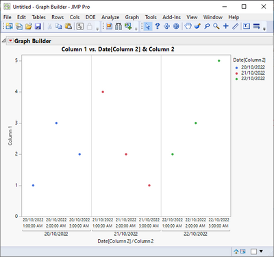
This image might be easier to understand for some users to understand what is going on
After some paint and copy-paste of combining couple of graphs, something like this (should maybe work for nominal and ordinal x-axis too):
- Mark as New
- Bookmark
- Subscribe
- Mute
- Subscribe to RSS Feed
- Get Direct Link
- Report Inappropriate Content
Re: How to insert X axis break in graph builder?
Thanks for all the suggestions so far Jemster, jthi and ih.
If I understand it correctly, this is not done quickly and easily, and especially not if I want to make changes to the display or data. I will still try to make one of the solutions work.
I also think this should be implemented in JMP - I will see if I can add it to the Wish List.
Greetings Paul
Edit
wish list - https://community.jmp.com/t5/JMP-Wish-List/Add-easily-configurable-axis-breaks-to-the-Graph-Builder/...
- Mark as New
- Bookmark
- Subscribe
- Mute
- Subscribe to RSS Feed
- Get Direct Link
- Report Inappropriate Content
Re: How to insert X axis break in graph builder?
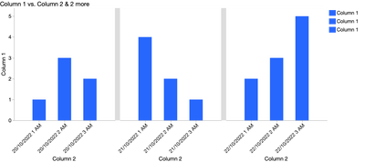
You might be interested in https://community.jmp.com/t5/JMP-Blog/How-to-create-an-axis-break-in-JMP/ba-p/30611, which shows another way to add an axis break: by adding a duplicate of the variable and adjusting each part to only show a fraction. Here's what it looks like on jthi's data, but changing the x variable (column 2) back to continuous:
I did some clean-up, changing the colors to all be the same, but would also want to edit the Legend Settings to hide the extra legend entries.
Graph Builder(
	Size( 973, 455 ),
	Show Control Panel( 0 ),
	Graph Spacing( 15 ),
	Variables( X( :Column 2 ), X( :Column 2 ), X( :Column 2 ), Y( :Column 1 ) ),
	Elements( Position( 1, 1 ), Bar( X, Y, Legend( 7 ) ) ),
	Elements( Position( 2, 1 ), Bar( X, Y, Legend( 8 ) ) ),
	Elements( Position( 3, 1 ), Bar( X, Y, Legend( 9 ) ) ),
	SendToReport(
		Dispatch( {}, "Column 2", ScaleBox,
			{Min( 20oct2022 + 00:01:00 ), Max(20oct2022 + 03:59:00 ), Interval( "Hour" ),
			Inc( 1 ), Minor Ticks( 0 )}
		),
		Dispatch( {}, "Column 2", ScaleBox( 2 ),
			{Min( 21oct2022 + 00:01:00 ), Max(21oct2022 + 03:59:00 ), Interval( "Hour" ),
			Inc( 1 ), Minor Ticks( 0 )}
		),
		Dispatch( {}, "Column 2", ScaleBox( 3 ),
			{Min( 22oct2022 + 00:01:00 ), Max(22oct2022 + 03:59:00 ), Interval( "Hour" ),
			Inc( 1 ), Minor Ticks( 0 )}
		),
		Dispatch( {}, "400", ScaleBox,
			{Legend Model( 7,
				Properties( 0, {Fill Color( 5 )}, Item ID( "Column 1", 1 ) )
			), Legend Model( 8,
				Properties( 0, {Fill Color( 5 )}, Item ID( "Column 1", 1 ) )
			), Legend Model( 9,
				Properties( 0, {Fill Color( 5 )}, Item ID( "Column 1", 1 ) )
			)}
		)
	)
);
- Mark as New
- Bookmark
- Subscribe
- Mute
- Subscribe to RSS Feed
- Get Direct Link
- Report Inappropriate Content
Re: How to insert X axis break in graph builder?
This wish could fix the issue:
X group: restrict the values on the axis to the respective group
with the new option :restrict x axis to the respective group everything will get very comfortable
... and robust:
There are some workarounds, but all of them are quite fragile. Just imagine what happens if some rows are added ...
For continuous values, some trick will be necessary to store the range and scale information for every subplot.
Is it worth it?
For nominal value, it's much easier: get a much better plot, just by removing empty space.
The only question here:
equal widths of 1 ... Nmax (with some alignment rule: left, center,right, stretch?)
or individual widths for each subplot: 1 ... Ni
- Mark as New
- Bookmark
- Subscribe
- Mute
- Subscribe to RSS Feed
- Get Direct Link
- Report Inappropriate Content
Re: How to insert X axis break in graph builder?
This is a super useful feature and has long been a reason that I move to GraphPad Prism for Time series data.
- Mark as New
- Bookmark
- Subscribe
- Mute
- Subscribe to RSS Feed
- Get Direct Link
- Report Inappropriate Content
Re: How to insert X axis break in graph builder?
The link in the first line of your answer was very helpful. Thank you.
Recommended Articles
- © 2026 JMP Statistical Discovery LLC. All Rights Reserved.
- Terms of Use
- Privacy Statement
- Contact Us
