I’ve been asked three times this year about how to make a graph in JMP with an axis break. Before I show how, I want to ask “Why?” The obvious answer to “Why?” is “to show items with very different values in one graph,” but that’s a little unsatisfying. I want to know why they need to be in one graph. The advantage of a graphical representation of data over a text representation is that we can judge values based on graphical properties like position, length and slope. However, once we break the scale, those properties are no longer as comparable. We effectively have two separate graphs after all – which is actually how we can make such views in JMP.
Related to my “Why?” inquiry, I’ve had a difficult time finding a compelling real-world example to illustrate an axis break, so I made some hypothetical data. Say we have timing values for a series of 100 runs of some process. Usually, the process takes a few seconds per run. But sometimes there’s a glitch, and it takes several minutes. Here’s the data on one graph (all on one y scale).
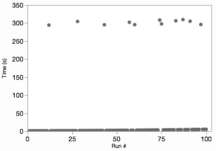
We can see where the glitches are, but we can’t see any of the variation in the normal non-glitch runs. Some would also object to the “wasted” space in the middle of the graph. However, those aren’t necessarily bad attributes. The non-glitch variation is lost because it’s insignificant compared to the glitch times, and the space works to show the difference. Nonetheless, if our audience already understands those features of the data, we can break the graph in two to show both subsets on more natural scales.
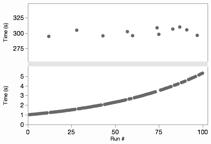
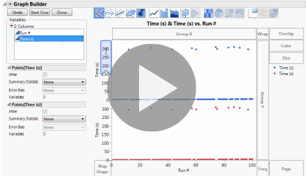
Now we can see that the non-glitch times are increasing on some curve. The “trick” in Graph Builder is to add the variable to be split to the graph twice in two different axis slots. Then we can adjust the axes independently, perhaps even making one of them a log axis. The Graph Spacing menu command adds the spacer between the graphs to emphasize the break. It’s easier to show than explain, so here’s an animated GIF of those steps.
I skimmed a few journals looking for examples of broken axes. Here’s an example of a pattern I saw a few times for drug treatment studies where the short-term and long-term responses are both interesting. This graph is from Annals of Internal Medicine and shows two different groups’ responses to an HIV treatment.
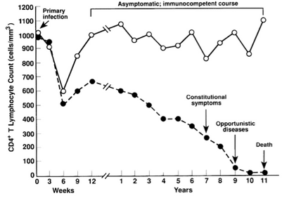
Each side of the axis break uses different units of time, which fits perfectly with the idea that there are really two separate axes. One thing that bothers me about this graph, though, is the connection of the lines across the gap. Notice the difference in my JMP version:
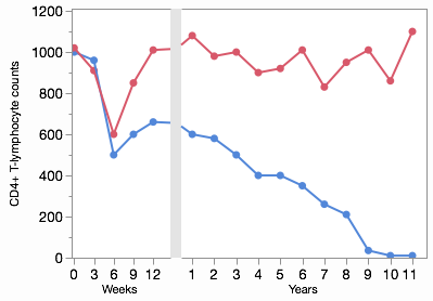
With different x scales, the slopes should be different. That is, the change per week (slope on the left) should be flatter than the change per year (slope on the right) for the same transition. Fortunately, Graph Builder takes care of this for you, but it’s something to be aware of when you’re reading these kinds of graphs in the wild.
The broken line from the HIV study is an example of how an axis break can distort the information encoded by the graphic element. A more serious distortion occurs when bar charts are split by a scale break since the bars can no longer do their job of representing values with length. I’m not even going to show a picture of that. Never use a scale break with a bar chart.
When making graphs with scale breaks, make sure each part works on its own, because perceptually they really are separate graphs.