- New to JMP? Let the Data Analysis Director guide you through selecting an analysis task, an analysis goal, and a data type. Available now in the JMP Marketplace!
- See how to install JMP Marketplace extensions to customize and enhance JMP.
- Subscribe to RSS Feed
- Mark Topic as New
- Mark Topic as Read
- Float this Topic for Current User
- Bookmark
- Subscribe
- Mute
- Printer Friendly Page
Discussions
Solve problems, and share tips and tricks with other JMP users.- JMP User Community
- :
- Discussions
- :
- Re: Creating two factor interaction plot (without the full matrix profile)
- Mark as New
- Bookmark
- Subscribe
- Mute
- Subscribe to RSS Feed
- Get Direct Link
- Report Inappropriate Content
Creating two factor interaction plot (without the full matrix profile)
How do I have JMP give a clearer, bigger, simpler two factor interaction plot for just two factors that I hand select for the model that has been fit with Fit Model?
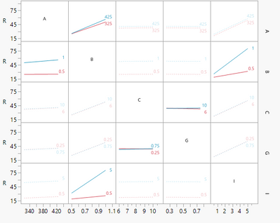
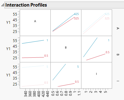
JMP gives a profiler, like so, but it is a giant matrix and frankly not particularly readable if one wants to focus well on one particular two factor interaction.
I see no way to tell it I don't want to see the whole matrix and to select the factors as desired.
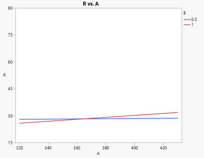
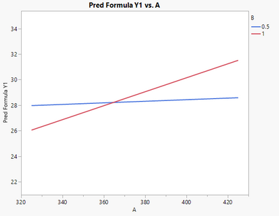
Creating in graph builder using the raw data gives a different result and I'm not clear why (I'm an engineer not a statistician), but I suspect it has something to do with the fact the model in the interaction profile in the Fit Model area doesn't include all the possible model terms as many were insignificant. Here is the AB interaction. It is bigger and clearer, but according to the Fit Model profiler, it is wrong, very wrong.
Accepted Solutions
- Mark as New
- Bookmark
- Subscribe
- Mute
- Subscribe to RSS Feed
- Get Direct Link
- Report Inappropriate Content
Re: Creating two factor interaction plot (without the full matrix profile)
Hi @Victor_G ,
Appear to have the solution, though it is rather involved. From JMP Technical Support:
Since you have all continuous variables that you wish to exclude, I think the following approach should work.
If you do the following I think you will have the same Interaction Plot in Graph Builder that you see in your Least Squares report...
-- Run your model as you normally would and turn on the Interaction Plots.
-- Click the hotspot in the top left and choose Factor Profiling > Profiler to turn on the Prediction Profiler (if it is checked it is already on).
-- Now go down to the Profiler and click directly in the plot for A while holding down the Alt key (to specify Factor Settings).
-- Check the Lock Factor Setting box and click OK.
--Continue to do the same to Lock Factor Settings for every factor except the two you are interested in (D and I).
-- Now click the hotspot associated with the Prediction Profiler and select Output Grid Table.
-- Open Graph Builder and build the interaction plot from this new table (i.e., Response as Y, D as X, I as Overlay).
-- This should be the same plot you see in the Least Squares report, except that the axes may be different and there are traces for each of the curves. You can copy and paste the axes from the original Interaction Plot to Graph Builder if you like:
-- Right click on the x-axis of the original Interaction Plot and choose Edit > Copy Axis Settings.
-- Right-click on the x-axis of your plot in Graph Builder and choose Edit > Paste Axis Settings.
-- Do the same for y-axis.
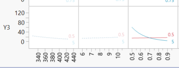
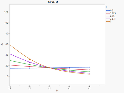
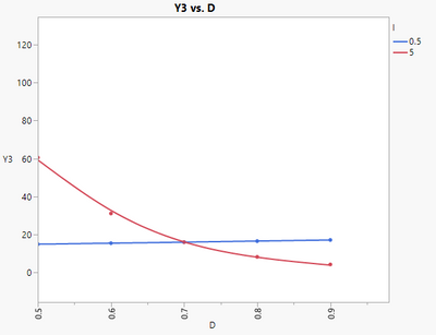
An example below of response Y3 for the two factor D x I interaction -- I had transformed Y3 with a log (time to failure):
Using local data filter:
The message suggests something else may happen when the model contains non-continuous predictors. I'll deal with that when it happens.
- Mark as New
- Bookmark
- Subscribe
- Mute
- Subscribe to RSS Feed
- Get Direct Link
- Report Inappropriate Content
Re: Creating two factor interaction plot (without the full matrix profile)
Hi @CanonicalHazard,
It should be possible to do it with Graph Builder, provided that you saved and used the Prediction formula of your response from your model.
As an example, I used the dataset "2x3x4 Factorial" available in the JMP sample index.
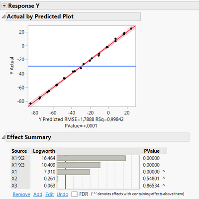
When building the model, it seems that two interactions effects are significant :
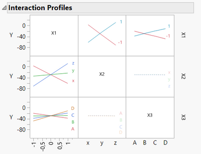
The interactions can be seen in the "Interaction Profiles" panel :
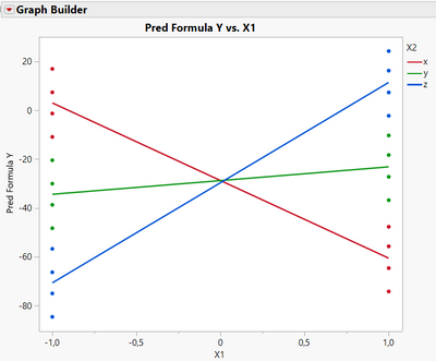
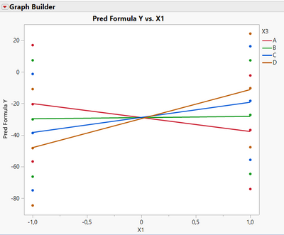
I save the Prediction formula for the response Y, and use it in the Graph Builder, use X1 as X and X2 as "overlay" role variable in the Graph Builder and I am able to find the same interaction plot than seen before :
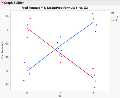
I can also do it with X2 as X and X1 as overlay variable, even if X2 is a categorical factor, as this factor has a "Value Order" property, so JMP knows in which order to display the levels. I end up with this graph, very similar to what was shown previously in "Interaction Profiles" panel :
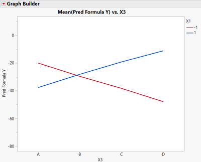
And here with X3 as X variable (and removing points from Graph Builder to make the visualization more simple) :
Of course you can customize the graph, removing the points or keeping them, changing the colors, visualisation styles, ... Take also care that the Y range of the graph is the same than the predicted Y values range, in order to have the same slope and behaviour for your interaction (and not have misleading visualization).
I hope this answer will help you,
"It is not unusual for a well-designed experiment to analyze itself" (Box, Hunter and Hunter)
- Mark as New
- Bookmark
- Subscribe
- Mute
- Subscribe to RSS Feed
- Get Direct Link
- Report Inappropriate Content
Re: Creating two factor interaction plot (without the full matrix profile)
Thanks. I see that works for a number of data sets. For some unknown reason it does not work with mine.
- Mark as New
- Bookmark
- Subscribe
- Mute
- Subscribe to RSS Feed
- Get Direct Link
- Report Inappropriate Content
Re: Creating two factor interaction plot (without the full matrix profile)
Would it be possible to provide the dataset in an anonimized way ?
It would be much easier to investigate this topic with the same data to see what is going on.
"It is not unusual for a well-designed experiment to analyze itself" (Box, Hunter and Hunter)
- Mark as New
- Bookmark
- Subscribe
- Mute
- Subscribe to RSS Feed
- Get Direct Link
- Report Inappropriate Content
Re: Creating two factor interaction plot (without the full matrix profile)
Hi @Victor_G ,
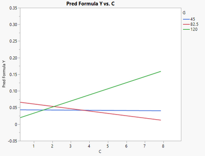
Attached is an experiment, including because it has the additional element of a 3rd level for each factor. Check out the CG interaction in the "Fit Least Squares" interaction profiler. How to pop that out separately without the entire matrix of all the factors is my goal. There must be a command somewhere to do this. Saving the Y predicted formula then using graph builder does not recreate what is shown in the profiler.
Profiler:
Graph builder of Y predicted formula:
- Mark as New
- Bookmark
- Subscribe
- Mute
- Subscribe to RSS Feed
- Get Direct Link
- Report Inappropriate Content
Re: Creating two factor interaction plot (without the full matrix profile)
Hi @CanonicalHazard,
Thanks for the example dataset and sorry for my delay.
I found the same results as you, and using the magnifier tool, I can see on the interaction plot you show that intersection between lines is at C = 2, which does correspond to the intersection for levels G at 82,5 and 120 (not 45 and 120).
I don't understand why we are not able to reproduce the same graph as in "Interaction plots". I thought this may be due to a problem of coding the levels for the factors, but I checked and this was not a problem.
I am clueless, but this may be due to the presence of a third (intermediate) level ? For designs involving 2-levels continuous factors, I am able to reproduce the Interaction plots without any problem.
"It is not unusual for a well-designed experiment to analyze itself" (Box, Hunter and Hunter)
- Mark as New
- Bookmark
- Subscribe
- Mute
- Subscribe to RSS Feed
- Get Direct Link
- Report Inappropriate Content
Re: Creating two factor interaction plot (without the full matrix profile)
Thank you for looking at it. I wrote to JMP support and got this: "there is not a way to limit the Interaction Profiler to include only a subset of the factors in the matrix." This I guess we already knew, thus the reason for trying to recreate it. But it is good confirmation there isn't something hiding in Fit Model that will do it. I replied to it asking about manually creating and no reply yet.
I also noticed a competitive software can do it and gives something wholly different than the JMP Interaction Profiler (sometimes).
So now I am at, "what math is used to create these interaction plots?" For two level factorials that are balanced designs (same number of instances low as high) that is quite simple, though tedious to do by hand. If they are unbalanced or have a third level, there must be something like weighting that is done.
Also my base understanding is to use the raw data, not a predicted value. But I'm not sure. So another thing to consider. When I get a chance I'll do a helpfile, document and book search to find a reputable source or author that explains how to calculate interaction plots for special situations (3 levels, unbalanced designs, etc.).
In the meantime I think I may trust the competitive program (very presumptuous of me I know -- but I'm learning from a statistician that uses both software programs and that person trusts the interaction plots in the current version of the competitive program). My workflow will be to do everything in JMP. Then when I want to report something cleanly, I'll use the other program that makes bigger, clearer interaction plots. Probably should do all the research first, but there is a reason why I bought pre-programmed software! Research takes time. (at least for me).
- Mark as New
- Bookmark
- Subscribe
- Mute
- Subscribe to RSS Feed
- Get Direct Link
- Report Inappropriate Content
Re: Creating two factor interaction plot (without the full matrix profile)
Hi @CanonicalHazard,
Great, if you have any infos with your example on how to recreate the interactions plot, please inform community members on this post, it will be instructive for everyone.
I agree with you, you don't need any model or anything to do the interaction plots, you can use directly the raw data (and it makes more sense to visualize first, model after).
Perhaps you can compare the interaction plots between the other software and what we would do "logically" with the Graph Builder (use response as Y, one factor as X, and another factor as "Overlay" variable) ? If they look the same, there may be something to search for.
Good luck for your research !
"It is not unusual for a well-designed experiment to analyze itself" (Box, Hunter and Hunter)
- Mark as New
- Bookmark
- Subscribe
- Mute
- Subscribe to RSS Feed
- Get Direct Link
- Report Inappropriate Content
Re: Creating two factor interaction plot (without the full matrix profile)
Hi @Victor_G ,
Appear to have the solution, though it is rather involved. From JMP Technical Support:
Since you have all continuous variables that you wish to exclude, I think the following approach should work.
If you do the following I think you will have the same Interaction Plot in Graph Builder that you see in your Least Squares report...
-- Run your model as you normally would and turn on the Interaction Plots.
-- Click the hotspot in the top left and choose Factor Profiling > Profiler to turn on the Prediction Profiler (if it is checked it is already on).
-- Now go down to the Profiler and click directly in the plot for A while holding down the Alt key (to specify Factor Settings).
-- Check the Lock Factor Setting box and click OK.
--Continue to do the same to Lock Factor Settings for every factor except the two you are interested in (D and I).
-- Now click the hotspot associated with the Prediction Profiler and select Output Grid Table.
-- Open Graph Builder and build the interaction plot from this new table (i.e., Response as Y, D as X, I as Overlay).
-- This should be the same plot you see in the Least Squares report, except that the axes may be different and there are traces for each of the curves. You can copy and paste the axes from the original Interaction Plot to Graph Builder if you like:
-- Right click on the x-axis of the original Interaction Plot and choose Edit > Copy Axis Settings.
-- Right-click on the x-axis of your plot in Graph Builder and choose Edit > Paste Axis Settings.
-- Do the same for y-axis.
An example below of response Y3 for the two factor D x I interaction -- I had transformed Y3 with a log (time to failure):
Using local data filter:
The message suggests something else may happen when the model contains non-continuous predictors. I'll deal with that when it happens.
- Mark as New
- Bookmark
- Subscribe
- Mute
- Subscribe to RSS Feed
- Get Direct Link
- Report Inappropriate Content
Re: Creating two factor interaction plot (without the full matrix profile)
This post was started with the wish to re-create one of the subplots of Interaction Profile via Graph Builder.
Is it possible to re-create the whole matrix of Interaction profiles in Graph Builder?
Recommended Articles
- © 2026 JMP Statistical Discovery LLC. All Rights Reserved.
- Terms of Use
- Privacy Statement
- Contact Us
