- New to JMP? Let the Data Analysis Director guide you through selecting an analysis task, an analysis goal, and a data type. Available now in the JMP Marketplace!
- See how to install JMP Marketplace extensions to customize and enhance JMP.
- Subscribe to RSS Feed
- Mark Topic as New
- Mark Topic as Read
- Float this Topic for Current User
- Bookmark
- Subscribe
- Mute
- Printer Friendly Page
Discussions
Solve problems, and share tips and tricks with other JMP users.- JMP User Community
- :
- Discussions
- :
- Creating two factor interaction plot (without the full matrix profile)
- Mark as New
- Bookmark
- Subscribe
- Mute
- Subscribe to RSS Feed
- Get Direct Link
- Report Inappropriate Content
Creating two factor interaction plot (without the full matrix profile)
How do I have JMP give a clearer, bigger, simpler two factor interaction plot for just two factors that I hand select for the model that has been fit with Fit Model?
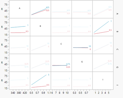
JMP gives a profiler, like so, but it is a giant matrix and frankly not particularly readable if one wants to focus well on one particular two factor interaction.
I see no way to tell it I don't want to see the whole matrix and to select the factors as desired.
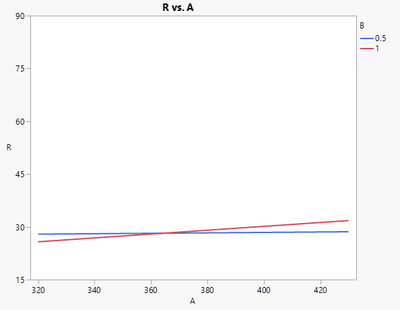
Creating in graph builder using the raw data gives a different result and I'm not clear why (I'm an engineer not a statistician), but I suspect it has something to do with the fact the model in the interaction profile in the Fit Model area doesn't include all the possible model terms as many were insignificant. Here is the AB interaction. It is bigger and clearer, but according to the Fit Model profiler, it is wrong, very wrong.
- Mark as New
- Bookmark
- Subscribe
- Mute
- Subscribe to RSS Feed
- Get Direct Link
- Report Inappropriate Content
Re: Creating two factor interaction plot (without the full matrix profile)
Hi hogi!
Yes, by using the manual method posted in this thread. I do this by tediously doing one at a time following the manual method posted. Again tedious. I'm sure someone (such as myself) could write a script to do it. I have not yet been inclined to try. It is a weakness of JMP. Simplified interaction plots are a great way to present to others the main conclusions (and best factor levels) of an experiment. The Profiler alone requires dragging left and right over and over to see the effects of such interactions. Annoying.
I noticed that in Fit Model -- Survival or Hazard personality there are no interaction plots at all. One does get the Profiler so I've been using the manual method in this thread after locking a particular survival rate (like 10% failure) then locking any other factors then the Output Grid method. The most tedious part is using the local data filter in Graph Builder to get rid of the extra levels from the Grid Table; to get back to just a linear model or whatever the number of levels there were in the original experiment.
Reviewing my notes above it appears that since we are using the Profiler and the Output Grid Table these must be predicted values from the model.
I should add that in many cases I cannot verify the resulting plots are accurate. I have used a competing program to check, but I wouldn't know which was correct (I've found several errors in the competing program in other things). And I don't know how to do it from scratch. Perhaps the prediction formula whereby any locked factors are set to the predicted mid between low and high?
- Mark as New
- Bookmark
- Subscribe
- Mute
- Subscribe to RSS Feed
- Get Direct Link
- Report Inappropriate Content
Re: Creating two factor interaction plot (without the full matrix profile)
Please note that the curves depicted via Prediction Profiler depend on the current setting in the profiler.
E.g. for "2x3x4 Factorial", with 0, y, C, the curves look similar to the curves in
https://community.jmp.com/t5/Discussions/Creating-two-factor-interaction-plot-without-the-full-matri... :
here are some other interaction profiles for the setting: 1, x, DD:
Jmp uses the full prediction model to depict the interactions.
Variables which are not specified by the position in the matrix (group by) or on the x axis are taken from the settings of the prediction profiler.
On the other hand, when you generate a Interaction Plot in Minitab, it takes the raw values.
Variables which are not specified by the position in the matrix (group by) or on the x axis are removed by taking the mean over all existing values.
So, if you select some "mean" values in the prediction profiler, the Interaction Profiles in Jmp might look similar to the Interaction Profiles in Minitab.
- Mark as New
- Bookmark
- Subscribe
- Mute
- Subscribe to RSS Feed
- Get Direct Link
- Report Inappropriate Content
Re: Creating two factor interaction plot (without the full matrix profile)
The "Minitab version" can be created with the below code.
Instead of using the raw values, one could also use the Predicted values (-> column switcher).
To get the functionality of the Jmp Interaction Profiles, one would need a functionality to specify fixed values (from prediction profiler) for the third (or in general: additional) dimension(s).
dt = Open( "$SAMPLE_DATA/Design Experiment/2x3x4 Factorial.jmp" );

	myFit= dt <<
	Fit Model(
		Y( :Y ),
		Effects( :X1, :X2, :X3, :X1 * :X2, :X1 * :X3, :X2 * :X3 ),
		Personality( "Standard Least Squares" ),
		Emphasis( "Effect Screening" ),
		Run(
			Profiler(
				1,
				Confidence Intervals( 1 ),
				Desirability Functions( 1 ),
				Term Value(
					X1( 0, Lock( 0 ), Show( 1 ) ),
					X2( "x", Lock( 0 ), Show( 1 ) ),
					X3( "A", Lock( 0 ), Show( 1 ) )
				)
			),
			:Y 		)
	);
myFit  << Predicted Values;


dtLabels= New Table( "labels",
	Add Rows( 3 ),
	New Column( "variable", Character,Nominal,
		Set Values( {"X1", "X2", "X3"} )
	)
);

myDT = dt << Join(
	With( dtLabels ),
	Cartesian Join,
);

myDT << New Column( "Legend",
	Character,
	Nominal,
	set each value( Char(As Column( :variable[] )[]) )
);

myDT << Graph Builder(
	Show Control Panel( 0 ),
	Variables(
		X( :X1 ),
		X( :X2 ),
		X( :X3 ),
		Y( :Y ),
		Group Y( :variable ),
		Overlay( :Legend )
	),
	Elements(
		Position( 1, 1 ),
		Points( X, Y, Legend( 1 ) ),
		Smoother( X, Y, Legend( 6 ) )
	),
	Elements(
		Position( 2, 1 ),
		Points( X, Y, Legend( 2 ) ),
		Smoother( X, Y, Legend( 3 ) )
	),
	Elements(
		Position( 3, 1 ),
		Points( X, Y, Legend( 4 ) ),
		Smoother( X, Y, Legend( 5 ) )
	),
	Column Switcher( :Y, {:Y, :Predicted Y}, Title( "choose column" ) )
);- « Previous
-
- 1
- 2
- Next »
Recommended Articles
- © 2026 JMP Statistical Discovery LLC. All Rights Reserved.
- Terms of Use
- Privacy Statement
- Contact Us


