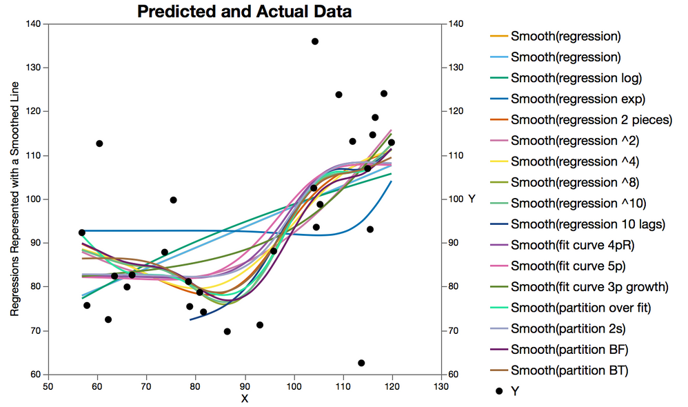
Fitting Curves to the XKCD Data Set
Teaser, XKCD. Curve Fitting by XKCD
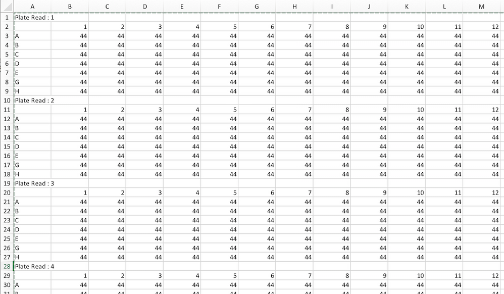
Most instruments will export plate reader data to an Excel file; however, the format of the data is generally difficult to format before starting analysis. This is an attempt to deal with one of those formats
Reformatting the raw data to the tall single table format that JMP uses.
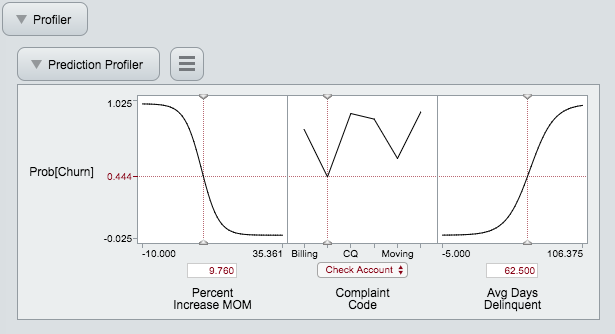
A quick trick to publish Nominal Logistic Regression model Profilers as Interactive HTML5 figures
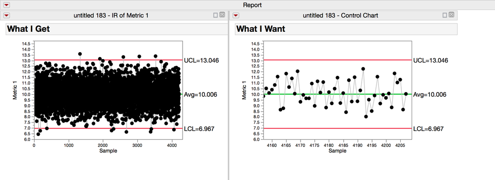
I have a data set with everything measured for the last two years and evey week I update it with the current production runs. This data set has thousands of rows, but I'm really only interested in seeing the what's happened in the last 50 runs, which is about the last month of data. My problem is that I have to format the x-axis or the charts each time so that they don't show all the data. Is ther...
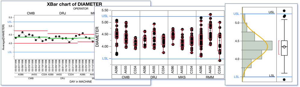
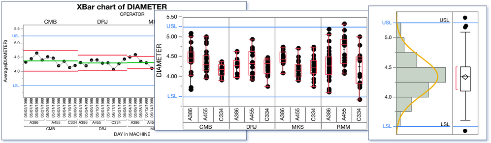
Some quick notes on adding spec limit lines to all the columns in a table with spec limits When specification limits are defined in the properties of a column, it is often convenient to have the spec limits drawn as reference lines on the graphs for that column. In the column properties for Spec Limits, there is a check box that will cause the specification for that column to be used anytime the...
Its easy to click the "Show as Graph Reference Lines" check box for a single column, but what if you want to 250 columns turned on?
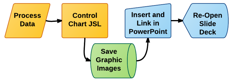
Script and comments on how to generate a series of graphic images from a list of columns
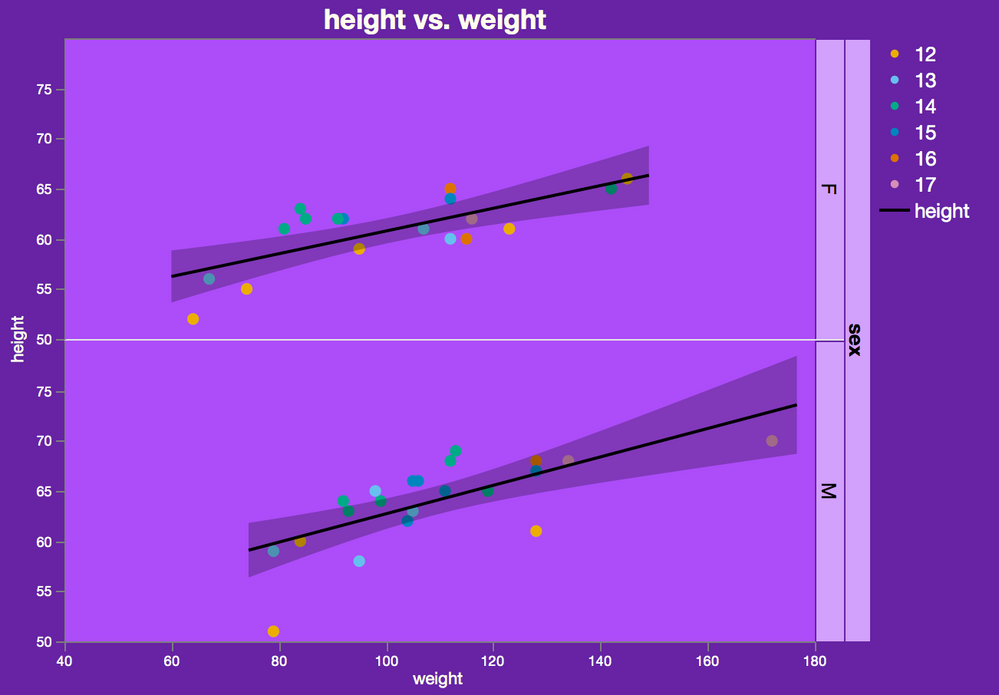
In Pharma and Biotech, there was a time when "foils" and 35mm slides were the standard for presentations. Most of the time these slides had dark backgrounds and light colored text and figures. IMHO this format looked great. Well, times have changed and now the most common format is exactly the opposite and this is reflected in the default settings. The old-school look can be yours again, and a l...