How to generate control charts that only show the last 50 rows of data

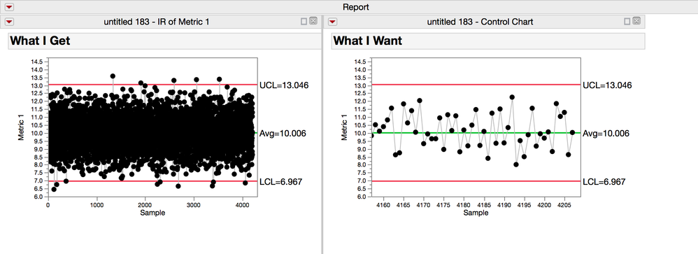
In the figure above, on the left, the default chart with all the data from my table and on the right is a chart from the same table with only the last 50 rows displayed.
Before getting started, I want to add two quick notes that will be helpful here. First, there is a useful little function in JSL called nrows(). This function returns the number of rows in a data table. Second, its helpful to know a couple of things about formatting contol charts: If the axis label isn't specified, then its just the row number. If its specified, but the column data type is character, then the axis units are still in rows, eventhough the character label is displayed on the graph. Formatting the control chart x-axis can be really confusing if you don't know this. For example, if my label is a column with dates, and its character, and I try to add a reference line on Febuary 14, I have to figure out which row matches that date to get the reference line in the right place. Now if the date column is numeric, then I'll see options for increments in years, months, days, and if I add a reference line on Febuary 14, I'll love the result I'll see on the graph.
To get started I need a control chart script to work with (I don't type them from memory, JMP writes them for me). Make a control chart, and only adjust the x-axis a little on the high and low side of the graph, then save the script to the script window.
Control Chart(
	Group Size( 1 ),
	KSigma( 3 ),
	Chart Col( :Metric 1, Individual Measurement ),
	SendToReport(
		Dispatch(
			{"Individual Measurement of Metric 1"},
			"1",
			ScaleBox,
			{Min( -227.995207667732 ), Max( 4448.40549051231 ), Inc( 281 ),
			Minor Ticks( 0 )}
		)
	)
);
The bit that we need to edit is down at the bottom in the Dispatch, right under "Scale Box". This list of things (its a list because it's in curly brackets {}) includes the minimum axis setting, the maximum and increments in rows.
To get this script to only show the last 50 rows of data I need to replace that list with this list:
{Min( nrows()-50 ),Max( nrows()+2), Inc( 5 ) }
Now the maximum is the number of rows in the table, plus 2 for padding in the graph, which makes it look better. And the minimum is 50 from the end of the table, nrows() minus 50. The increment argument isn't always automaticaly there so be aware that you might need to add it yourself some times. In this case there will be a label every 5 rows. If you specifed a label column, it would correspond to the label on every 5th row.
The final step would be to save this script back to your data table so that next week when you update the data, the script is there ready to go.
You must be a registered user to add a comment. If you've already registered, sign in. Otherwise, register and sign in.