- Subscribe to RSS Feed
- Mark Topic as New
- Mark Topic as Read
- Float this Topic for Current User
- Bookmark
- Subscribe
- Mute
- Printer Friendly Page
Discussions
Solve problems, and share tips and tricks with other JMP users.- JMP User Community
- :
- Discussions
- :
- Re: how to make cumulative probability plots in JMP?
- Mark as New
- Bookmark
- Subscribe
- Mute
- Subscribe to RSS Feed
- Get Direct Link
- Report Inappropriate Content
how to make cumulative probability plots in JMP?
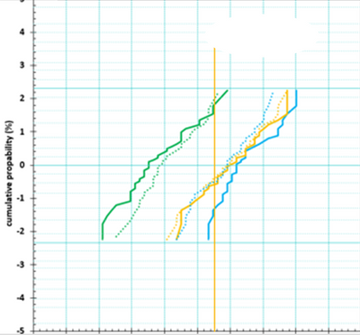
How can I make cumulative probability plot like the one below? Appreciate your help.
- Mark as New
- Bookmark
- Subscribe
- Mute
- Subscribe to RSS Feed
- Get Direct Link
- Report Inappropriate Content
Re: how to make cumulative probability plots in JMP?
@hogi wrote:@Mauro Thanks a lot for the Kudo - an also for the other 3.
With 4 Kudos this feature should be kind of save to appear in a future Jmp version
Hm,Summary Statistics: add Cumulative Probability is still in Acknowledged state.
Seems that more Kudos are needed to trigger the development.
- Mark as New
- Bookmark
- Subscribe
- Mute
- Subscribe to RSS Feed
- Get Direct Link
- Report Inappropriate Content
Re: how to make cumulative probability plots in JMP?
@hogi wrote:
Hm,Summary Statistics: add Cumulative Probability is still in Acknowledged state.
Seems that more Kudos are needed to trigger the development.
Good news:
there is even an older wish toAdd CDFs to Graph Builder from 2022 - and this wish got in the queue for a future Jmp release
Great!
- Mark as New
- Bookmark
- Subscribe
- Mute
- Subscribe to RSS Feed
- Get Direct Link
- Report Inappropriate Content
Re: how to make cumulative probability plots in JMP?
Additional advantages of using the built-in Summary Statistics of Graph Builder:
- For Group X / Group Y / Wrap / Page subplots, the calculation is always correct - no need to split the calculation by manually adding columns as argmuments of the Col Aggregations:
Col Rank( var, groupbyCol, GroupXCol, GroupYCol, WrapCol, PageCol, excluded());
Col Number( var, groupbyCol, GroupXCol, GroupYCol, WrapCol, PageCol, excluded())
- If a Local Data Filter is activated for the plot, GraphBuilder Summary Statistics restricts the calculation automatically to the filtered rows, the Formula in a Transform Column ignores the LDF: Transform Column: Bug with excluded rows
- Mark as New
- Bookmark
- Subscribe
- Mute
- Subscribe to RSS Feed
- Get Direct Link
- Report Inappropriate Content
Re: how to make cumulative probability plots in JMP?
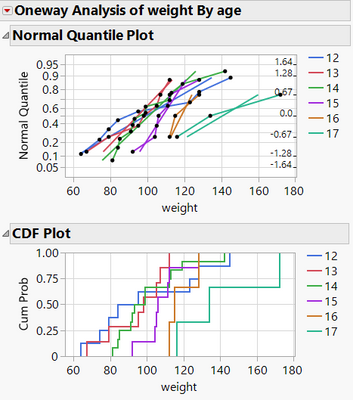
Till cumulative probability will be available via Summary Statistics in Graph Builder (Add CDFs to Graph Builder ) ....
Plot quantile by actual can be used as a workaround:
It's similar to CDF - but with access to the data points.
disadvantages:
- many black points!
- no split plots
- ...
Names Default to Here(1);
dt = Open( "$SAMPLE_DATA/Big Class.jmp" );
Oneway(
	Y( :weight ),
	X( :age ),
	All Graphs( 0 ),
	Plot Quantile by Actual( 1 ),
	CDF Plot( 1 ),
	Local Data Filter( Close Outline( 1 ) )
)
- Mark as New
- Bookmark
- Subscribe
- Mute
- Subscribe to RSS Feed
- Get Direct Link
- Report Inappropriate Content
Re: how to make cumulative probability plots in JMP?
.
- Mark as New
- Bookmark
- Subscribe
- Mute
- Subscribe to RSS Feed
- Get Direct Link
- Report Inappropriate Content
Re: how to make cumulative probability plots in JMP?
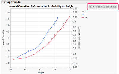
@r30363 wrote:if I want to do Left side Y-axis with standard deviation, right side Y-axis with cumulative probability, how to add a right Y in graph builder?
The left and right Y axis are not linked. So, after changing one of them one has to click on "reset Normal Quantile Scale" - or is there a Plot Scale Change Handler in Jmp? *)
Names Default To Here( 1 );
dt = Open( "$SAMPLE_DATA/Big Class.jmp" );
New Column( "normal Quantiles" );

Graph Builder(
	Transform Column( "Cumulative Probability", Formula( Col Rank( :height, :sex ) / (Col Number( :height, :sex ) + 1) ) ),
	Show Control Panel( 0 ),
	Variables( X( :height ), Y( :normalQuantiles ), Y( :Cumulative Probability, Position( 1 ), Side( "Right" ) ), Overlay( :sex ) ),
	Elements( Points( X, Y( 2 ) ), Smoother( X, Y( 2 ) ) ),
	SendToReport(
		Dispatch(
			{},
			"Cumulative Probability",
			ScaleBox,
			{Scale( "Normal Probability" ), Format( "Best", 12 ), Min( 0.01 ), Max( 0.99 ), Inc( 0.1 ), Minor Ticks( 1 )}
		)
	)
);
New Namespace(
	"reset"
);
reset:NormalQuantileScale = Function( {},
	myScript = (Current Report() << XPath( "//AxisBox" ))[3] << get script();
	myMin = Normal Quantile( myScript["min"] );
	myMax = Normal Quantile( myScript["max"] );
	(Current Report() << XPath( "//AxisBox" ))[2] << Min( myMin ) << Max( myMax ) << inc( 0.5 );
);
Current Report()[List Box( 2 )] << append( Button Box( "reset Normal Quantile Scale", reset:NormalQuantileScale() ) );
reset:NormalQuantileScale()- Mark as New
- Bookmark
- Subscribe
- Mute
- Subscribe to RSS Feed
- Get Direct Link
- Report Inappropriate Content
Re: how to make cumulative probability plots in JMP?
asking for a friend/colleague:
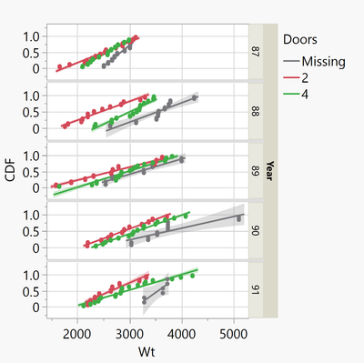
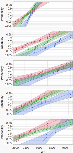
With the current version of Jmp, is there an easy way to generate a split grouped probability plot?
I can generate such a plot via Graph Builder, but I have to implement a hand-made functionality which re-generates the Transform column once the user selects different columns or different entries in the Local Data Filter - and it's extremely slow!
Accepting that the graph won't be as interactive as what a Jmp user is used from Graph Builder, one can use Live Distribution/Compare Groups - with a By variable. It can be much faster than Graph Builder - but there are cases where you have to wait literally "hours" till the plot shows up [see below].
The original report doesn't look like expected - but with several commands to the report (*) the plot gets almost as nice as in Minitab.
The benefit compared to the Graph Builder approach: more Distributions/scales to select from
The disadvantages compared to Minitab:
- not stable
- very slow
Open( "$SAMPLE_DATA/Cars.jmp" );Graph Builder(
	Transform Column(
		"CDF",
		Formula(
			Col Rank(
				:Wt,
				:Doors,
				:Year
			) / (Col Number(
				:Wt,
				:Doors,
				:Year
			) + 1)
		)
	),
	Variables( X( :Wt ), Y( :CDF ), Group Y( :Year ), Overlay( :Doors ) ),
	Elements( Line Of Fit( X, Y, ), Points( X, Y, Legend( 14 ) ) )
);

myld = Life Distribution(
	Perspective( Compare Groups ),
	Y( :Wt ),
	Grouping( :Doors ),
	Confidence Interval Method( Wald ),
	Select Distribution( Distribution, Normal ),
	Select Scale( Normal ),
	<< Show Statistics( 0 ),
	By( :Year)
);
(myld  << XPath("(//OutlineBox[text()='Statistics'])")) << Visibility( "Collapse" );
(myld << xpath("//OutlineBox[text()='Individual Group']")) << Visibility( "Collapse" );
((myld << xpath ("//RadioBox")) << parent) << Visibility( "Collapse" );
(myld << xpath("//OutlineBox[text()='Compare Distribution']//IfBox"))<< Visibility( "Collapse" );
//(myld << xpath("//OutlineBox[text()='Compare Distribution']")) <<Set Title( "" );
// current Report()[ListBox(1)] << Set Horizontal( 1 );
(myld << xpath("//OutlineBox")) <<Set Title( "" );
myABS = (myld << xpath ("//OutlineBox//AxisBox"));
Transform Each({ABList},myABs[1::Nitems(myABs)-1],ABList[2]) << Label Row(
				{Automatic Tick Marks( 0 ), Show Major Ticks( 0 ),
				Show Minor Ticks( 0 ), Show Major Labels( 0 )} );
myTEBs = (myld << xpath ("//OutlineBox//TextEditBox"));
Transform Each({TEBList},myTEBs[1::Nitems(myTEBs)-1],TEBList[2])<<Set Text( "" ) ;
- Mark as New
- Bookmark
- Subscribe
- Mute
- Subscribe to RSS Feed
- Get Direct Link
- Report Inappropriate Content
Re: how to make cumulative probability plots in JMP?
At the moment, Life Distribution is definitely the most versatile/elegant way in Jmp to create a probability plot.
The confidence intervals look very nice.
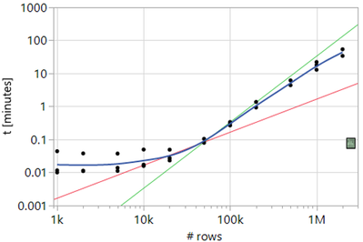
On the other hand, it takes a while for Life Distribution to open - depending on the number of data points, it can take hours:
TS-00122043
- Mark as New
- Bookmark
- Subscribe
- Mute
- Subscribe to RSS Feed
- Get Direct Link
- Report Inappropriate Content
Re: how to make cumulative probability plots in JMP?
With a little work you can almost reproduce what you get from the Fit Y by X CDFs -- you just have to add a line and switch its connection to "Step" and Summary Statistic to "Max". However unlike a real CDF you don't get the vertical lines at the endpoints going to 0 and 1.0. I'm hoping this will make it into Graph Builder as a first-class citizen someday.
- Mark as New
- Bookmark
- Subscribe
- Mute
- Subscribe to RSS Feed
- Get Direct Link
- Report Inappropriate Content
Re: how to make cumulative probability plots in JMP?
With a little work?
how?
Recommended Articles
- © 2025 JMP Statistical Discovery LLC. All Rights Reserved.
- Terms of Use
- Privacy Statement
- Contact Us

