- New to JMP? Let the Data Analysis Director guide you through selecting an analysis task, an analysis goal, and a data type. Available now in the JMP Marketplace!
- See how to install JMP Marketplace extensions to customize and enhance JMP.
- Subscribe to RSS Feed
- Mark Topic as New
- Mark Topic as Read
- Float this Topic for Current User
- Bookmark
- Subscribe
- Mute
- Printer Friendly Page
Discussions
Solve problems, and share tips and tricks with other JMP users.- JMP User Community
- :
- Discussions
- :
- Tracking a 96-well over time
- Mark as New
- Bookmark
- Subscribe
- Mute
- Subscribe to RSS Feed
- Get Direct Link
- Report Inappropriate Content
Tracking a 96-well over time
Hello,
I have a kinetic assay that records OD over time on a 96 well plate.
The output is OD and I have data columns with time and location (A1, A2 etc) for each OD value.
By applying the map shape I can visualize the 96-well plate in Graph Builder on a certain time (e.g. at 0 or 1 hour).
Would it be possible for Graph Builder or another SAS JMP feature to show the development of OD over time on the same plate (similar to the Bubble Plot function) ?
- Mark as New
- Bookmark
- Subscribe
- Mute
- Subscribe to RSS Feed
- Get Direct Link
- Report Inappropriate Content
Re: Tracking a 96-well over time
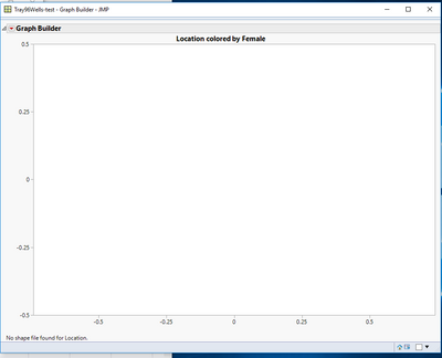
Yes, I tried dragging my response variable to the middle, still is showing an empty graph with error message "No shape file found for Location".
- Mark as New
- Bookmark
- Subscribe
- Mute
- Subscribe to RSS Feed
- Get Direct Link
- Report Inappropriate Content
Re: Tracking a 96-well over time
I don't know what is wrong.
I verified that my 96-well example is working. Then I examined your files and found them to be correctly defined but I had the same problem as you. I created a new data table for the Name and XY information, copied your data values to my tables, added the column properties. I tested it with all the files together in the same test folder but nothing help. The problem is not the data, it is one of your shape files.
I recommend that you contact JMP Technical Support for further help. ( support@jmp.com )
- Mark as New
- Bookmark
- Subscribe
- Mute
- Subscribe to RSS Feed
- Get Direct Link
- Report Inappropriate Content
Re: Tracking a 96-well over time
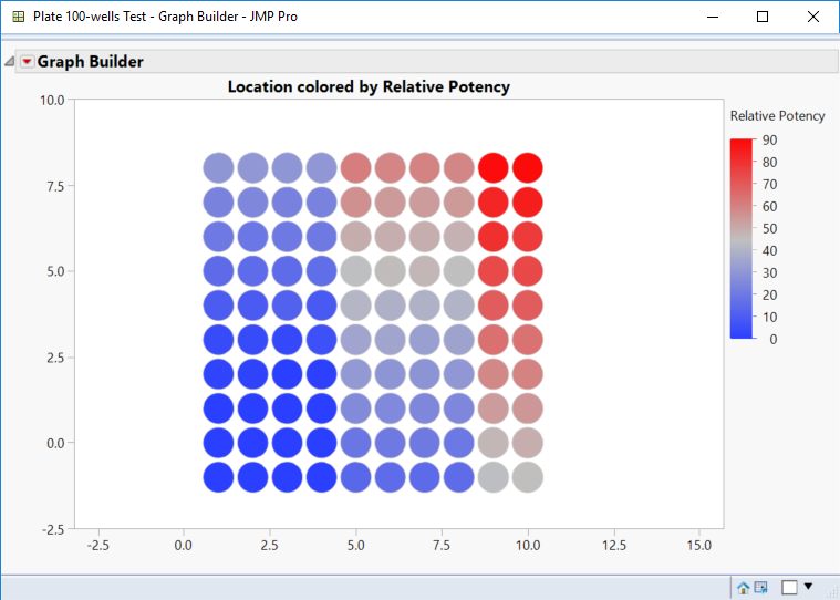
In the meantime, I created the shape and test files for 100 wells. I did not take the time to remove the 4 center wells from the shape files or the test file. It works for me.
Be sure to save the files together or move the two shape definition files to the common shape folder documented for your version of JMP.
There is definitely something wrong with the shape files that you created, but I can't see what it is.
- Mark as New
- Bookmark
- Subscribe
- Mute
- Subscribe to RSS Feed
- Get Direct Link
- Report Inappropriate Content
Re: Tracking a 96-well over time
JMP can do some fairly amazing things with this kind of data. (I'm not sure what you already know so some of this might be a little basic, who knows who else might read it.)
The first step it to get it in the right format. From an Excel mindset this is absolutely daunting, but the table tools in JMP make it easy. What we need is one column for time, one column for OD and one column for location. (also you might have replicates of a treatment on the plate, but that gets a little more complex, so I'm going to run with the simple case. If we had that, we might want to get the means of the treatment replicates, and in that case, we wouldn't have a location column, we would have a treatment column.)
-To get all the locations in one place, go to Tables>Stack, and stack all the columns that have OD data, and don't select any other column.
-This should result in one Time col, one col with OD values, and one col with Location IDs. (Rename the column with OD values "OD600" or something appropriate.
First graph: Use graph builder, put Time on the X axis and OD on the Y. Depending on what your're growing you see a roughtly sigmoidal shaped data point cloud. Last, add the Location variable to the overlay role. In the graph elements, turn on Data points and either the smoother or the connected line.
Bubble plot: X is time, Time is time, Y is OD, and ID is location. Run this graph, click the play button, and watch the most painful time series graph appear before your eyes, then never do this again or make any of you respected coworkers watch it. IMHO, the time variable should never be used for both the X axis variable and the Time role simultaneously. This is a graphical sin and an abomination (again, in my humble opinion, which might be strong.) If you had measured pH, O2, CO2, NH4, your favorite carbon source, Gln, Glu, or anyother metabolite, then looking at ratios of these on the X and Y axis and using the time variable in the time role is likely to be an interesting graph to look at. Bubble plots are great for looking at relationships between variables over time in groups and as individuals.
The real graph: Analyze>Specialized modeling>Fit Curve. Put Time in X, put DO in Y, and put Location in the ID/Group role. Go to the hot spot and try picking models that fit your data. (Sigmoidal>Logistic> try 4p and 5p options) The JMP fits all your growth curves and will give you a table of parameter estimates.
Hope this helps a little. This is usually some pretty fun data to work with, so if you end up making some killer figures, post an image if you can.
Cheers,
-B
Note: In JMP 14 there is a new tool that will do even more for this case, but I'm sure that will be covered when its available.
- « Previous
-
- 1
- 2
- Next »
Recommended Articles
- © 2026 JMP Statistical Discovery LLC. All Rights Reserved.
- Terms of Use
- Privacy Statement
- Contact Us


