- New to JMP? Let the Data Analysis Director guide you through selecting an analysis task, an analysis goal, and a data type. Available now in the JMP Marketplace!
- See how to install JMP Marketplace extensions to customize and enhance JMP.
- Subscribe to RSS Feed
- Mark Topic as New
- Mark Topic as Read
- Float this Topic for Current User
- Bookmark
- Subscribe
- Mute
- Printer Friendly Page
Discussions
Solve problems, and share tips and tricks with other JMP users.- JMP User Community
- :
- Discussions
- :
- Tracking a 96-well over time
- Mark as New
- Bookmark
- Subscribe
- Mute
- Subscribe to RSS Feed
- Get Direct Link
- Report Inappropriate Content
Tracking a 96-well over time
Hello,
I have a kinetic assay that records OD over time on a 96 well plate.
The output is OD and I have data columns with time and location (A1, A2 etc) for each OD value.
By applying the map shape I can visualize the 96-well plate in Graph Builder on a certain time (e.g. at 0 or 1 hour).
Would it be possible for Graph Builder or another SAS JMP feature to show the development of OD over time on the same plate (similar to the Bubble Plot function) ?
Accepted Solutions
- Mark as New
- Bookmark
- Subscribe
- Mute
- Subscribe to RSS Feed
- Get Direct Link
- Report Inappropriate Content
Re: Tracking a 96-well over time
To expand on Ian's answer, you can add a local data filter to your graph, change your time axis to ordinal if you want to see discrete sample times, and then use animation under the data filter. If you run the script below you would just need to press play in the upper left:
Names default to here( 1 );

dt = Open( "$SAMPLE_DATA/Time Series/Air.jmp" );

Column( dt, "date" ) << Set Modeling Type( "Ordinal" );

graph = dt << Graph Builder(
	Size( 516, 680 ),
	Show Control Panel( 0 ),
	Variables( Y( :Ozone Concentration ) ),
	Elements( Bar( Y, Legend( 3 ) ) ),
	Local Data Filter(
		Add Filter(
			columns( :date ),
			Where( :date == 1953936000 ),
			Display( :date, Size( 256, 360 ), List Display )
		),
		Animation( Animate Column( :date ), Animate Rate( 90 ) )
	),
	SendToReport(
		Dispatch(
			{},
			"Ozone Concentration",
			ScaleBox,
			{Format( "Best", 9 ), Min( 0 ), Max( 10 ), Inc( 2 ), Minor Ticks( 1 )}
		)
	)
);
- Mark as New
- Bookmark
- Subscribe
- Mute
- Subscribe to RSS Feed
- Get Direct Link
- Report Inappropriate Content
Re: Tracking a 96-well over time
Get your Graph Builder display the way you want it, then try adding your 'time' variable to the local data filter.
- Mark as New
- Bookmark
- Subscribe
- Mute
- Subscribe to RSS Feed
- Get Direct Link
- Report Inappropriate Content
Re: Tracking a 96-well over time
To expand on Ian's answer, you can add a local data filter to your graph, change your time axis to ordinal if you want to see discrete sample times, and then use animation under the data filter. If you run the script below you would just need to press play in the upper left:
Names default to here( 1 );

dt = Open( "$SAMPLE_DATA/Time Series/Air.jmp" );

Column( dt, "date" ) << Set Modeling Type( "Ordinal" );

graph = dt << Graph Builder(
	Size( 516, 680 ),
	Show Control Panel( 0 ),
	Variables( Y( :Ozone Concentration ) ),
	Elements( Bar( Y, Legend( 3 ) ) ),
	Local Data Filter(
		Add Filter(
			columns( :date ),
			Where( :date == 1953936000 ),
			Display( :date, Size( 256, 360 ), List Display )
		),
		Animation( Animate Column( :date ), Animate Rate( 90 ) )
	),
	SendToReport(
		Dispatch(
			{},
			"Ozone Concentration",
			ScaleBox,
			{Format( "Best", 9 ), Min( 0 ), Max( 10 ), Inc( 2 ), Minor Ticks( 1 )}
		)
	)
);
- Mark as New
- Bookmark
- Subscribe
- Mute
- Subscribe to RSS Feed
- Get Direct Link
- Report Inappropriate Content
Re: Tracking a 96-well over time
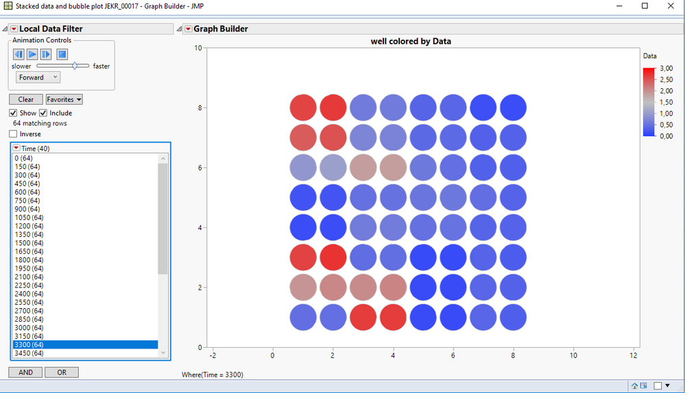
Thank you for your reply.
It was easy to re-write the script to my case and add my wells under Shape.
I have added the output below
- Mark as New
- Bookmark
- Subscribe
- Mute
- Subscribe to RSS Feed
- Get Direct Link
- Report Inappropriate Content
Re: Tracking a 96-well over time
- Mark as New
- Bookmark
- Subscribe
- Mute
- Subscribe to RSS Feed
- Get Direct Link
- Report Inappropriate Content
Re: Tracking a 96-well over time
I did not draw them. JMP have developed JMP-files with the 96-well and 384-well format. You can then add them under Map role in column properties.
- Mark as New
- Bookmark
- Subscribe
- Mute
- Subscribe to RSS Feed
- Get Direct Link
- Report Inappropriate Content
Re: Tracking a 96-well over time
So they do, thanks!
- Mark as New
- Bookmark
- Subscribe
- Mute
- Subscribe to RSS Feed
- Get Direct Link
- Report Inappropriate Content
Re: Tracking a 96-well over time
The shape files for the microtiter plate wells can be found in here in the JMP File Exchange area of the JMP Community.
- Mark as New
- Bookmark
- Subscribe
- Mute
- Subscribe to RSS Feed
- Get Direct Link
- Report Inappropriate Content
Re: Tracking a 96-well over time
Hi Mark,
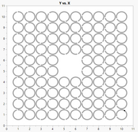
I tried to make change 96 well plate design according to my plate design, which is 10*10 and 4 wells left empty in the middle. But my out put is showing empty graph. Is it possible to use this graph for producing heatmaps for multiple variables.

- Mark as New
- Bookmark
- Subscribe
- Mute
- Subscribe to RSS Feed
- Get Direct Link
- Report Inappropriate Content
Re: Tracking a 96-well over time
So, you made your own shape files for your 10x10 plate layout? Did you follow the steps described in this blog post?
So, you can add the new shapes to Graph Builder but your response data (Y) does not appear? Did you drag the data column with the response data into the middle of Graph Builder? Did you follow the steps described in the blog post mentioned above?
Recommended Articles
- © 2026 JMP Statistical Discovery LLC. All Rights Reserved.
- Terms of Use
- Privacy Statement
- Contact Us


