- New to JMP? Let the Data Analysis Director guide you through selecting an analysis task, an analysis goal, and a data type. Available now in the JMP Marketplace!
- See how to install JMP Marketplace extensions to customize and enhance JMP.
- Subscribe to RSS Feed
- Mark Topic as New
- Mark Topic as Read
- Float this Topic for Current User
- Bookmark
- Subscribe
- Mute
- Printer Friendly Page
Discussions
Solve problems, and share tips and tricks with other JMP users.- JMP User Community
- :
- Discussions
- :
- Re: Life Distribution - event plot - left and right censor. How to plot failed r...
- Mark as New
- Bookmark
- Subscribe
- Mute
- Subscribe to RSS Feed
- Get Direct Link
- Report Inappropriate Content
Life Distribution - event plot - left and right censor. How to plot failed rows
Hello,
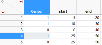
I'm trying to get an event plot for a survival analysis with left and right censored data, plus failed items.
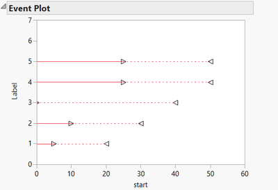
I uploaded data table and event plot. My problem is that I can not insert "x" to the right end of failed items (line 3 and 5).
If you look at line 4 and 5, they have different censor codes but they have same plotting. I was expecting to see an "x" on the right side of line 5.
What am I missing?
thank
[*Edit by staffer sseligman: Including another relevant part of poster's question here.]
I attached a part of my real table:
event: 1= failed 0=no event or censored
months to event: time from surgery to event
from surgery to today: from the date of surgery to today (disregarding the presence or absence of an event, drop out, etc...)
months from oldest: I inserted this column in order to insert left censoring (maybe it is not the right term). Given 0 the time of surgery of the first patient, months from oldest are the delay, in months, of the surgery of all the other patients
difference: it is the time to event, calculated for each patient from a 0, that is the time of the first surgery of the first patient.
For example, patient #5 was operated 9 months after the first one and failed after 102,9 months. In a time line where 0 is the surgery of the first patient, his failure should be placed at 112 months. Tha's why I'm expecting an "x" at 112 months and a triangle at 9 months.
Accepted Solutions
- Mark as New
- Bookmark
- Subscribe
- Mute
- Subscribe to RSS Feed
- Get Direct Link
- Report Inappropriate Content
Re: Life Distribution - event plot - left and right censor. How to plot failed rows
Thank you for the example and the explanation. I understand better what you want to plot. Unfortunately, that is not how the Event Plot works. It's behavior is fixed and cannot be altered.
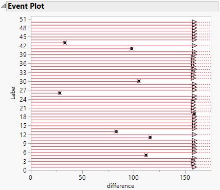
Your description leads me to believe that the proper analysis (correct estimates) involves using the difference column for the time to event role and the event column for the censor role, where event = 0 is censored. With that set up for launch, I get this Event Plot:
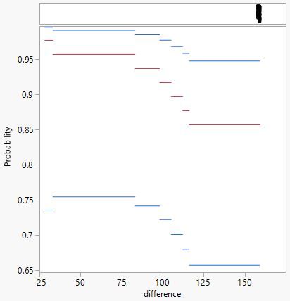
All of the subjects entered at difference = 0, their individual start time to the event (or last observed non-event). There were 7 events in this sample. The rest were censored. Here is the associated analysis, using the options to show the survival curve and not show the mid-points.:
The 7 events appear in the empirical survival curve and the remainder appear in the scatter plot at the top.
I realize that the Event Plot is not the graphic that you want. Perhaps we can make it in the Graph Builder. I will think about it, now that I understand what you want.
- Mark as New
- Bookmark
- Subscribe
- Mute
- Subscribe to RSS Feed
- Get Direct Link
- Report Inappropriate Content
Re: Life Distribution - event plot - left and right censor. How to plot failed rows
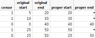
I assume that censor = 1 means that the life time is censored. Given that interpretation, you are not using the start and end values properly. If you use interval censoring, Life Distribution ignores the censor variable. Entering an interval indicates a failure event in that interval. If the observation is right censored, then life goes in the starting column and missing goes in the end column. A left censored life value goes in the end column and missing goes in the start column. An exact failure time is entered in both start and end columns.
I think that this way should work:
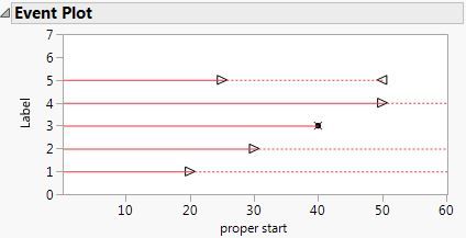
That leads to this event plot, which seems correct to me if I interpreted your data correctly:
- Mark as New
- Bookmark
- Subscribe
- Mute
- Subscribe to RSS Feed
- Get Direct Link
- Report Inappropriate Content
Re: Life Distribution - event plot - left and right censor. How to plot failed rows
Thanks for the reply,
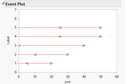
this is what I get reversing the order...
- Mark as New
- Bookmark
- Subscribe
- Mute
- Subscribe to RSS Feed
- Get Direct Link
- Report Inappropriate Content
Re: Life Distribution - event plot - left and right censor. How to plot failed rows
Ha! You replied before I coud finish editing my original post. Ignore it. I think the issue is how to preoperly use the start and end life time columns to indicate left, right, or interval censoring.
- Mark as New
- Bookmark
- Subscribe
- Mute
- Subscribe to RSS Feed
- Get Direct Link
- Report Inappropriate Content
Re: Life Distribution - event plot - left and right censor. How to plot failed rows
Is there a way to display a start point (triangle) and a failure (x) on the right side? I'm asking because your line 3 starts and ends at the same moment; what if you wanted to plot something like "my" line 3, that is, something that starts at time 0 and ends at 40?
I hope I made myself clear, my English is far from perfect
- Mark as New
- Bookmark
- Subscribe
- Mute
- Subscribe to RSS Feed
- Get Direct Link
- Report Inappropriate Content
Re: Life Distribution - event plot - left and right censor. How to plot failed rows
You are not using interval censoring properly. If you enter 0 and 40 for observation 3, you are telling JMP that the failure occurred in this interval of time. If it is uncensored, then enter 40 for both start and end so that JMP knows it is an exact life.
It doesn't matter when the subject life began. It is assumed that all begin at life = 0. The question is how do you indicate the life value?
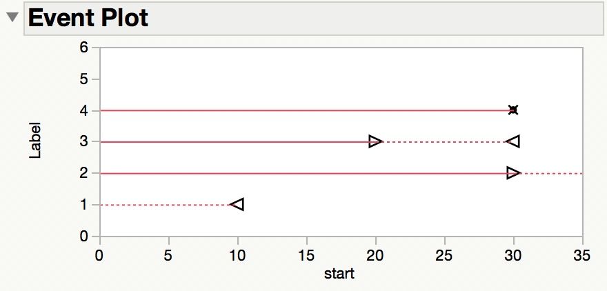
Most cases involve only right censoring, so Life Distribution makes this special case easy. You enter the life value and, if present, the censor value. All other cases (left censoring, interval censoring) use two life values. See this example in which life is observed every 10 time units for the different kinds of censoring when using two life data columns:
This data results in the following Event Plot in Life Distribution:
- Mark as New
- Bookmark
- Subscribe
- Mute
- Subscribe to RSS Feed
- Get Direct Link
- Report Inappropriate Content
Re: Life Distribution - event plot - left and right censor. How to plot failed rows
Ok, so it is not possible to have a scenario like this:
row 1: observed from 20 to 30 and did not fail
row 2: observed from 20 to 30 and failed at 40 (like your row 3 but with an "x" instead of the right triangle)
I'm asking because I have an observational study in which patients entered at different time points (that would be my left censoring) . During observation failures were recorded. It is a survival study with patients entering at different time points. I can plot a survival curve using the Kaplan Meier method but I was also interested giving an idea of the oservation time and failure time for each patient.
Failure time is always known
Nethertheless your explanation is very clear, thanks
- Mark as New
- Bookmark
- Subscribe
- Mute
- Subscribe to RSS Feed
- Get Direct Link
- Report Inappropriate Content
Re: Life Distribution - event plot - left and right censor. How to plot failed rows
Random start times are OK The time can be subject age, if birth is time = 0, or time since diagnosis, treatment, or entering the study. The definition of the event should make this clear. So life is time to event.The time to event is what is entered into the JMP data table. The time is the observed life as exact life, left-, right-, or interval-censored life. You would not enter more than one observation (row) for the same patient.
You do not need to enter the end time for right censored data. So your example of row 1 would use start = 30 and end = missing.
If you observe at 20 and they survived but when you observe again at 30 they failed, then use interval censoring with start = 20 and end = 30.
If you observe at 40 and they fail then, use exact failure time of start = end = 40.
If in fact all of your failures are exact times or censored, then do not use interval censoring (use two columns for life). You should use a single life data column with the last time of the last observation and then an adjoining column to indicate if it is exact or right-censored.
You might have a case of truncation, not censoring.
I am sorry for any confusion that I might have caused.
- Mark as New
- Bookmark
- Subscribe
- Mute
- Subscribe to RSS Feed
- Get Direct Link
- Report Inappropriate Content
Re: Life Distribution - event plot - left and right censor. How to plot failed rows
Yuo are very patient with me :)
I didn't understand the last answer perfectly. I attached a part of my real table:
event: 1= failed 0=no event or censored
months to event: time from surgery to event
from surgery to today: from the date of surgery to today (disregarding the presence or absence of an event, drop out, etc...)
months from oldest: I inserted this column in order to insert left censoring (maybe it is not the right term). Given 0 the time of surgery of the first patient, months from oldest are the delay, in months, of the surgery of all the other patients
difference: it is the time to event, calculated for each patient from a 0, that is the time of the first surgery of the first patient.
For example, patient #5 was operated 9 months after the first one and failed after 102,9 months. In a time line where 0 is the surgery of the first patient, his failure should be placed at 112 months. Tha's why I'm expecting an "x" at 112 months and a triangle at 9 months.
- Mark as New
- Bookmark
- Subscribe
- Mute
- Subscribe to RSS Feed
- Get Direct Link
- Report Inappropriate Content
Re: Life Distribution - event plot - left and right censor. How to plot failed rows
Thank you for the example and the explanation. I understand better what you want to plot. Unfortunately, that is not how the Event Plot works. It's behavior is fixed and cannot be altered.
Your description leads me to believe that the proper analysis (correct estimates) involves using the difference column for the time to event role and the event column for the censor role, where event = 0 is censored. With that set up for launch, I get this Event Plot:
All of the subjects entered at difference = 0, their individual start time to the event (or last observed non-event). There were 7 events in this sample. The rest were censored. Here is the associated analysis, using the options to show the survival curve and not show the mid-points.:
The 7 events appear in the empirical survival curve and the remainder appear in the scatter plot at the top.
I realize that the Event Plot is not the graphic that you want. Perhaps we can make it in the Graph Builder. I will think about it, now that I understand what you want.
Recommended Articles
- © 2026 JMP Statistical Discovery LLC. All Rights Reserved.
- Terms of Use
- Privacy Statement
- Contact Us
