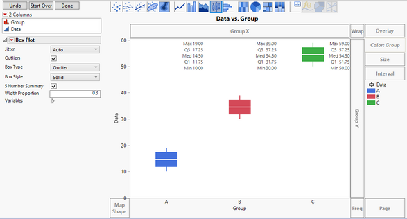
I am not able to see all of the details in your graph, but I hope this will get you what you need.
Drag your data column to the Y-axis.
Drag your grouping column to the X-axis.
Change the graphing element to the boxplot.
Change the style to be Solid.
Check the 5-number summary box.
Drag the grouping column to the Color area.
In my example I also changed the width proportion so that the box did not overlap with the 5-number summary.

Dan Obermiller