cancel
Showing results for 
Show  only  | Search instead for 
Did you mean: 
  • Instantly extract effect sizes, F-ratios, and FDR-adjusted p-values from your models with the Calculate Effects Sizes extension, available now in the JMP Marketplace!
  • New to JMP? Join us Sept. 23-24 for the Early User Edition of Discovery Summit, tailor-made for new users. Register now for free!
  • Your voice matters! Tell us how you prefer to receive JMP updates, so we can tailor our communication to your needs. Take short survey.

Discussions

Solve problems, and share tips and tricks with other JMP users.
Choose Language Hide Translation Bar
Dan2
Level I

How to mark statistical result and put a color in the graph

Hi I am beginner of JMP

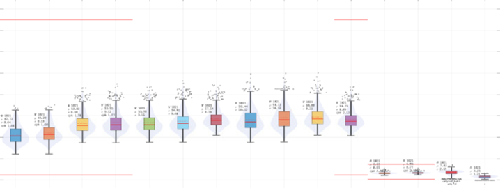
1. I would like to understand how to mark statistical result like below graph 

   I can see the box plot of many items below. Each item has its own quantity, mean, std, cpk value

   How can I draw a picture like this? I only know how to draw by graph builder. (Here I couldn't find any function for this)

2. How can I put colors like below picture? I cannot find it at graph builder function either.

Dan2_0-1623073808033.png


1 REPLY 1

Re: How to mark statistical result & put a color in the graph

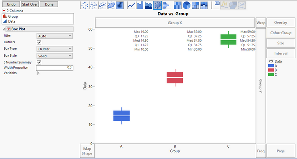
I am not able to see all of the details in your graph, but I hope this will get you what you need.


Drag your data column to the Y-axis. 

Drag your grouping column to the X-axis.

Change the graphing element to the boxplot.

Change the style to be Solid.

Check the 5-number summary box.

Drag the grouping column to the Color area.
In my example I also changed the width proportion so that the box did not overlap with the 5-number summary.
Capture.PNG

Dan Obermiller

Recommended Articles