- Subscribe to RSS Feed
- Mark Topic as New
- Mark Topic as Read
- Float this Topic for Current User
- Bookmark
- Subscribe
- Mute
- Printer Friendly Page
Discussions
Solve problems, and share tips and tricks with other JMP users.- JMP User Community
- :
- Discussions
- :
- How to mark statistical result and put a color in the graph
- Mark as New
- Bookmark
- Subscribe
- Mute
- Subscribe to RSS Feed
- Get Direct Link
- Report Inappropriate Content
How to mark statistical result and put a color in the graph
Hi I am beginner of JMP
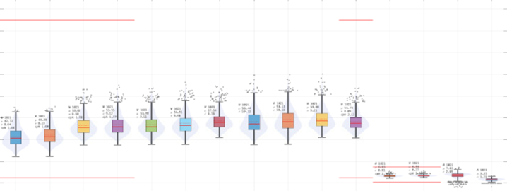
1. I would like to understand how to mark statistical result like below graph
I can see the box plot of many items below. Each item has its own quantity, mean, std, cpk value
How can I draw a picture like this? I only know how to draw by graph builder. (Here I couldn't find any function for this)
2. How can I put colors like below picture? I cannot find it at graph builder function either.
- Mark as New
- Bookmark
- Subscribe
- Mute
- Subscribe to RSS Feed
- Get Direct Link
- Report Inappropriate Content
Re: How to mark statistical result & put a color in the graph
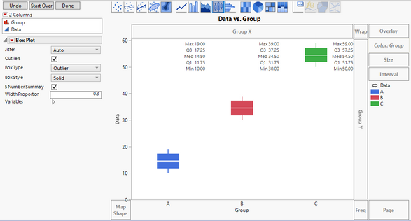
I am not able to see all of the details in your graph, but I hope this will get you what you need.
Drag your data column to the Y-axis.
Drag your grouping column to the X-axis.
Change the graphing element to the boxplot.
Change the style to be Solid.
Check the 5-number summary box.
Drag the grouping column to the Color area.
In my example I also changed the width proportion so that the box did not overlap with the 5-number summary.
Recommended Articles
- © 2025 JMP Statistical Discovery LLC. All Rights Reserved.
- Terms of Use
- Privacy Statement
- Contact Us


