cancel
Showing results for 
Show  only  | Search instead for 
Did you mean: 
New to using JMP? Hit the ground running with the Early User Edition of Discovery Summit. Register now, free of charge.
Register for our Discovery Summit 2024 conference, Oct. 21-24, where you’ll learn, connect, and be inspired.
Choose Language Hide Translation Bar
Hegedus1
Level III

How to interpret nonparametric density on scatterplot

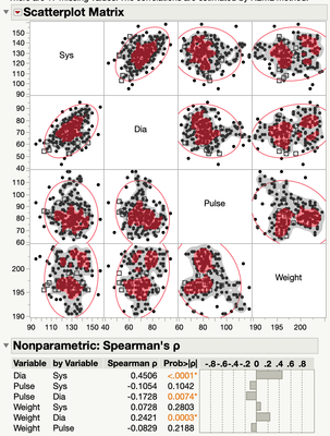
For the scatterplot matrix in the multivariate platform, I have done the Spearman correlation and added the non-parametric density to the plot. How does one interpret it? There are gray regions and black dots and red regions with red dots.  What is the meaning of the coloration?  The manual speaks only about how to add it the graph and is silent on its interpretation.
 

Hegedus1_0-1619796153813.png

Andy


1 REPLY 1

Re: How to interpret nonparametric density on scatterplot

From JMP Help:


Nonpar Density

Shows or hides shaded density contours based on a smooth nonparametric bivariate surface that describes the density of data points. Contours for the 10% and 50% quantiles of the nonparametric surface are shown.