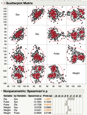
For the scatterplot matrix in the multivariate platform, I have done the Spearman correlation and added the non-parametric density to the plot. How does one interpret it? There are gray regions and black dots and red regions with red dots. What is the meaning of the coloration? The manual speaks only about how to add it the graph and is silent on its interpretation.
Andy