cancel
Showing results for 
Show  only  | Search instead for 
Did you mean: 
  • JMP will suspend normal business operations for our Winter Holiday beginning on Wednesday, Dec. 24, 2025, at 5:00 p.m. ET (2:00 p.m. ET for JMP Accounts Receivable).
    Regular business hours will resume at 9:00 a.m. EST on Friday, Jan. 2, 2026.
  • We’re retiring the File Exchange at the end of this year. The JMP Marketplace is now your destination for add-ins and extensions.

Discussions

Solve problems, and share tips and tricks with other JMP users.
%3CLINGO-SUB%20id%3D%22lingo-sub-350658%22%20slang%3D%22en-US%22%20mode%3D%22NONE%22%3ESo%20erstellen%20Sie%20eine%20grafische%20Darstellung%20eines%20S%C3%A4ulendiagramms%20mit%20in%20JMP%20berechneten%20Fehlerbalken%3C%2FLINGO-SUB%3E%3CLINGO-BODY%20id%3D%22lingo-body-350658%22%20slang%3D%22en-US%22%20mode%3D%22NONE%22%3E%3CP%3EHallo%20alle%2C%3C%2FP%3E%0A%3CP%3E%26nbsp%3B%3C%2FP%3E%0A%3CP%3EIch%20bin%20neu%20bei%20JMP%20und%20versuche%20zu%20verstehen%20oder%20herauszufinden%2C%20wie%20man%20ein%20S%C3%A4ulendiagramm%20zeichnet%20und%20in%20JMP%20berechnete%20Fehlerbalken%20einbezieht.%3C%2FP%3E%0A%3CP%3EZur%20Veranschaulichung%20meiner%20Frage%20habe%20ich%20einen%20Screenshot%20des%20S%C3%A4ulendiagramms%20und%20der%20Fehlerbalken%20angeh%C3%A4ngt%2C%20die%20ich%20generieren%20m%C3%B6chte.%3C%2FP%3E%0A%3CP%3EDer%20Datensatz%20enth%C3%A4lt%204%20Replikate%20mit%20der%20Bezeichnung%20R1%E2%80%93R4.%20Ich%20m%C3%B6chte%20den%20Mittelwert%20von%20R1%20und%202%20berechnen%20und%20den%20Mittelwert%20von%20R3%20und%20R4%20separat%20berechnen.%3C%2FP%3E%0A%3CP%3EDas%20resultierende%20Diagramm%20sollte%20bis%20auf%20die%20Darstellung%20der%20Mittelwerte%20das%20gleiche%20Layout%20wie%20das%20beigef%C3%BCgte%20haben.%3C%2FP%3E%0A%3CP%3EIch%20m%C3%B6chte%20auch%2C%20dass%20der%20Fehler%20dieses%20berechneten%20Mittelwerts%20f%C3%BCr%20jede%20Spalte%20angezeigt%20wird.%3C%2FP%3E%0A%3CP%3EWie%20w%C3%BCrde%20ich%20da%20vorgehen%3F%20Ich%20habe%20zahlreiche%20M%C3%B6glichkeiten%20ausprobiert%2C%20Daten%20zu%20stapeln%20und%20darzustellen%2C%20aber%20ich%20schaffe%20es%20scheinbar%20nie%2C%20das%20gew%C3%BCnschte%20Ergebnis%20zu%20erzielen.%20Ganz%20zu%20schweigen%20davon%2C%20dass%20ich%20noch%20nicht%20herausgefunden%20habe%2C%20wie%20ich%20die%20Fehlerbalken%20tats%C3%A4chlich%20%C3%BCber%20meinen%20Spalten%20darstellen%20kann.%3C%2FP%3E%0A%3CP%3E%26nbsp%3B%3C%2FP%3E%0A%3CP%3EIch%20habe%20auch%20den%20Datensatz%20angeh%C3%A4ngt%2C%20der%20zur%20Erstellung%20der%20Abbildung%20verwendet%20wurde.%3C%2FP%3E%0A%3CP%3E%26nbsp%3B%3C%2FP%3E%0A%3CP%3EJede%20Eingabe%20ist%20willkommen!%3C%2FP%3E%0A%3CP%3EDanke%2C%3C%2FP%3E%0A%3CP%3Ecensoredcactus%20%3A)%3C%2Fimg%3E%3C%2FP%3E%0A%3CP%3E%3CSPAN%20class%3D%22lia-inline-image-display-wrapper%20lia-image-align-inline%22%20image-alt%3D%22Imagefinal.png%22%20style%3D%22width%3A%20400px%3B%22%3E%3CSPAN%20class%3D%22lia-inline-image-display-wrapper%22%20image-alt%3D%22Imagefinal.png%22%20style%3D%22width%3A%20400px%3B%22%3E%3Cspan%20class%3D%22lia-inline-image-display-wrapper%22%20image-alt%3D%22Imagefinal.png%22%20style%3D%22width%3A%20400px%3B%22%3E%3Cimg%20src%3D%22https%3A%2F%2Fcommunity.jmp.com%2Ft5%2Fimage%2Fserverpage%2Fimage-id%2F29545i47549C331F88FDAA%2Fimage-size%2Fmedium%3Fv%3Dv2%26amp%3Bpx%3D400%22%20role%3D%22button%22%20title%3D%22Imagefinal.png%22%20alt%3D%22Imagefinal.png%22%20%2F%3E%3C%2Fspan%3E%3C%2FSPAN%3E%3C%2FSPAN%3E%3C%2FP%3E%0A%3CP%3E%E2%80%83%3C%2FP%3E%3C%2FLINGO-BODY%3E%3CLINGO-LABS%20id%3D%22lingo-labs-350658%22%20slang%3D%22en-US%22%20mode%3D%22NONE%22%3E%3CLINGO-LABEL%3EQualit%C3%A4ts-%20und%20Verfahrenstechnik%3C%2FLINGO-LABEL%3E%3C%2FLINGO-LABS%3E%3CLINGO-SUB%20id%3D%22lingo-sub-350804%22%20slang%3D%22en-US%22%20mode%3D%22NONE%22%3EBetreff%3A%20Wie%20man%20ein%20S%C3%A4ulendiagramm%20mit%20in%20JMP%20berechneten%20Fehlerbalken%20grafisch%20darstellt%3C%2FLINGO-SUB%3E%3CLINGO-BODY%20id%3D%22lingo-body-350804%22%20slang%3D%22en-US%22%20mode%3D%22NONE%22%3E%3CP%3EHallo%20Mark%2C%3C%2FP%3E%3CP%3EDanke%20f%C3%BCr%20deine%20Antwort.%20Ich%20werde%20es%20versuchen.%20Deine%20Erkl%C3%A4rung%20macht%20aber%20Sinn!%3C%2FP%3E%3CP%3E%26nbsp%3B%3C%2FP%3E%3CP%3EBeifall%2C%3C%2FP%3E%3CP%3Ezensierter%20Kaktus%3C%2FP%3E%3C%2FLINGO-BODY%3E%3CLINGO-SUB%20id%3D%22lingo-sub-350749%22%20slang%3D%22en-US%22%20mode%3D%22NONE%22%3EBetreff%3A%20Wie%20man%20ein%20S%C3%A4ulendiagramm%20mit%20in%20JMP%20berechneten%20Fehlerbalken%20grafisch%20darstellt%3C%2FLINGO-SUB%3E%3CLINGO-BODY%20id%3D%22lingo-body-350749%22%20slang%3D%22en-US%22%20mode%3D%22NONE%22%3E%3CP%3EOh%2C%20jetzt%20kann%20ich%20das%20Bild%20sehen%2C%20das%20du%20geteilt%20hast.%3C%2FP%3E%0A%3CP%3E%26nbsp%3B%3C%2FP%3E%0A%3CP%3ESie%20m%C3%BCssen%20eine%20neue%20Gruppierungsvariable%20erstellen%2C%20die%20angibt%2C%20ob%20die%20Zeile%20zu%20R1%20oder%20R2%20oder%20zu%20R3%20oder%20R4%20geh%C3%B6rt.%20Dann%20k%C3%B6nnen%20Sie%20Graph%20Builder%20verwenden.%20Ziehen%20Sie%20Daten%20auf%20Y%20und%20Bezirk%20auf%20X.%20Ziehen%20Sie%20m%5E2%20auf%20Gruppe%20X.%20Ziehen%20Sie%20Gruppe%20auf%20Overlay.%20W%C3%A4hlen%20Sie%20das%20Element%20Bar%20aus.%20%C3%84ndern%20Sie%20dann%20die%20Fehlerleiste%20in%20der%20Eigenschaftenliste%20auf%20der%20linken%20Seite.%3C%2FP%3E%0A%3CP%3E%26nbsp%3B%3C%2FP%3E%0A%3CP%3E%3CSPAN%20class%3D%22lia-inline-image-display-wrapper%20lia-image-align-inline%22%20image-alt%3D%22area.JPG%22%20style%3D%22width%3A%20617px%3B%22%3E%3CSPAN%20class%3D%22lia-inline-image-display-wrapper%22%20image-alt%3D%22area.JPG%22%20style%3D%22width%3A%20617px%3B%22%3E%3Cspan%20class%3D%22lia-inline-image-display-wrapper%22%20image-alt%3D%22area.JPG%22%20style%3D%22width%3A%20617px%3B%22%3E%3Cimg%20src%3D%22https%3A%2F%2Fcommunity.jmp.com%2Ft5%2Fimage%2Fserverpage%2Fimage-id%2F29524i96C4BCAFFDE7C99C%2Fimage-size%2Flarge%3Fv%3Dv2%26amp%3Bpx%3D999%22%20role%3D%22button%22%20title%3D%22area.JPG%22%20alt%3D%22area.JPG%22%20%2F%3E%3C%2Fspan%3E%3C%2FSPAN%3E%3C%2FSPAN%3E%3C%2FP%3E%3C%2FLINGO-BODY%3E%3CLINGO-SUB%20id%3D%22lingo-sub-350747%22%20slang%3D%22en-US%22%20mode%3D%22NONE%22%3EBetreff%3A%20Wie%20man%20ein%20S%C3%A4ulendiagramm%20mit%20in%20JMP%20berechneten%20Fehlerbalken%20grafisch%20darstellt%3C%2FLINGO-SUB%3E%3CLINGO-BODY%20id%3D%22lingo-body-350747%22%20slang%3D%22en-US%22%20mode%3D%22NONE%22%3E%3CP%3EIch%20kann%20dein%20Bild%20nicht%20%C3%B6ffnen.%20W%C3%BCnschen%20Sie%20sich%20ein%20solches%20Balkendiagramm%3F%3C%2FP%3E%0A%3CP%3E%26nbsp%3B%3C%2FP%3E%0A%3CP%3E%3CSPAN%20class%3D%22lia-inline-image-display-wrapper%20lia-image-align-inline%22%20image-alt%3D%22area.JPG%22%20style%3D%22width%3A%20624px%3B%22%3E%3CSPAN%20class%3D%22lia-inline-image-display-wrapper%22%20image-alt%3D%22area.JPG%22%20style%3D%22width%3A%20624px%3B%22%3E%3Cspan%20class%3D%22lia-inline-image-display-wrapper%22%20image-alt%3D%22area.JPG%22%20style%3D%22width%3A%20624px%3B%22%3E%3Cimg%20src%3D%22https%3A%2F%2Fcommunity.jmp.com%2Ft5%2Fimage%2Fserverpage%2Fimage-id%2F29523i28B155A297A50753%2Fimage-size%2Flarge%3Fv%3Dv2%26amp%3Bpx%3D999%22%20role%3D%22button%22%20title%3D%22area.JPG%22%20alt%3D%22area.JPG%22%20%2F%3E%3C%2Fspan%3E%3C%2FSPAN%3E%3C%2FSPAN%3E%3C%2FP%3E%3C%2FLINGO-BODY%3E
Choose Language Hide Translation Bar

How to graph a column chart with error bars calculated in JMP

Hello all,


I am a new to JMP and am trying to understand or figure out how to plot a column chart and include error bars calculated in JMP.

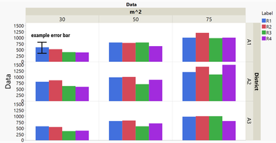
To illustrate my question I have attached a screenshot of the column chart and error bars I would like to generate.

The dataset has 4 replicates denoted R1-R4. I would like to calculate the mean of R1&2 and separately calculate the mean of R3&R4.

The resulting graph should have the same layout as the attached one except for representing the means.

I would also like to have the error of that calculated mean shown for each column.

How would I go about that? I have been trying numerous ways to stack data and plot but I can never seem to get to my desired result. Not to mentioned I have not found out yet how to actually plot the error bars on top of my columns.


I have also attached the dataset which was used to generate the figure.


Any input is appreciated!

Thanks,

censoredcactus :)

Imagefinal.png

1 ACCEPTED SOLUTION

Accepted Solutions

Re: How to graph a column chart with error bars calculated in JMP

Oh, now I can see the picture your shared.


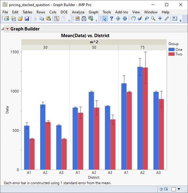
You need to create a new grouping variable that indicates if the row belongs to R1 or R2, or if it belongs to R3 or R4. Then you can use Graph Builder. Drag Data to Y and District to X. Drag m^2 to Group X. Drag Group to Overlay. Select the Bar element. Then change the error bar in the property list on the left.


area.JPG

View solution in original post

3 REPLIES 3

Re: How to graph a column chart with error bars calculated in JMP

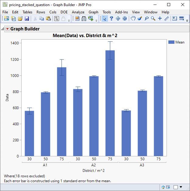
I cannot open your picture. Do you desire a bar chart like this?


area.JPG

Re: How to graph a column chart with error bars calculated in JMP

Oh, now I can see the picture your shared.


You need to create a new grouping variable that indicates if the row belongs to R1 or R2, or if it belongs to R3 or R4. Then you can use Graph Builder. Drag Data to Y and District to X. Drag m^2 to Group X. Drag Group to Overlay. Select the Bar element. Then change the error bar in the property list on the left.


area.JPG

Re: How to graph a column chart with error bars calculated in JMP

Hi Mark,

thanks for your answer. I will have a go at it. Your explanation makes sense though!


Cheers,

censoredcactus

Recommended Articles