- New to JMP? Let the Data Analysis Director guide you through selecting an analysis task, an analysis goal, and a data type. Available now in the JMP Marketplace!
- See how to install JMP Marketplace extensions to customize and enhance JMP.
- Subscribe to RSS Feed
- Mark Topic as New
- Mark Topic as Read
- Float this Topic for Current User
- Bookmark
- Subscribe
- Mute
- Printer Friendly Page
Discussions
Solve problems, and share tips and tricks with other JMP users.- JMP User Community
- :
- Discussions
- :
- Re: How to add percentile lines in probability plot?
- Mark as New
- Bookmark
- Subscribe
- Mute
- Subscribe to RSS Feed
- Get Direct Link
- Report Inappropriate Content
How to add percentile lines in probability plot?
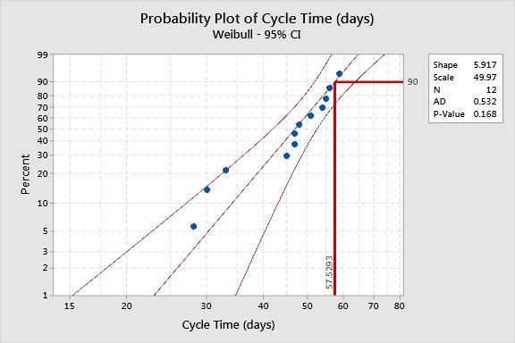
example: suppose I want to mark the 90th percentile on Y axis and link it to its corresponding value on x-axis on a probability plot.
How can this be done? Thanks
Accepted Solutions
- Mark as New
- Bookmark
- Subscribe
- Mute
- Subscribe to RSS Feed
- Get Direct Link
- Report Inappropriate Content
Re: How to add percentile lines in probability plot?
See Help > Books > Essential Graphing for more details.
You can use the Line and Annotation tools to add these graphic elements to your plot with the mouse.
Alternatively, you can right-click inside the plot frame and select Customize. You will have to add some scripting expressions. The Pen Color( "red" ), H Line( x min, x max, 90 ), V Line( quantile, y min, y max ), and Text( CounterClockwise, "quantile" ) would be all you need.
- Mark as New
- Bookmark
- Subscribe
- Mute
- Subscribe to RSS Feed
- Get Direct Link
- Report Inappropriate Content
Re: How to add percentile lines in probability plot?
The answer depends on many things. For example,
- Do you want to work interactively or use a script?
- Are you using a built-in plot (e.g., Normal Quantile Plot in Distribution) or a custom plot (e.g., Picture Box object)?
- How do you want to mark the 90th percentile? A line?
- How is the percentile determined? Is it the empirical distribution, such as used in Quantiles report from Distribution? Is it from a fitted distribution model?
- Mark as New
- Bookmark
- Subscribe
- Mute
- Subscribe to RSS Feed
- Get Direct Link
- Report Inappropriate Content
Re: How to add percentile lines in probability plot?
1. I work interactively 100%
2. Using a built in plot (e.g., Normal Quantile Plot in Distribution)
3. A line (L - shaped) going from 90th percentile on Y axis and connecting to corresponding value on X axis
4. The percentile is choosen
Please see attached JPG for reference.. thanks
- Mark as New
- Bookmark
- Subscribe
- Mute
- Subscribe to RSS Feed
- Get Direct Link
- Report Inappropriate Content
Re: How to add percentile lines in probability plot?
See Help > Books > Essential Graphing for more details.
You can use the Line and Annotation tools to add these graphic elements to your plot with the mouse.
Alternatively, you can right-click inside the plot frame and select Customize. You will have to add some scripting expressions. The Pen Color( "red" ), H Line( x min, x max, 90 ), V Line( quantile, y min, y max ), and Text( CounterClockwise, "quantile" ) would be all you need.
- Mark as New
- Bookmark
- Subscribe
- Mute
- Subscribe to RSS Feed
- Get Direct Link
- Report Inappropriate Content
Re: How to add percentile lines in probability plot?
What if you need to draw a line for each categorical value you have in the X AXIS? The customized scripting does not work that way. Additionally the bar or line drop down menu (red triangle) doesn't include an option for the summary statistic to be a quantile.
Recommended Articles
- © 2026 JMP Statistical Discovery LLC. All Rights Reserved.
- Terms of Use
- Privacy Statement
- Contact Us


