- New to JMP? Let the Data Analysis Director guide you through selecting an analysis task, an analysis goal, and a data type. Available now in the JMP Marketplace!
- See how to install JMP Marketplace extensions to customize and enhance JMP.
- Subscribe to RSS Feed
- Mark Topic as New
- Mark Topic as Read
- Float this Topic for Current User
- Bookmark
- Subscribe
- Mute
- Printer Friendly Page
Discussions
Solve problems, and share tips and tricks with other JMP users.- JMP User Community
- :
- Discussions
- :
- Re: Heatmap binning in JMP 15
- Mark as New
- Bookmark
- Subscribe
- Mute
- Subscribe to RSS Feed
- Get Direct Link
- Report Inappropriate Content
Heatmap binning in JMP 15
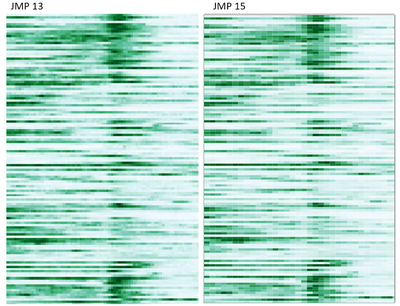
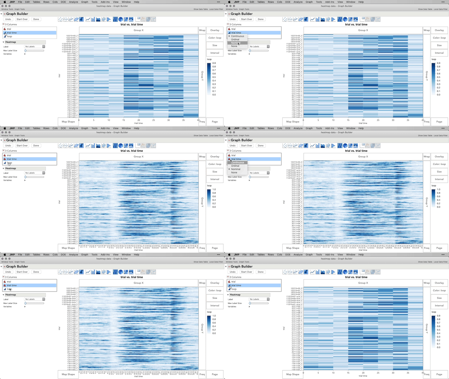
I am having an issue with heatmap binning in JMP Pro 15. My axis variable (time) is continuous and consists of 0.2s intervals. However, JMP 15 treats all increments <=1 exactly the same, plotting the heatmap with an increment of 1.
This was not a problem in JMP13....the 2 plots below are the same data, same script.
Thanks in advance for any thoughts on what's going on here.
Accepted Solutions
- Mark as New
- Bookmark
- Subscribe
- Mute
- Subscribe to RSS Feed
- Get Direct Link
- Report Inappropriate Content
Re: Heatmap binning in JMP 15
Hi @michaelh,
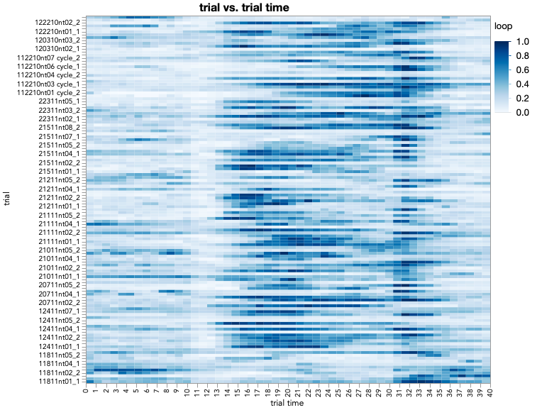
I see just what you're experiencing -- setting the axis with an Increment=0.2, and Minor Ticks=0 returns this graph for me as well:
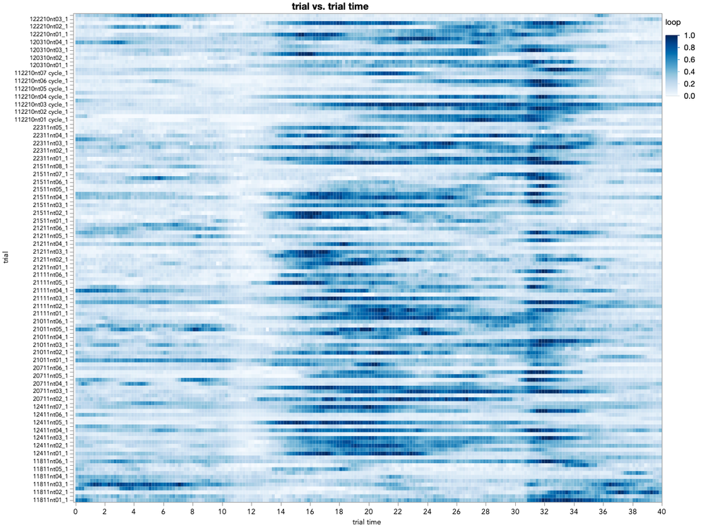
Which, as you observed, isn't an increment of 0.2, but rather of 1. I think what's happening is the JMP axis display logic, to not have labels that overlap, is clashing with your specification. We can get around this by specifying an increment that JMP can display with the labels, such as an increment of 2, but then have the number of minor ticks specified to make intervals of 0.2 -- so, that's 9 minor ticks (at 0.2,0.4,0.6,0.8,1.0,1.2,1.4,1.6,1.8). Doing that returns:
Does that work for you as a solution?
I don't recommend it, but one alternative to not have the axis display logic clash with the increment is to make the graph as big as possible, and decrease your font size until it's possible to display the labels for your increment. If you do that, nothing clashes and jmp will go ahead with an increment = 0.2 and no minor ticks.
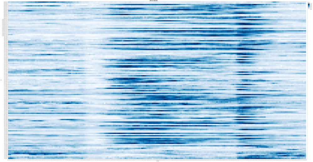
One final option, which I suggest only if you have every increment represented in the data, is to make the X axis column Nominal. That will force the display of each measured bin, with jmp packing the (now categorical) labeling the best it can:
- Mark as New
- Bookmark
- Subscribe
- Mute
- Subscribe to RSS Feed
- Get Direct Link
- Report Inappropriate Content
Re: Heatmap binning in JMP 15
Hi @michaelh,
I answered a question similar to yours in this post:
Some problem using Heatmap.
In short, JMP 15 is attempting to keep the number of bins for the Heat Map to a reasonable number when you have a continuous modeling type. If you have summarized data at predictable intervals, you could treat that variable as Nominal and JMP will plot every increment. Alternatively, as I show in the post I linked to above, you could instead go to the X Axis settings (double click the x-axis) and change the increment to match your desired level (0.2 in your case).
I hope this helps!
- Mark as New
- Bookmark
- Subscribe
- Mute
- Subscribe to RSS Feed
- Get Direct Link
- Report Inappropriate Content
Re: Heatmap binning in JMP 15
Thanks Julian... I've tried both of those. Setting the incrememt to 0.2 for some reason still produces a heatmap with a 1.0 increment in JMP 15 -- the only difference between the 2 heatmaps I posted are the JMP version. The increments and all other axis/plot setting are exactly the same. Time is defined as continuous, but changing it to ordinal has no effect.
- Mark as New
- Bookmark
- Subscribe
- Mute
- Subscribe to RSS Feed
- Get Direct Link
- Report Inappropriate Content
Re: Heatmap binning in JMP 15
Hi @michaelh
I can't seem to replicate what you are experiencing in JMP 15: when I change the X-axis increment the Heat Map updates to that new setting. Let's see if we can determine if this is something specific with your data, or if there is something specific with your install of JMP going wrong.
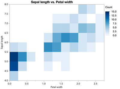
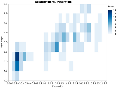
Using the Iris.jmp sample data set, we can make the following heatmap, allowing for default scaling of the bins:
Open("$SAMPLE_DATA\Iris.jmp");
Graph Builder(
	Show Control Panel( 0 ),
	Variables( X( :Petal width ), Y( :Sepal length ) ),
	Elements( Heatmap( X, Y, Legend( 7 ) ) )
);
This will return:
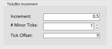
Double-clicking the X-axis, we can see the Increment and minor ticks are set such that we will get a bin on the x at every 0.25 -- the increment of 0.5 divided by 1 minor tick into 2 sections:
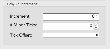
If we wanted bins at every 0.10 increment, without minor ticks, we'd use:
and that returns this for me (after I make the window a little bigger to stop the crowing on the X axis):
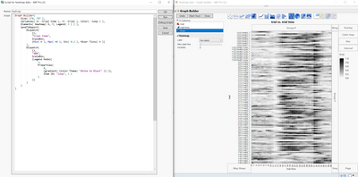
Are you able to replicate this behavior interactively? If so, there must be something with your particular data table that's preventing the Heat Map from honoring your increment changes. Are you able to share a bit of your data?
- Mark as New
- Bookmark
- Subscribe
- Mute
- Subscribe to RSS Feed
- Get Direct Link
- Report Inappropriate Content
Re: Heatmap binning in JMP 15
Thanks for sticking with this Julian...happy to share a data file. I've left a script for producing the heatmap in the table.
As you can see, the script specificies an increment of 0.2, but produces a heatmap with increment of 1. For me this problem is specific to JMP 15 Pro (works fine in JMP 13).
Also, hovering over a point in the heatmap confirms that each is an average of 5 rows.
- Mark as New
- Bookmark
- Subscribe
- Mute
- Subscribe to RSS Feed
- Get Direct Link
- Report Inappropriate Content
Re: Heatmap binning in JMP 15
Hi @michaelh,
I see just what you're experiencing -- setting the axis with an Increment=0.2, and Minor Ticks=0 returns this graph for me as well:
Which, as you observed, isn't an increment of 0.2, but rather of 1. I think what's happening is the JMP axis display logic, to not have labels that overlap, is clashing with your specification. We can get around this by specifying an increment that JMP can display with the labels, such as an increment of 2, but then have the number of minor ticks specified to make intervals of 0.2 -- so, that's 9 minor ticks (at 0.2,0.4,0.6,0.8,1.0,1.2,1.4,1.6,1.8). Doing that returns:
Does that work for you as a solution?
I don't recommend it, but one alternative to not have the axis display logic clash with the increment is to make the graph as big as possible, and decrease your font size until it's possible to display the labels for your increment. If you do that, nothing clashes and jmp will go ahead with an increment = 0.2 and no minor ticks.
One final option, which I suggest only if you have every increment represented in the data, is to make the X axis column Nominal. That will force the display of each measured bin, with jmp packing the (now categorical) labeling the best it can:
- Mark as New
- Bookmark
- Subscribe
- Mute
- Subscribe to RSS Feed
- Get Direct Link
- Report Inappropriate Content
Re: Heatmap binning in JMP 15
Thanks...Those workarounds work!
- Mark as New
- Bookmark
- Subscribe
- Mute
- Subscribe to RSS Feed
- Get Direct Link
- Report Inappropriate Content
Re: Heatmap binning in JMP 15
wish to fix this issue by a new setting in graph builder:
Heatmap: option to adjust the bin size
Recommended Articles
- © 2026 JMP Statistical Discovery LLC. All Rights Reserved.
- Terms of Use
- Privacy Statement
- Contact Us
