- New to JMP? Let the Data Analysis Director guide you through selecting an analysis task, an analysis goal, and a data type. Available now in the JMP Marketplace!
- See how to install JMP Marketplace extensions to customize and enhance JMP.
- Subscribe to RSS Feed
- Mark Topic as New
- Mark Topic as Read
- Float this Topic for Current User
- Bookmark
- Subscribe
- Mute
- Printer Friendly Page
Discussions
Solve problems, and share tips and tricks with other JMP users.- JMP User Community
- :
- Discussions
- :
- Some problem using Heatmap
- Mark as New
- Bookmark
- Subscribe
- Mute
- Subscribe to RSS Feed
- Get Direct Link
- Report Inappropriate Content
Some problem using Heatmap
With attached Wafer Stacked Samll.jmp file, I plan to show the heatmap of wafer defect with following step, but Heatmap can't show properly .
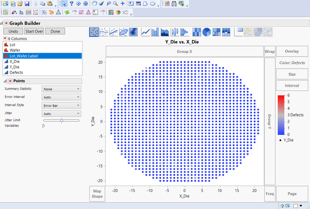
1. Showing the scatter plot, it's ok
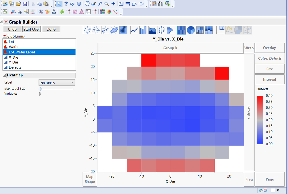
2. but when I show the Heatmap, it looks worng. It doesn't show heatmap for each die location.
Accepted Solutions
- Mark as New
- Bookmark
- Subscribe
- Mute
- Subscribe to RSS Feed
- Get Direct Link
- Report Inappropriate Content
Re: Some problem using Heatmap
Hi @Justin_Yao,
The short answer: set your X and Y variables to ordinal, or change the Increment axis setting.
The longer answer:
I can see how that's undesirable in this situation. By default, and with continuous variables, the heatmap will set the axes so that there aren't too many bins, and in most situations this is good. In this case, you do want to see each die location. You have a few options to make JMP do this, and both are worth knowing about.
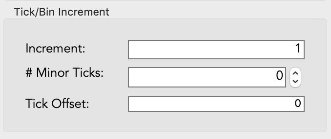
The first option is to adjust your X and Y axes to have an increment of 1 (and no minor tics). Double click each axis, and set the Increment to 1 in the bottom left section:
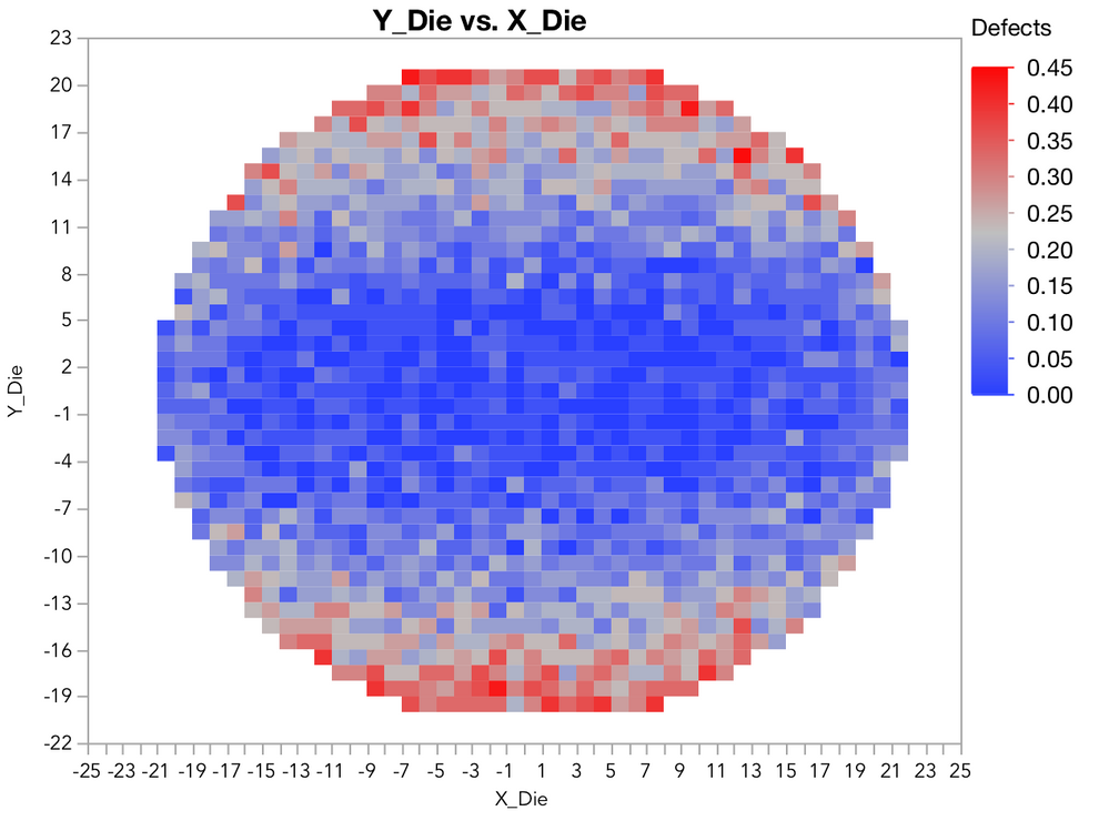
This will give you the following plot, which seems like what you want, or at least very close to it. Method 2 below is going to give you one additional benefit of displaying the die locations as their whole numbers, rather than ranges.
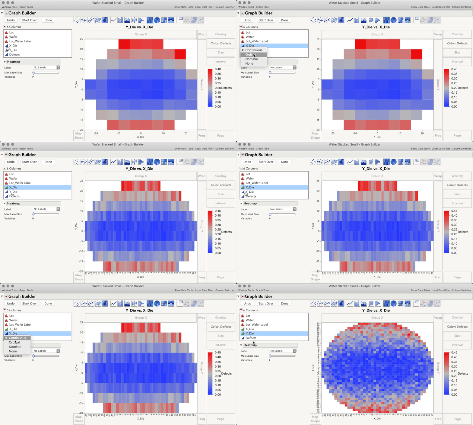
A second option is to change the modeling type of the X and Y variables to Ordinal. This will force JMP to display every level of each variable, and do so without any binning. One benefit of this is your die locations are displayed as the whole numbers they are, rather than ranges. To make this change, Right-Click the blue triangle in the variable list and change each variable to Ordinal, as below.
I hope this helps!
- Mark as New
- Bookmark
- Subscribe
- Mute
- Subscribe to RSS Feed
- Get Direct Link
- Report Inappropriate Content
Re: Some problem using Heatmap
Sure it help, thank you julian.
- Mark as New
- Bookmark
- Subscribe
- Mute
- Subscribe to RSS Feed
- Get Direct Link
- Report Inappropriate Content
Re: Some problem using Heatmap
I'm not sure of the technical reason why JMP does this, but when you switch to a heatmap it automatically bins the data. If you adjust the increment on the X and Y axes to 1 (rather than 10 and 5, which is what the default graph appears to use), then your graph will look just like the scatter plot. I will also point out that your data, colored by defects, shows little variation. If you change the gradient from linear to quantile, you will see that there is varaiation - the choice of linear vs quantile gradient is not automatic and you need to think carefully about the context before deciding which to use. But, when the defect values are clustered like this, the linear scale does not show much.
Actually, when I look at your defect data, it is predominantly zeros (92%). It might be more informative to recode the defects into a binary variable (none or some) or three values (none, one, more than one).
- Mark as New
- Bookmark
- Subscribe
- Mute
- Subscribe to RSS Feed
- Get Direct Link
- Report Inappropriate Content
Re: Some problem using Heatmap
- Mark as New
- Bookmark
- Subscribe
- Mute
- Subscribe to RSS Feed
- Get Direct Link
- Report Inappropriate Content
Re: Some problem using Heatmap
Hi @Justin_Yao,
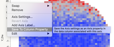
I know which video you're talking about (I am the one who recorded it), and I can see how that is confusing, my apologies! I'm not 100% sure what happened, but I believe what may have happened is that I had saved these axis settings to a column property on the table I used for recording the demo (after making changes, right-click an axis > save to column property).
In that way, when I recorded the demo and made the graph those axis settings are already set. I can see how this made for a confusing demo for users like you trying this out on their own. When I update this demo I will be sure to show the methods for changing the axis binning. Thanks for letting us know, this will help other users, too.
- Mark as New
- Bookmark
- Subscribe
- Mute
- Subscribe to RSS Feed
- Get Direct Link
- Report Inappropriate Content
Re: Some problem using Heatmap
- Mark as New
- Bookmark
- Subscribe
- Mute
- Subscribe to RSS Feed
- Get Direct Link
- Report Inappropriate Content
Re: Some problem using Heatmap
Hi @jules.
The hint with the "ordinal" setting works great :)
Unfortunately, for larger maps JMP automatically adjusts the minor grids.
So, one has to adjust the aggregation area (minor grid size) manually.
But even saving the settings as a column preference doesn't solve the problem:
ZoomOut/zoomIn will destroy all settings. Just run the code and then drag the axis to change the range to e.g. -400 ... 400 and then back to 0 ... 100.
-> All the red points will be gone :(
Is there a setting in GraphBuilder/Heatmap to forces JMP to fix the tile aggregation area to a fixed size (esp: 1x1)?
Names Default To Here(1);

nmax=100;

dt = New Table("dt",
	Add Rows(nmax * nmax),
	New Column("X", Numeric, Ordinal, Format("Best", 12), <<Set Each Value(Floor((Row()-1) / nmax))),
	New Column("Y", Numeric, Ordinal, Format("Best", 12), <<Set Each Value(Modulo((Row() - 1), nmax))),
	New Column("sparse", Numeric, Ordinal, Format("Best", 12), <<Set Each Value(If(Modulo(:X,10)+Modulo(:Y,10)==0,1,0))),

);

Graph Builder(
	Variables( X( :X ), Y( :Y ), Overlay( :sparse ), Color( :sparse ) ),
	Show Control Panel( 0 ),
	Elements( Points( X, Y, Legend( 6 ) ) ),
	SendToReport(
		Dispatch(
			{},
			"400",
			ScaleBox,
			{Legend Model(
				6,
				Properties( 0, {Marker( "Dot" )}, Item ID( "0", 1 ) ),
				Properties( 1, {Marker( "FilledSquare" )}, Item ID( "1", 1 ) )
			)}
		)
	)
);


gbHeatmap = Graph Builder(
	Size( 606, 544 ),
	Show Control Panel( 0 ),
	Graph Spacing( 4 ),
	Variables( X( :X ), Y( :Y ), Overlay( :sparse ), Color( :sparse ) ),
	Elements( Heatmap( X, Y, Legend( 7 ) ) )
);


wait(2);

gbr = Report(gbHeatmap);

gbr[Axisbox( 1 )] << {Inc( 10 ), Minor Ticks( 9 )};
gbr[Axisbox( 2 )] << {Inc( 10 ), Minor Ticks( 9 )};- Mark as New
- Bookmark
- Subscribe
- Mute
- Subscribe to RSS Feed
- Get Direct Link
- Report Inappropriate Content
Re: Some problem using Heatmap
Hi @hogi,
I know how frustrating this is! This is an instance where JMP is trying to be helpful by automatically setting your increments, but in your case you're doing so intentionally. There is an easy way to override: hold the shift key while dragging the axis to resize a graph, and JMP won't automatically change the axis increments. You can see the help docs here for more information:
- Mark as New
- Bookmark
- Subscribe
- Mute
- Subscribe to RSS Feed
- Get Direct Link
- Report Inappropriate Content
Re: Some problem using Heatmap
Oh, great :)
I will add this easteregg to out collection.
CTRL/Alt/Shift + click/select/double click/right click
Is there also a shortcut which prevents the magnifier from changing my Ticks settings?
Recommended Articles
- © 2026 JMP Statistical Discovery LLC. All Rights Reserved.
- Terms of Use
- Privacy Statement
- Contact Us
