- New to JMP? Let the Data Analysis Director guide you through selecting an analysis task, an analysis goal, and a data type. Available now in the JMP Marketplace!
- See how to install JMP Marketplace extensions to customize and enhance JMP.
- Subscribe to RSS Feed
- Mark Topic as New
- Mark Topic as Read
- Float this Topic for Current User
- Bookmark
- Subscribe
- Mute
- Printer Friendly Page
Discussions
Solve problems, and share tips and tricks with other JMP users.- JMP User Community
- :
- Discussions
- :
- Re: bug with Graph Builder? multiple response + multiple histograms
- Mark as New
- Bookmark
- Subscribe
- Mute
- Subscribe to RSS Feed
- Get Direct Link
- Report Inappropriate Content
Graph Builder: multiple response + multiple histograms
Gaph Builder can now display values with modeling type multiple response. That's very useful!
the problem:
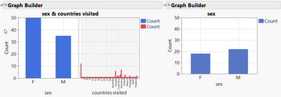
If there are multiple histogram or bar charts next to each other and one of the displayed values has modeling type multiple response, it also affects the numbers in the other plots.
In the example below, the number of visited countries affects the number of male and female students in the class. Sending Katie around the world increases the number of female students in the class.
Is there a way to display the actual number of male and female students, even if a column with modeling type multiple response is displayed in the same plot?
edit:
added a link to Tiny Traps in Jmp and JSL
dt = Open( "$SAMPLE_DATA/Big Class Families.jmp" );

NewWindow("compare",H List box(
dt << Graph Builder(
	Show Control Panel( 0 ),
	Variables(
		X( :sex ),
		X( :countries visited )
	),
	Elements( Position( 1, 1 ), Bar( X, Legend( 3 ) ) ),
	Elements( Position( 2, 1 ), Bar( X, Legend( 8 ) ) ),
	SendToReport(
		Dispatch(
			{},
			"",
			ScaleBox,
			{Min( 0 ), Max( 50 ), Inc( 10 ), Minor Ticks( 1 )}
		)
	)
);

dt << Graph Builder(
	Show Control Panel( 0 ),
	Variables( X( :sex ) ),
	Elements( Bar( X, Legend( 3 ) ) ),
	SendToReport(
		Dispatch(
			{},
			"",
			ScaleBox,
			{Min( 0 ), Max( 50 ), Inc( 10 ), Minor Ticks( 1 )}
		)
	)
)));

dt << Minimize Window();

New Window( "",
		<<Type( "Modal Dialog" ),
		Text Box("Now Let's send Katie around the world ...")
		);


dt:countries visited[1] = "1,2,3,4,5,6,7,8,9,,10,11,12,13,14,15,16,17,18,19,20,21,22,23,24,25,26,27,28,29,30"
- Mark as New
- Bookmark
- Subscribe
- Mute
- Subscribe to RSS Feed
- Get Direct Link
- Report Inappropriate Content
Re: bug with Graph Builder? multiple response + multiple histograms
Hi @hogi,
I don't think this is a bug, but rather an expected change depending on the way your data is structured and the informations you're displaying.
- In chart 1, I guess you have one row per student, but having multiple responses per student means that the chart on the left will display number of male or female responses and not number of male or female students.
- In chart 2, you're only displaying the variable "sex" of your observations, so you'll have your correct number of students.
Maybe reformatting the datatable (stacking the information about the countries) and/or adding a student "ID" column (to identify the subject answering and avoiding duplicate count of responses) could help.
In some cases, you may also have to create separate graphs.
Hope this first answer may help you.
"It is not unusual for a well-designed experiment to analyze itself" (Box, Hunter and Hunter)
- Mark as New
- Bookmark
- Subscribe
- Mute
- Subscribe to RSS Feed
- Get Direct Link
- Report Inappropriate Content
Re: bug with Graph Builder? multiple response + multiple histograms
Hi @Victor_G
it's just the standard Big Class Families data table, so yes, one row per student..
I used it because of the Columns with modeling type multiple response.
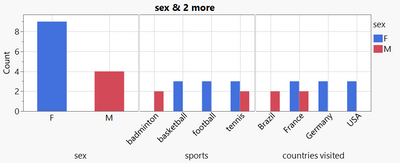
Let's take a simpler example with just 2 students in the class, one girl and one boy.
The results are quite surprising:
- 9 counts for female ?!?! - just because the single girl in the class has 3 sports activities and visited 3 countries
- the single girl counts 3x for basketball,(same also for the other sports activities) . because she visited 3 countries?!?
- the ppor boy just counts 2x, because he visited just 2 countries
Is this response really "expected" ?
I wonder who needs this complex type of plot: product of the number of the individual "responses"
Could be that there are some users who really need it like this, but I hope that there is a function to disable this mode.
Why not just count = number of students split by the categories on the respective X axis - no interference from other subplots.
dt = New Table( "test",
	Add Rows( 2 ),
	New Column( "sex",
		Character,
		"Nominal",
		Set Selected,
		Set Values( {"F", "M"} )
	),
	New Column( "sports",
		Character,
		"Multiple Response",
		Set Selected,
		Set Values( {"tennis,basketball,football", "tennis,badminton"} )
	),
	New Column( "countries visited",
		Character,
		"Multiple Response",
		Set Selected,
		Set Values( {"France,Germany,USA", "France,Brazil"} )
	)
);

dt << Graph Builder(
	Size( 813, 354 ),
	Show Control Panel( 0 ),
	Summary Statistic( "Median" ),
	Graph Spacing( 4 ),
	Variables( X( :sex ), X( :sports ), X( :countries visited ), Overlay( :sex ) ),
	Elements( Position( 1, 1 ), Bar( X, Legend( 10 ) ) ),
	Elements( Position( 2, 1 ), Bar( X, Legend( 11 ) ) ),
	Elements( Position( 3, 1 ), Bar( X, Legend( 12 ) ) )
);
- Mark as New
- Bookmark
- Subscribe
- Mute
- Subscribe to RSS Feed
- Get Direct Link
- Report Inappropriate Content
Re: bug with Graph Builder? multiple response + multiple histograms
Hi @hogi,
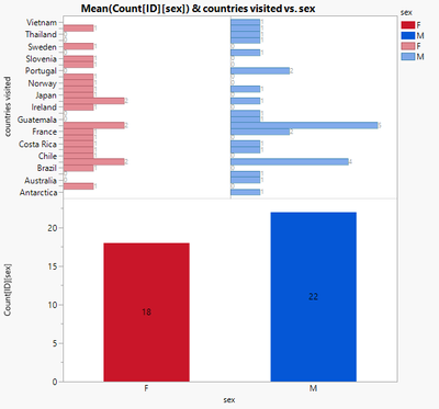
I have understood your problem, but this behaviour seems quite normal to me, regarding the data and type of graph you show : the Y axis "Count" is supposed in your example to count independently the number of responses (no matter the students) AND the number of students per sex, which are two different count informations.
I have found a workaround here (it just needs a column "Count ID by sex" to create the chart below):
And here is the script if you want to try it :
Graph Builder(
	Size( 565, 582 ),
	Show Control Panel( 0 ),
	Variables(
		X( :sex ),
		Y( :countries visited ),
		Y( :"Count[ID][sex]"n ),
		Overlay( :sex )
	),
	Elements( Position( 1, 1 ), Histogram( X, Y, Legend( 11 ), Counts( 1 ) ) ),
	Elements(
		Position( 1, 2 ),
		Bar( X, Y, Legend( 4 ), Label( "Label by Value" ) )
	),
	SendToReport(
		Dispatch(
			{},
			"400",
			ScaleBox,
			{Legend Model(
				11,
				Properties( 0, {Fill Color( 19 )}, Item ID( "F", 1 ) ),
				Properties( 1, {Fill Color( 21 )}, Item ID( "M", 1 ) )
			), Legend Model(
				4,
				Properties( 0, {Fill Color( 19 )}, Item ID( "F", 1 ) ),
				Properties( 1, {Fill Color( 21 )}, Item ID( "M", 1 ) )
			)}
		),
		Dispatch(
			{},
			"400",
			LegendBox,
			{Legend Position( {11, [2, 3], 4, [0, 1]} )}
		)
	)
);
This should solve the problem you have by showing two types of informations on the same graph.
"It is not unusual for a well-designed experiment to analyze itself" (Box, Hunter and Hunter)
- Mark as New
- Bookmark
- Subscribe
- Mute
- Subscribe to RSS Feed
- Get Direct Link
- Report Inappropriate Content
Re: bug with Graph Builder? multiple response + multiple histograms
Hi @Victor_G Unfortunately, the workaround doesn't work for my case.
I have a survey with ~10 questions and want to generate a combined histogram plot of the results.
The issue: 2 of the questions allowed multiple response.
With the current ("expected"?) behavior of Graph Builder, the "counts" of the remaining histograms are generated by
weighting the individual "counts" with the respective product of the number of responses of multiple questions 1&2.
If "expected" like this, this is not like intended :)
Unfortunately, also too many degrees to display. Therefore, it's not possible to escape the issue by adding dimensions.
I will submit a wish to add a functionality (checkbox) where the user can choose between the current way of plotting and a more "useful" one where the histograms of the subplots just show the "counts" (as expected) without interference from the other plots.
By the way: It's still hard for me to find a suitable application case for the current behavior.
Can somebody/anybody describe a case where in adjacent histograms the "counts" of one plot is weighted by the sum of products of individual number of responses of the other plots?
- Mark as New
- Bookmark
- Subscribe
- Mute
- Subscribe to RSS Feed
- Get Direct Link
- Report Inappropriate Content
Re: bug with Graph Builder? multiple response + multiple histograms
I just got the confirmation from Jmp Support that this bug will be fixed in a future release :)
TS-00034150
- Mark as New
- Bookmark
- Subscribe
- Mute
- Subscribe to RSS Feed
- Get Direct Link
- Report Inappropriate Content
Re: bug with Graph Builder? multiple response + multiple histograms
@hogi wrote:... fixed in a future release :)
in Jmp 17.2, the bug is still there,
so "future release" = Jmp 18 or later
- Mark as New
- Bookmark
- Subscribe
- Mute
- Subscribe to RSS Feed
- Get Direct Link
- Report Inappropriate Content
Re: bug with Graph Builder? multiple response + multiple histograms
Jmp 18 -> no
maybe: later
JMP 18.1 -> no
- Mark as New
- Bookmark
- Subscribe
- Mute
- Subscribe to RSS Feed
- Get Direct Link
- Report Inappropriate Content
Re: bug with Graph Builder? multiple response + multiple histograms
Hm, there is still this bug with multiple response and multiple histograms in Graph Builder.
Maybe illustrative:
Names Default to Here(1);
dt = Open( "$SAMPLE_DATA/Big Class Families.jmp" );
Graph Builder(
	Variables( X( :name ), X( :sports, Order By( :sports, Descending, Order Statistic( "N" ) ) ) ),
	Elements( Position( 1, 1 ), Bar( X, Legend( 3 ), Summary Statistic( "N" ) ) ),
	Elements( Position( 2, 1 ), Bar( X, Legend( 4 ), Summary Statistic( "N" ) ) )
);
the right plot shows how many students participate in which sports activity - and the left graphs shows the number of students with the same name:
students with the same name ?!?!
It's Robert, right?
- Mark as New
- Bookmark
- Subscribe
- Mute
- Subscribe to RSS Feed
- Get Direct Link
- Report Inappropriate Content
Re: bug with Graph Builder? multiple response + multiple histograms
Counting students with the same name is not possible via the Summary Statistics (N) in Graph Builder - due to the multiple response column on the right, there are too many "rows". This happens as soon as a multiple response column is used within the same report, on an axis, as color, size, ....
A workaround: do the counting "manually" - via a transform column:
Graph Builder(
	Transform Column( "student=1", Formula( 1 ) ),
	Transform Column(
		"Col Number@X",
		Formula( Col Number( 1, :"@Exclude"n, :"@Filter"n, :"@Graph"n, :"@Overlay"n, :"@X"n ) )
	),
	Size( 573, 393 ),
	Summary Statistic( "Median" ),
	Graph Spacing( 4 ),
	Variables(
		X( :name ),
		X( :sports, Order By( :sports, Descending, Order Statistic( "N" ) ) ),
		Y( :"Col Number@X"n ),
		Y( :"student=1"n, Position( 1 ) )
	),
	Elements( Position( 1, 1 ), Bar( X, Y( 1 ), Legend( 3 ), Summary Statistic( "Mean" ) ) ),
	Elements( Position( 2, 1 ), Bar( X, Y( 2 ), Legend( 4 ), Summary Statistic( "N" ) ) )
);
now the plot looks much better:
Up to now, it was quite complicated to generate a graph like this - one that is "interactive" like a standard Graph Builder plot:
what happens when the user drags another column onto wrap - or onto an X axis?
The new scoping option in JMP19 make Transform Columns - as comfortable as Summary Statistics (:green_heart:)
A new era of Graph Builder!
see: New in Graph Builder for JMP 19 by @XanGregg
you want to count the students by age - just drag age onto the x axis and the counting will adjust automatically to the new categories:
Recommended Articles
- © 2026 JMP Statistical Discovery LLC. All Rights Reserved.
- Terms of Use
- Privacy Statement
- Contact Us


