- New to JMP? Let the Data Analysis Director guide you through selecting an analysis task, an analysis goal, and a data type. Available now in the JMP Marketplace!
- See how to install JMP Marketplace extensions to customize and enhance JMP.
- Subscribe to RSS Feed
- Mark Topic as New
- Mark Topic as Read
- Float this Topic for Current User
- Bookmark
- Subscribe
- Mute
- Printer Friendly Page
Discussions
Solve problems, and share tips and tricks with other JMP users.- JMP User Community
- :
- Discussions
- :
- Re: Changing the names in legend of plot
- Mark as New
- Bookmark
- Subscribe
- Mute
- Subscribe to RSS Feed
- Get Direct Link
- Report Inappropriate Content
Changing the names in legend of plot
Hi
I have 6 variables: Step1=12, Step2=13, Step3=10, A=500, B=900, C=1300.
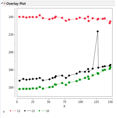
and I'm ploting col "x" vs first three variables ,that are names of columns, like below; but I want to change the name of them to variables A, B, and C in the legend of plot. (see pic). how can I do that? how can I change :Name("12") to show 500 (the value of A) instead of 12?
Thanks
t = current data table();
Overlay Plot(
X( :x ),
Y( Column( dt, Char(Step1)), Column( dt, Char(Step2)), Column( dt, Char(Step3)) ) ,
Connect Points( 1 ),
:Name("12")(Connect Color( 3), Overlay Marker Color( 3 ),
Overlay Marker( 12 ), Line Width( "Thin" )),
:Name("13")(Connect Color( 0 ), Overlay Marker Color( 0 ),
Overlay Marker( 16 ), Line Width( "Thin" )),
:Name("10")(Connect Color( 20 ), Overlay Marker Color( 20 ),
Overlay Marker( 15 ), Line Width( "Thin" )));
Accepted Solutions
- Mark as New
- Bookmark
- Subscribe
- Mute
- Subscribe to RSS Feed
- Get Direct Link
- Report Inappropriate Content
Re: Changing the names in legend of plot
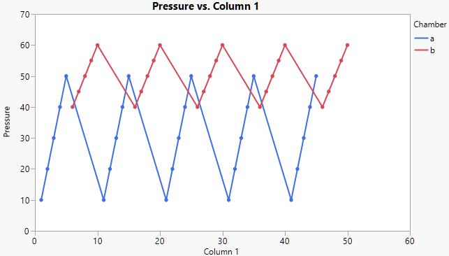
Thanks for providing the larger table. To keep the A and B lines separate, use the Overlay role. Here's a script.
Graph Builder(
	Variables( X( :Column 1 ), Y( :Pressure ), Overlay( :Chamber )),
	Elements( Points( X, Y, Legend( 7 ) ), Line( X, Y, Legend( 8 ) ) )
)- Mark as New
- Bookmark
- Subscribe
- Mute
- Subscribe to RSS Feed
- Get Direct Link
- Report Inappropriate Content
Re: Changing the names in legend of plot
I have the same Problem. Is there is no solution for the above mentioned Problem?
- Mark as New
- Bookmark
- Subscribe
- Mute
- Subscribe to RSS Feed
- Get Direct Link
- Report Inappropriate Content
Re: Changing the names in legend of plot
- Mark as New
- Bookmark
- Subscribe
- Mute
- Subscribe to RSS Feed
- Get Direct Link
- Report Inappropriate Content
Re: Changing the names in legend of plot
I am using Overplay plot because i need points with line, which I couldn't find in the Graph Builder.
This question is specific to the Overplay plot.
I want to change the legend name Chamber=a to A and Chamber=b to B. Since, I have lot of similar graphs I want to do the changes in the graph and not in the data table column names.
- Mark as New
- Bookmark
- Subscribe
- Mute
- Subscribe to RSS Feed
- Get Direct Link
- Report Inappropriate Content
Re: Changing the names in legend of plot
Overlay Plot(
	X( :Column 1 ),
	Y( :Pressure ),
	Grouping( :Chamber ),
	Overlay Groups,
	Connect Points( 1 )
);

Overlay Plot(
	X( :Column 1 ),
	Y( :Pressure ),
	Grouping(
		Transform Column(
			"Chamber_UC",
			Character,
			Nominal,
			Formula( Uppercase( :Chamber ) )
		)
	),
	Overlay Groups
);

Graph Builder(
	Size( 522, 450 ),
	Show Control Panel( 0 ),
	Graph Spacing( 10 ),
	Variables( X( :Column 1 ), Y( :Pressure ), Overlay( :Chamber ) ),
	Elements( Points( X, Y, Legend( 5 ) ), Smoother( X, Y, Legend( 6 ) ) ),
	SendToReport(
		Dispatch(
			{},
			"400",
			ScaleBox,
			{Legend Model( 6, Level Name( 0, "A" ), Level Name( 1, "B" ) )}
		)
	)
);
If you use this Script with your data table you will get three graphs:
First is your Overlay Plot as it is.
Second is an Overlay Plot with a local transformed variable created in the Overlay Plot Menu Window by right click on Chamber in the variable selection area, then using "formula", then click in the Formula Editor on "Chamber" and then "Character"->"Uppercase". This newly build (and not present in the data table) variable can be used as Group variable (may you have to change the Appearance using the red triangle options to avoid two plots.
Third is the easiest one as Xan proposed already. It is build with Graph Builder. You need to place "Column 1" on "X" and "Pressure" on "Y", then "Chamber" on "Overlay". Next you doubleclick on the legend and change the names by doubleclick on "a" and "b" in the now opened window and change it to Uppercase. In case you cannot see both lines and points you need to either drag the missing icon into the graph or hold the shift key and klick on the missing icon on top of the graph.
However, you should now get to your result, either by script or manually.
Cheers,
Martin
- Mark as New
- Bookmark
- Subscribe
- Mute
- Subscribe to RSS Feed
- Get Direct Link
- Report Inappropriate Content
Re: Changing the names in legend of plot
Hallo Martin,
Thanks for your reply. But it doesn't solve my Problem.
1 and 2 point) are basically changing the column name (which I don't want). I need to change the variable name inside the columns itself.
3) I know how to change the legends in Graph Builder.But as mentioned that I need to use Overlay Plot because I need connecting lines between the Points which is not possible in Graph Builder (as far as I know).
Can you please tell me is it possible to change the variable names inside the column using Overlay plot or JMP doesn't allow this?
Thank you.
Sibani
- Mark as New
- Bookmark
- Subscribe
- Mute
- Subscribe to RSS Feed
- Get Direct Link
- Report Inappropriate Content
Re: Changing the names in legend of plot
In principle if I know how can i use the following command (found in Scripting book)
''Labeled(Row State())=1; // labels current row
it might help me.
But I am not sure.
- Mark as New
- Bookmark
- Subscribe
- Mute
- Subscribe to RSS Feed
- Get Direct Link
- Report Inappropriate Content
Re: Changing the names in legend of plot
Hmm, this is what I've done with Graph Builder, it has lines and points. Am I missing something?
- Mark as New
- Bookmark
- Subscribe
- Mute
- Subscribe to RSS Feed
- Get Direct Link
- Report Inappropriate Content
Re: Changing the names in legend of plot
Btw, double click on the legend in Overlay Plot does also open the legend window and I can change the entries. What version of JMP are you using? This all should be available in JMP 12 and probably back to JMP 10. Not fully shure anymore if GB was introduced in JMP 9 or 10, and the overlay plot I believe was there right from the beginning or at least one version later.
- Mark as New
- Bookmark
- Subscribe
- Mute
- Subscribe to RSS Feed
- Get Direct Link
- Report Inappropriate Content
Re: Changing the names in legend of plot
I am using JMP 12. Can you please show a video in which you are able to change the legend names because in my case I can change the legend name. But as soon as I say Ok. nothing is changed.
Recommended Articles
- © 2026 JMP Statistical Discovery LLC. All Rights Reserved.
- Terms of Use
- Privacy Statement
- Contact Us


