- New to JMP? Let the Data Analysis Director guide you through selecting an analysis task, an analysis goal, and a data type. Available now in the JMP Marketplace!
- See how to install JMP Marketplace extensions to customize and enhance JMP.
- Subscribe to RSS Feed
- Mark Topic as New
- Mark Topic as Read
- Float this Topic for Current User
- Bookmark
- Subscribe
- Mute
- Printer Friendly Page
Discussions
Solve problems, and share tips and tricks with other JMP users.- JMP User Community
- :
- Discussions
- :
- Re: Can JMP show the probability of 1 result or range through a graph?
- Mark as New
- Bookmark
- Subscribe
- Mute
- Subscribe to RSS Feed
- Get Direct Link
- Report Inappropriate Content
Can JMP show the probability of 1 result or range through a graph?
Hello everyone!!!, a question:
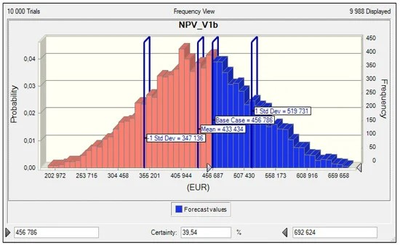
What graph in JMP can answer the probabilities of obtaining a value or range of response, for example like the following graph.
Greetings,
Marco
- Tags:
- windows
- Mark as New
- Bookmark
- Subscribe
- Mute
- Subscribe to RSS Feed
- Get Direct Link
- Report Inappropriate Content
Re: Can JMP show the probability of 1 result or range through a graph?
All the charts will have their own separate sliders. It will require some re-writing of the code, but I will take that into account when I rewrite the script (tomorrow most likely) to be closer to add-in level code which I would accept (I have my framework for writing scripts for JMP add-ins).
- Mark as New
- Bookmark
- Subscribe
- Mute
- Subscribe to RSS Feed
- Get Direct Link
- Report Inappropriate Content
Re: Can JMP show the probability of 1 result or range through a graph?
This code isn't good enough for me to turn it into an add-in (it would require at least one partial rewrite for me to consider it adequate), especially because I won't be updating it. If you wish to make it into an adding using Add-In Manager is the best option.
The script has been added as .zip file because it contains multiple files which must be in specific folders. After unpacking it
you should be able to open and run probability_calculator.jsl
- Mark as New
- Bookmark
- Subscribe
- Mute
- Subscribe to RSS Feed
- Get Direct Link
- Report Inappropriate Content
Re: Can JMP show the probability of 1 result or range through a graph?
Hello JTHI,
Excellent!!!, now it allows several columns and a nice presentation..... it deserves to be a JMP add-in......
Greetings,
Marco
- Mark as New
- Bookmark
- Subscribe
- Mute
- Subscribe to RSS Feed
- Get Direct Link
- Report Inappropriate Content
Re: Can JMP show the probability of 1 result or range through a graph?
- Mark as New
- Bookmark
- Subscribe
- Mute
- Subscribe to RSS Feed
- Get Direct Link
- Report Inappropriate Content
Re: Can JMP show the probability of 1 result or range through a graph?
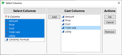
I'm sure I got lost, I can't repeat your example of 2 or more columns with the Certainty Formula.jmp table (table attached)
- Mark as New
- Bookmark
- Subscribe
- Mute
- Subscribe to RSS Feed
- Get Direct Link
- Report Inappropriate Content
Re: Can JMP show the probability of 1 result or range through a graph?
I'm sure I got lost, I can't repeat your example of 2 or more columns with the Certainty Formula.jmp table (table & script attached)
- Mark as New
- Bookmark
- Subscribe
- Mute
- Subscribe to RSS Feed
- Get Direct Link
- Report Inappropriate Content
Re: Can JMP show the probability of 1 result or range through a graph?
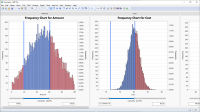
It's just to check if this is the right way. Is this what you want?
- Mark as New
- Bookmark
- Subscribe
- Mute
- Subscribe to RSS Feed
- Get Direct Link
- Report Inappropriate Content
Re: Can JMP show the probability of 1 result or range through a graph?
Yes, that is what I am referring to and that you can enter the minimum and maximum values in the graph to obtain certainty.
- Mark as New
- Bookmark
- Subscribe
- Mute
- Subscribe to RSS Feed
- Get Direct Link
- Report Inappropriate Content
Re: Can JMP show the probability of 1 result or range through a graph?
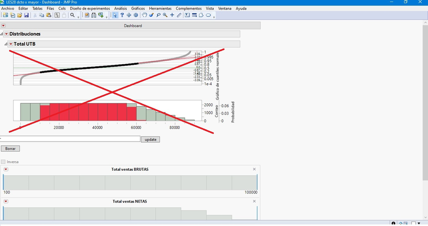
Each filter in each column, for example the Cost column and the Total Sale column, could show its certainty in its own bar chart......, then the normal quantile chart and the value chart would no longer be necessary. bars located below the normal quantile graph, example:
It should look like this:
- Mark as New
- Bookmark
- Subscribe
- Mute
- Subscribe to RSS Feed
- Get Direct Link
- Report Inappropriate Content
Re: Can JMP show the probability of 1 result or range through a graph?
Interesting.
So the most simple version - just a set of graphs with their own results - no "intersection" of the selection. (?)
I wonder what's the application case ...
sounds like:
- first graph: let's restrict the invest -
In how many of the simulated cases did we spend between 5 and 500 $? -> 20% - second graph: In how many cases do we earn 5 Mio $ -> 20 %
-> analysis finished. Positive findings :)
Recommended Articles
- © 2026 JMP Statistical Discovery LLC. All Rights Reserved.
- Terms of Use
- Privacy Statement
- Contact Us


