- JMP will suspend normal business operations for our Winter Holiday beginning on Wednesday, Dec. 24, 2025, at 5:00 p.m. ET (2:00 p.m. ET for JMP Accounts Receivable).
Regular business hours will resume at 9:00 a.m. EST on Friday, Jan. 2, 2026. - We’re retiring the File Exchange at the end of this year. The JMP Marketplace is now your destination for add-ins and extensions.
- Subscribe to RSS Feed
- Mark Topic as New
- Mark Topic as Read
- Float this Topic for Current User
- Bookmark
- Subscribe
- Mute
- Printer Friendly Page
Discussions
Solve problems, and share tips and tricks with other JMP users.- JMP User Community
- :
- Discussions
- :
- Re: Anyone know how to create divergent bar chart for Likert scale data?
- Mark as New
- Bookmark
- Subscribe
- Mute
- Subscribe to RSS Feed
- Get Direct Link
- Report Inappropriate Content
Anyone know how to create divergent bar chart for Likert scale data?
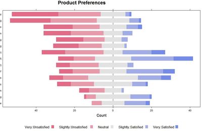
I would like to use JMP to create a divergent bar chart from Likert scale data (e.g., extremely dislike, strongly dislike, ... extremely like). I learned how to create such charts in R (see image below), but would much rather do it in JMP. I've seen examples in Tableau, but that's a real nightmare to create what I want there. I can figure out how to do it in JMP using negative and positive counts if I don't include the "neutral" data. I've tried splitting the neutral into 2 categories ("don't dislike" and "don't like", or some such pseudo-terminology.
Any suggestions? I have a reasonable degree of scripting skills in JMP, so that's certainly a possiblity.
Thanks!
Accepted Solutions
- Mark as New
- Bookmark
- Subscribe
- Mute
- Subscribe to RSS Feed
- Get Direct Link
- Report Inappropriate Content
Re: Anyone know how to create divergent bar chart for Likert scale data?
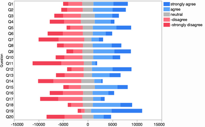
Using negative counts for the disagreeing responses and half the neutrals works OK.
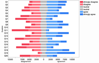
Another method just occurred to me that avoids the negative scale values: combine two graphs back-to-back, one with the agreeing items and another with the disagreeing items but reverse the scale of the latter:
After splitting the neutral responses in half, I made a graph with two X axes. One axis had the 3 disagreeing responses and one had the 3 agreeing responses. I also made the graph spacing equal to 0 to remove the middle seam. Full script:
Graph Builder(
  Size( 532, 454 ),
  Show Control Panel( 0 ),
  Graph Spacing( 0 ),
  Variables(
  X( :strongly disagree ),
  X( :disagree, Position( 1 ) ),
  X( :neutral, Position( 1 ) ),
  X( :agree ),
  X( :strongly agree, Position( 2 ) ),
  X( :neutral, Position( 2 ) ),
  Y( :Question )
  ),
  Elements(
  Position( 1, 1 ),
  Bar( X( 3 ), X( 2 ), X( 1 ), Y, Legend( 6 ), Bar Style( "Stacked" ) )
  ),
  Elements(
  Position( 2, 1 ),
  Bar( X( 3 ), X( 1 ), X( 2 ), Y, Legend( 7 ), Bar Style( "Stacked" ) )
  ),
  SendToReport(
  Dispatch( {}, "strongly disagree", ScaleBox, {Reversed Scale} ),
  Dispatch( {}, "Question", ScaleBox, {Reversed Scale} ),
  Dispatch(
  {},
  "400",
  ScaleBox,
  {Legend Model(
  6,
  Properties( 0, {Fill Color( 32 )} ),
  Properties( 1, {Fill Color( 35 )} ),
  Properties( 2, {Fill Color( 3 )} )
  ), Legend Model(
  7,
  Base( 0, 0, 0 ),
  Properties( 0, {Fill Color( 32 )} ),
  Properties( 1, {Fill Color( 37 )} ),
  Properties( 2, {Fill Color( 5 )} )
  )}
  ),
  Dispatch( {}, "400", LegendBox, {Position( {2, 1, 0, 3, 4, 5} )} ),
  Dispatch( {}, "X title", TextEditBox, {Set Text( "disagreement" )} ),
  Dispatch( {}, "X 1 title", TextEditBox, {Set Text( "agreement" )} )
  )
)
- Mark as New
- Bookmark
- Subscribe
- Mute
- Subscribe to RSS Feed
- Get Direct Link
- Report Inappropriate Content
Re: Anyone know how to create divergent bar chart for Likert scale data?
I can think of a few round-about ways but nothing straightforward. Did your split-neutral idea not work or was it too round-about?
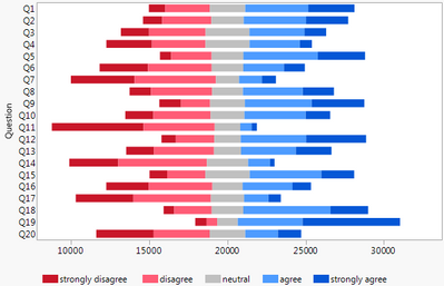
Another technique if you don't need the 0-centered count axis is to put 0 on the left and add an invisible (transparency = 0) dummy level on the left.With each answer count in a separate column, I computed the dummy value as "middle - strongly disagree - agree - neutral/2". I then stacked the answer columns, mainly so I could assign a Value Color property to whole group. I hid the dummy level from the legend in the Legend Settings dialog. Final table with script attached.
- Mark as New
- Bookmark
- Subscribe
- Mute
- Subscribe to RSS Feed
- Get Direct Link
- Report Inappropriate Content
Re: Anyone know how to create divergent bar chart for Likert scale data?
I like this solution. Too bad JMP won't let me have a split x-axis at 0 to do counts in both directions. I had hoped it would allow negative numbers for stacked bars, but it won't do that either. I had found a solution in Excel that would allow that. I was able to adapt your script to my data and I just removed the labels on the x-axis.
- Mark as New
- Bookmark
- Subscribe
- Mute
- Subscribe to RSS Feed
- Get Direct Link
- Report Inappropriate Content
Re: Anyone know how to create divergent bar chart for Likert scale data?
I changed the names of the options in the likert scale and the script is sorting them in alphabetical order. How can I prevent this?
- Mark as New
- Bookmark
- Subscribe
- Mute
- Subscribe to RSS Feed
- Get Direct Link
- Report Inappropriate Content
Re: Anyone know how to create divergent bar chart for Likert scale data?
You can impose the order you want by adding the Value Order column property.
- Mark as New
- Bookmark
- Subscribe
- Mute
- Subscribe to RSS Feed
- Get Direct Link
- Report Inappropriate Content
Re: Anyone know how to create divergent bar chart for Likert scale data?
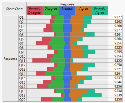
'Aligned Responses' in the Categorical platform might also be helpful. It will produce a Share Chart that is centered on the middle response value(s). You can find it under the 'Related' tab after Analyze -> Consumer Research -> Categorical. The attached file includes an example script; the screenshot below shows the results.
- Mark as New
- Bookmark
- Subscribe
- Mute
- Subscribe to RSS Feed
- Get Direct Link
- Report Inappropriate Content
Re: Anyone know how to create divergent bar chart for Likert scale data?
I've never seen a Share Chart before! I'm going to investigate this further. I see it needs a different format. Is there a way to assign colors or get a numerical "x-axis" somewhere to show counts in both directions (agree and disagree). Thanks for that solution!
- Mark as New
- Bookmark
- Subscribe
- Mute
- Subscribe to RSS Feed
- Get Direct Link
- Report Inappropriate Content
Re: Anyone know how to create divergent bar chart for Likert scale data?
Glad to help. You can set the value colors in Column Properties (Right click on a column name, then Column Properties -> Value Colors). If you are working with many columns that step can be scripted or, once the colors are set for the first column, you can copy and paste its column properties to the other columns.
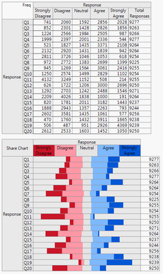
It's not possible to add the counts directly to the Share Chart, but if you change 'Frequencies (0)' to 'Frequencies (1)' in my previous script the counts will display just above the Share Chart. You can also add the counts after the results are produced by selecting the 'Frequencies' item in the red triangle menu. The screenshot below shows the results. You could extend this by using Supercategories to group the responses into something like "Any disagree response", "Neutral", and "Any agree response". Doing so will add the grouped counts to the frequency table.
- Mark as New
- Bookmark
- Subscribe
- Mute
- Subscribe to RSS Feed
- Get Direct Link
- Report Inappropriate Content
Re: Anyone know how to create divergent bar chart for Likert scale data?
Using negative counts for the disagreeing responses and half the neutrals works OK.
Another method just occurred to me that avoids the negative scale values: combine two graphs back-to-back, one with the agreeing items and another with the disagreeing items but reverse the scale of the latter:
After splitting the neutral responses in half, I made a graph with two X axes. One axis had the 3 disagreeing responses and one had the 3 agreeing responses. I also made the graph spacing equal to 0 to remove the middle seam. Full script:
Graph Builder(
  Size( 532, 454 ),
  Show Control Panel( 0 ),
  Graph Spacing( 0 ),
  Variables(
  X( :strongly disagree ),
  X( :disagree, Position( 1 ) ),
  X( :neutral, Position( 1 ) ),
  X( :agree ),
  X( :strongly agree, Position( 2 ) ),
  X( :neutral, Position( 2 ) ),
  Y( :Question )
  ),
  Elements(
  Position( 1, 1 ),
  Bar( X( 3 ), X( 2 ), X( 1 ), Y, Legend( 6 ), Bar Style( "Stacked" ) )
  ),
  Elements(
  Position( 2, 1 ),
  Bar( X( 3 ), X( 1 ), X( 2 ), Y, Legend( 7 ), Bar Style( "Stacked" ) )
  ),
  SendToReport(
  Dispatch( {}, "strongly disagree", ScaleBox, {Reversed Scale} ),
  Dispatch( {}, "Question", ScaleBox, {Reversed Scale} ),
  Dispatch(
  {},
  "400",
  ScaleBox,
  {Legend Model(
  6,
  Properties( 0, {Fill Color( 32 )} ),
  Properties( 1, {Fill Color( 35 )} ),
  Properties( 2, {Fill Color( 3 )} )
  ), Legend Model(
  7,
  Base( 0, 0, 0 ),
  Properties( 0, {Fill Color( 32 )} ),
  Properties( 1, {Fill Color( 37 )} ),
  Properties( 2, {Fill Color( 5 )} )
  )}
  ),
  Dispatch( {}, "400", LegendBox, {Position( {2, 1, 0, 3, 4, 5} )} ),
  Dispatch( {}, "X title", TextEditBox, {Set Text( "disagreement" )} ),
  Dispatch( {}, "X 1 title", TextEditBox, {Set Text( "agreement" )} )
  )
)
- Mark as New
- Bookmark
- Subscribe
- Mute
- Subscribe to RSS Feed
- Get Direct Link
- Report Inappropriate Content
Re: Anyone know how to create divergent bar chart for Likert scale data?
I have been using your original solution with the buffered region, but now this one allows me to include counts and so fits the bill perfectly! Plus, it looks most like my original R output. Great job! Thank you much!
Recommended Articles
- © 2026 JMP Statistical Discovery LLC. All Rights Reserved.
- Terms of Use
- Privacy Statement
- Contact Us
