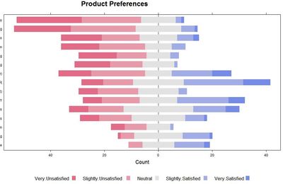
I would like to use JMP to create a divergent bar chart from Likert scale data (e.g., extremely dislike, strongly dislike, ... extremely like). I learned how to create such charts in R (see image below), but would much rather do it in JMP. I've seen examples in Tableau, but that's a real nightmare to create what I want there. I can figure out how to do it in JMP using negative and positive counts if I don't include the "neutral" data. I've tried splitting the neutral into 2 categories ("don't dislike" and "don't like", or some such pseudo-terminology.
Any suggestions? I have a reasonable degree of scripting skills in JMP, so that's certainly a possiblity.
Thanks!
