- New to JMP? Let the Data Analysis Director guide you through selecting an analysis task, an analysis goal, and a data type. Available now in the JMP Marketplace!
- See how to install JMP Marketplace extensions to customize and enhance JMP.
- Subscribe to RSS Feed
- Mark as New
- Mark as Read
- Bookmark
- Subscribe
- Printer Friendly Page
- Report Inappropriate Content
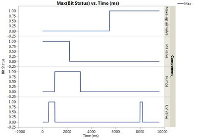
A timing chart is something process and system engineers use to visually see how the various components (actuators, solenoids, power relays, etc.) of a process are sequenced for a process cycle. In the past, I've always seen these done manually (there is a Youtube video of one being made in Excel by sizing cells and creating borders). I recently looked for an Excel template that would make a living timing diagram that would update if you changed the timing values. I couldn't find one, so I made one with JSL.
I'm sure it can be streamlined, but it works. It assumes the process is measured in seconds and breaks it into 10 ms intervals.
The data table is simply a list of the controlled components and the times that they are ON. The same component can be listed multiple times if it makes multiple appearances during the cycle. The script builds chartable data and Graph Builder does the rest.
jh
Recommended Articles
- © 2026 JMP Statistical Discovery LLC. All Rights Reserved.
- Terms of Use
- Privacy Statement
- Contact Us

