- New to JMP? Let the Data Analysis Director guide you through selecting an analysis task, an analysis goal, and a data type. Available now in the JMP Marketplace!
- See how to install JMP Marketplace extensions to customize and enhance JMP.
JMP Blog
A blog for anyone curious about data visualization, design of experiments, statistics, predictive modeling, and more- JMP User Community
- :
- Blogs
- :
- JMP Blog
- :
- Use JMP to find patterns (and anomalies) in data
- Subscribe to RSS Feed
- Mark as New
- Mark as Read
- Bookmark
- Subscribe
- Printer Friendly Page
- Report Inappropriate Content
Earlier this year, my manager sent me a very interesting post from Data Colada, a blog post written by three behavioral scientists that examines published research. The authors of Data Colada worked with a team of anonymous researchers and found some curious anomalies in a car mileage data set that was used in a 2012 paper. I am responsible for testing the Explore Patterns platform in JMP, which can be used to identify unusual or unexpected patterns in data. In this post, I use Explore Patterns, along with other useful tools in JMP, to search for unexpected or unusual patterns in the car mileage data.
Background
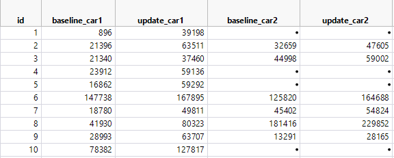
The first few rows and columns of the car mileage data set are shown below. These data were collected from a study in which 13,488 customers of a particular auto insurance agency were asked to report their current odometer readings. The readings reported by the customers are included in the data as the update_car1 to update_car4 columns, as each customer reported information for up to four cars. The data also contain the odometer readings for each vehicle when the insurance policies were first issued. These columns are named baseline_car1 to baseline_car4. Since all policies were not issued at the same time, the time elapsed from the baseline to the update varies for the observations in this study.
In the Data Colada post, the researchers presented four anomalies that were found in this data set. Let’s dig into each of these findings using JMP.
Anomaly #1: The distribution of the miles driven is uniform
The authors at Data Colada found that the distribution of miles driven was consistent with a uniform distribution ranging from 0 to 50,000 miles.
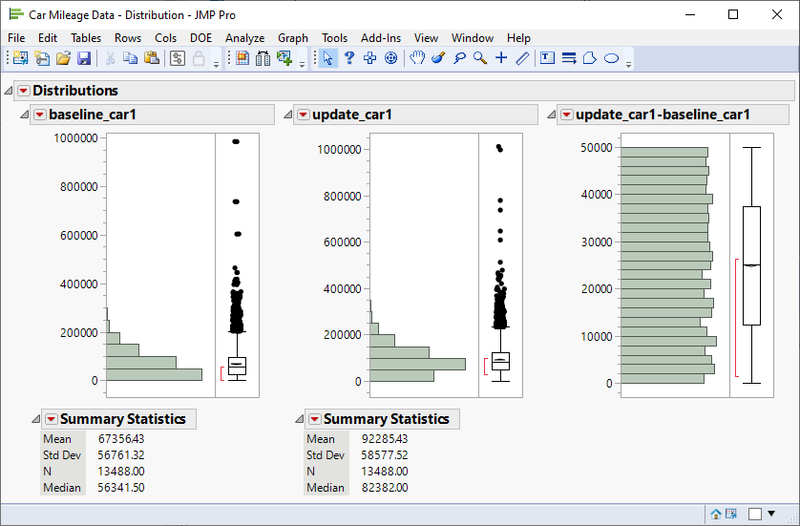
Since the data include a baseline and update column for each car's odometer readings, we create formula columns to store the miles driven by subtracting the baseline values from the updated values. In JMP, we then use the Distribution platform to view the distribution for the baseline and updates values, as well as the total miles driven for each car. Consider the Distribution report of the first car for each customer.
The shape of the distribution of baseline mileage is similar to the distribution of the updated mileage, with the median odometer reading about 26,000 miles higher at the update time. This finding is not by itself surprising. What I find most interesting about the baseline and update readings is that two participants owned vehicles that have been driven nearly 1 million miles! They must have very good mechanics.
The most alarming part of the report is the third Distribution above, showing the difference between the first two. The distribution of miles driven between the baseline and update times appears to be uniformly distributed between 0 and 50,000 miles. There are no values above 50,000 miles, and each bin of the histogram contains approximately the same number of participants. Visual inspection gives solid evidence in this case that the data are uniformly distributed. However, for data that are not as obvious, you could perform a goodness-of-fit test using the Fit Beta option in the Distribution platform.
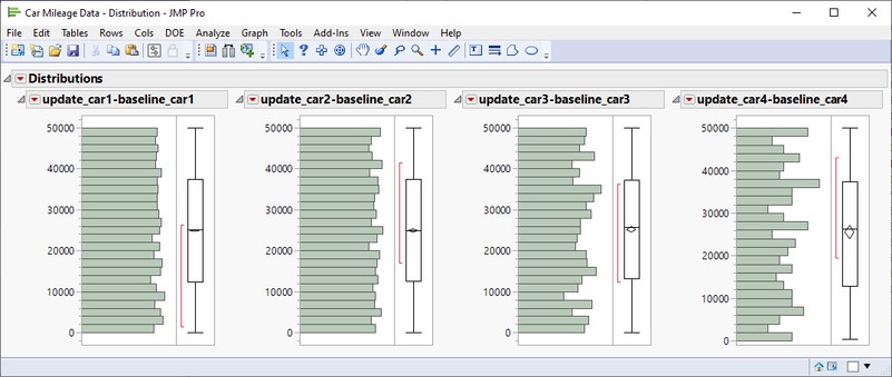
The screenshot below shows the distribution of miles driven (update – baseline) for each of the participants’ cars. We find that each distribution appears uniformly distributed between 0 and 50,000 for the second, third, and fourth cars as well. Based on this distribution pattern, we can conclude that the updated mileage values could have been generated by adding uniformly distributed random values to the baseline mileage values.
Anomaly #2: Baseline mileage used rounding, and updated mileages did not
The authors at Data Colada found that the baseline mileage had many values rounded to the nearest thousand while the updated mileage did not contain this rounding.
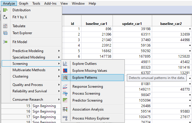
The researchers at Data Colada investigated rounding by looking at the last three digits of the mileages. We could use JSL to take a similar approach, but instead let’s use Explore Patterns! If you’ve never used Explore Patterns before, you can find it by selecting Analyze > Screening.
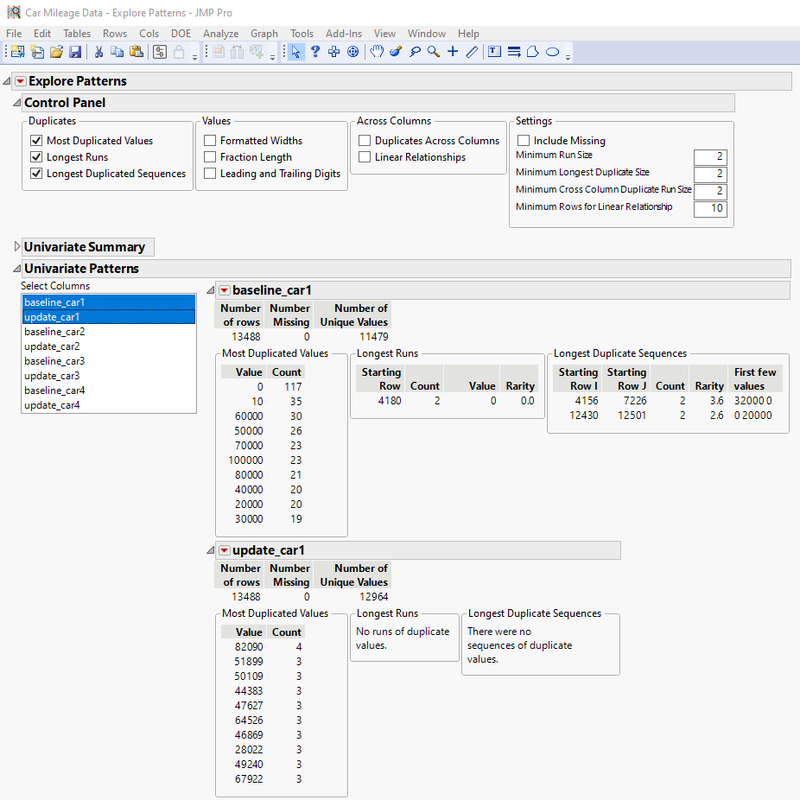
After we launch Explore Patterns to explore each baseline and update column, we get the output seen in the following screenshot. In the Univariate Patterns report, select the baseline and update values for the first car to compare the patterns.
By default, Explore Patterns includes the reports for the most duplicated values in each column, the longest runs in each column, and the longest duplicate sequences in each column. For the first car owned by participants, there is not much to be gained from the Longest Runs or Longest Duplicate Sequences reports. However, the Most Duplicated Values report shows an interesting contrast. In the baseline mileages for the first owned car, there are many values that appear to be rounded to the nearest 10,000. This is not necessarily an unexpected pattern to find; when I’m asked the mileage of my vehicle, I always round when answering.
The Most Duplicated Values report for the updated mileages is quite different. In this report, there are far fewer duplicates, and the duplicates that appear are not rounded like the baseline values. This is what would happen if the update columns were generated by adding uniformly distributed random values to the baseline values. Therefore, this finding is consistent with Anomaly #1.
Anomaly #3 – Data were entered in two fonts, and each observation has a ‘twin’ in the other font
The researchers noticed that in the original data file, the observations were recorded using two different fonts. Through some clever sorting, the researchers found that each baseline observation in one font corresponded to a very similar row in the other font.
I applaud the researchers for noticing the different fonts and taking this approach. However, let’s suppose the data were all in the same font and this red flag wasn’t raised. Can we use JMP to identify any curious relationships between rows and columns? Of course we can – this is the JMP Blog after all.
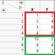
We can use Explore Patterns to investigate if there any linear relationships between columns for contiguous rows. Consider the following simple example. In the first four rows, the columns have an exact linear relationship where Y=2*X. In the next three rows, the two columns again have an exact linear relationship where Y=0.5*X.
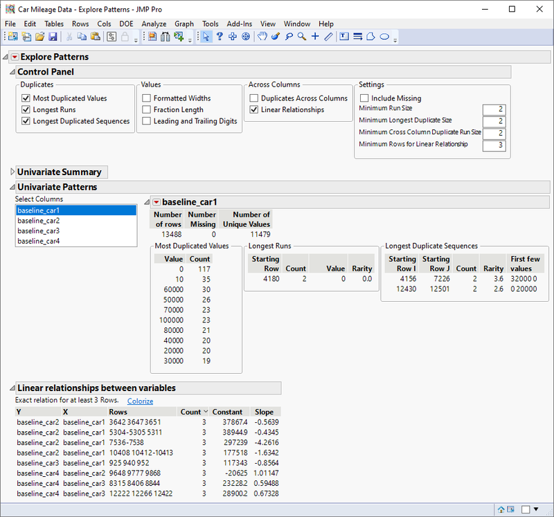
We can use Explore Patterns to search for linear relationships like this between the baseline columns. If we had not already noticed Anomaly #1, it would make sense to look for linear relationships in the updated columns, too.
If there were many exact linear relationships, or perhaps large runs of linear relationships, it may be a sign that the values in one column were generated using a multiple of another column. Here, there are only a few rows for which the baseline columns have an exact linear relationship. We could use the Colorize option to view these cells and inspect for any irregularities, but for a data set this size with many rounded values, it’s not surprising to find a few linear relationships.
Using Explore Patterns, we’ve investigated whether there are any suspicious linear relationships between rows for two columns for the baseline values. However, the results were not very useful. Now, let’s also look for linear relationships between columns among two rows, again for the baseline values. To do this, we will need to use Explore Patterns on the transpose of our data.
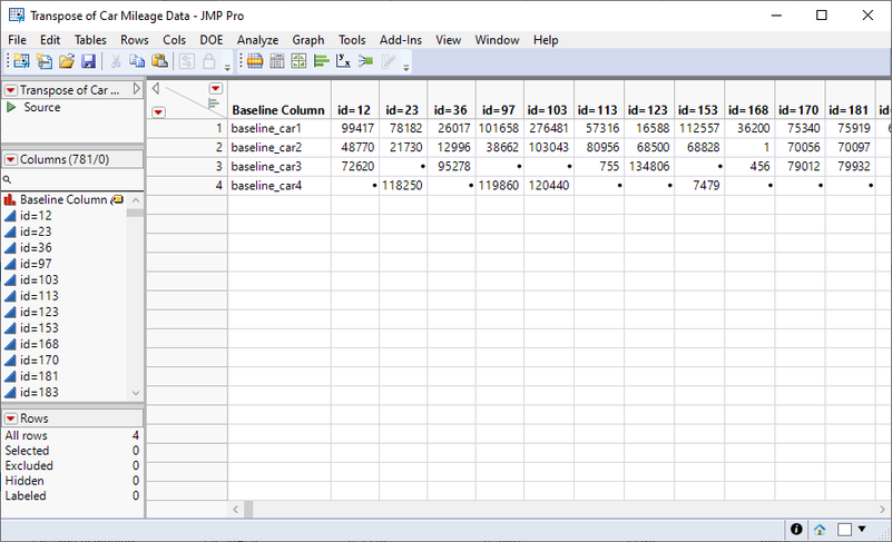
I used the Transpose option in JMP to transpose the data by the baseline columns, for participants that reported mileage for at least three vehicles. I excluded rows where participants had two or fewer cars as these would not help identify linear relationships.
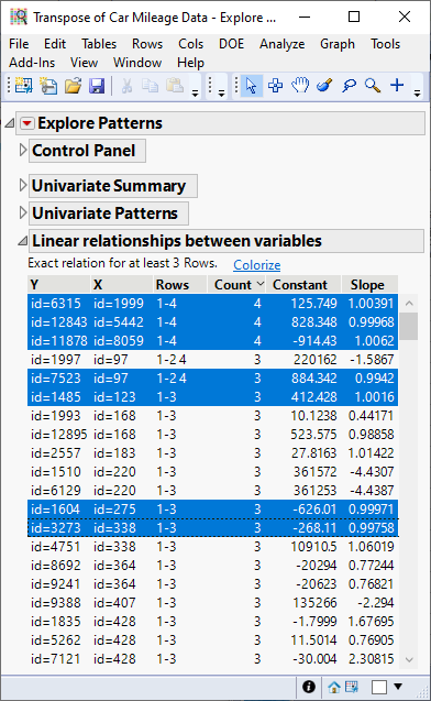
In the Explore Patterns report for this transposed data, there are many exact linear relationships where the slope is approximately one. Thus, there are many rows in the original data table that have a near twin row of baseline values across the cars. (Hint: You can right-click the Slope column and use the Select Where feature to highlight all rows where the slope is close to one. There are 69 pairs where the Slope is between 0.99 and 1.01).
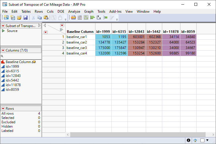
You can select Colorize above the table of linear relationships to colorize all values in an exact linear relationship, or you can right-click the Y column to colorize specific values. The table below contains the colorized values for the first three rows of the Linear Relationships report.
Explore Patterns has identified several pairs of ‘driving twins’ where the baseline mileage values were very similar across all cars, having an exact linear relationship. We could follow up on this by looking for more pairs that do not have exact linear relationship but are still very closely related. As illustrated in the Data Colada post, once you sort by the baseline value for the fourth car, it is easy to identify many driving twins.
Anomaly #4 – One font has many rounded baseline values, and the other does not
The researchers found that the baseline values in Calibri font were rounded, and the values in Cambria font were not rounded.
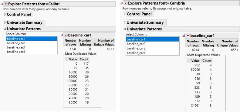
Now, suppose we knew that some rows were written in one font and the other rows were written in a second font, and that we have a column in our data with the font for each row. We may use Explore Patterns with the font name as a By column.
As seen in the Explore Patterns reports, the baseline mileage values for the rows in Calibri font have many rounded values, while the baseline values for the Cambria rows are not rounded. Since we would expect customer reported mileages to be rounded, this suggests that the original reported values were the rows with Calibri font and the “driving twin” data was created and then entered in the Cambria font.
Conclusion
Whenever you acquire a new data set, you likely do some exploratory analysis and data cleaning. Perhaps you search for outliers, check the data for missing values, or view the distribution of each variable. I hope this post has encouraged you to consider using Explore Patterns to check for unusual patterns in your data. Not all patterns you find using Explore Patterns are evidence that anything is wrong or concerning, but the utility provides you with a tool to find patterns that warrant further investigation.
You must be a registered user to add a comment. If you've already registered, sign in. Otherwise, register and sign in.
- © 2026 JMP Statistical Discovery LLC. All Rights Reserved.
- Terms of Use
- Privacy Statement
- Contact Us

