cancel
Showing results for 
Show  only  | Search instead for 
Did you mean: 
Browse apps to extend the software in the new JMP Marketplace
Choose Language Hide Translation Bar
XanGregg
Staff
Parallel coordinates in JMP

The biggest addition to Graph Builder in JMP 13 is a new element for parallel coordinates plots. JMP has long supported parallel coordinates plots as a separate platform, and integration into Graph Builder both expands the functionality and leverages core Graph Builder features like legends and grouping.
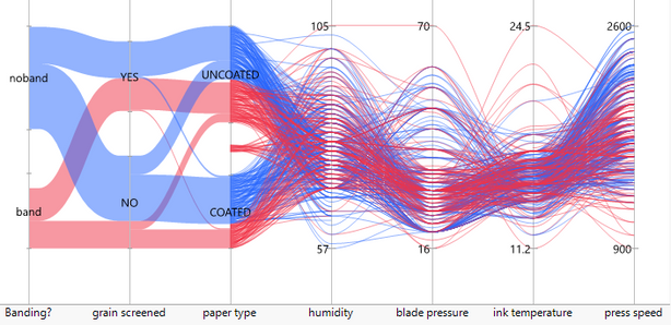
Categorical and continuous variables graphed with parallel coordinatesCategorical and continuous variables graphed with parallel coordinates

What is a parallel coordinates plot?

A parallel coordinates plot is an efficient way to visualize high dimensional data; however, it’s one of those chart types that requires a little explanation. For me, the first step in understanding parallel coordinates is to characterize “normal” graphs as using perpendicular coordinates. For comparison, here is the same two-variable data set shown using perpendicular coordinates and parallel coordinates.
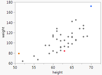
 

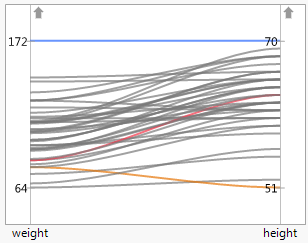
 Perpendicular weight and heightPerpendicular weight and height    Parallel weight and heightParallel weight and height

In perpendicular coordinates, each observation is represented by a point at a two-dimensional location; in parallel coordinates, each observation is represented by a line connecting two (or more) one-dimensional locations. I colored three observations in the above plots to help show the correspondence. The orange observation, for instance, is at weight=80 and height=51 in both graphs. For only two variables, perpendicular coordinates are far better, but this simple example helps to illustrate how the variables are encoded in the chart.

Parallel coordinates can be extended to any number of dimensions since all the dimensions are parallel to one another. For perpendicular coordinates, even three dimensions is pushing it on a flat surface. For more dimensions we can start adding color, size and trellising, but each of those loses some efficiency over pure positional representation, and we eventually run out of visual dimensions anyway.

Here’s a GIF showing the creation of a parallel view of the Fisher iris data set showing four continuous dimensions plus color. All the continuous dimensions participate equally. Order is important for seeing patterns, so interactions include the ability to directly rearrange and flip individual axes.
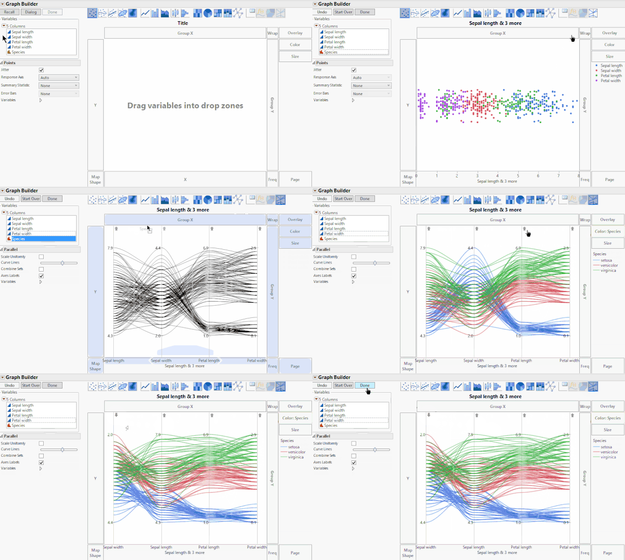
 

Creating a parallel coordinates graph in Graph BuilderCreating a parallel coordinates graph in Graph BuilderParallel coordinates can be useful for getting a quick view of an entire data set, but the more common use is in visualizing clusters, such as the iris species above. When the clustering has been computed by an algorithm, a parallel coordinate view can be a useful diagnostic.


Categorical variables

Categorical variables can be mixed with continuous variables, as shown in the first image of this post. When two categorical variables are next to each other, they are connected with a band whose width is proportional to the number of items. With some data sets, you can use this feature to get a Sankey-type chart.
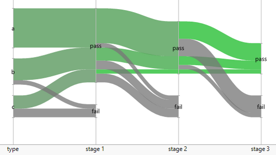
 

Using parallel coordinates to visualize a flowUsing parallel coordinates to visualize a flow

I hope you will give parallel coordinates a try in JMP 13, and let me know what you think. Want to try JMP? Download the free trial.

Last Modified: Sep 12, 2017 10:10 AM
Comments
arati_mejdal
Level XI

Great examples, @XanGregg!

teebahnson
Level III

beautiful figures and very nicely demonstrated with the GIF.  These types of figures take a lot of time and effort to program using other software packages and it's so nice to see this functionality added in JMP.  thanks! 

hellind
Level II

It is nice to know JMP have added this feature to be competitive with other software.

But I have a question on visualisation, how do you interpret the last graph? Seems like putting a percentage number on how many type-a patients pass different stages is more meaningful. Can't seems to see any patterns in the graph other than more failures at later stage and type-c.

XanGregg
Staff
Thanks for the comment and question. Maybe I should have planted a stronger pattern in the last graphic to make its case better. As a visual (without the numbers) it lets you see any really unusual changes in sizes or colors, which will be more meaningful if you're comparing lots of similar such charts. And because the groups split as you go across, you can follow groups as they "flow" through the stages. Group "a" fails very little in stage 1 or stage 2, but fails at a high rate in stage 3. Group "c" has a lot of failures in stages 1 and 2 but none in stage 3.


yvesa_roy
Level II
Very nice graphs. I already use parallel plots through the Mutlivariate platform, in order to find specific profiles between items in psychometric scales. But I really don't know how to obtain those Sankey plots. Could you please give us an example (data and syntax)?
XanGregg
Staff

Thanks, @yvesa_roy. I attached flow1.jmp which contains a script for the Sankey-type chart. The trick is to take advantage of the was the parallel coordinates element draw filled bands instead of lines for categorical variables. In the example, type, stage 1, stage 2, and stage 3 are all categorical variables.

yvesa_roy
Level II

Spendid!

And thank you very much @XanGregg, indeed. I found my mistake: instead of typing multiple lines per condition (a, pass, pass...), I tried to simplify the data set by typing only one line per combination and adding a variable with the frequency role. Bad idea!

pmd8
Level I

Like the last commenter (yvesa_roy), I have my data structured so that there is a frequency column. Is there is an easy way to convert this into the form required for parallel graphing? Thank you!

XanGregg
Staff
This add-in may help. It has a feature described as "Expand a table using frequency counts (unsummarize rows)." https://community.jmp.com/t5/JMP-Add-Ins/Data-Table-Tools-Add-in/ta-p/28582
pmd8
Level I

Perfect! For other users: From the Data Table Tools add-in, select Reshape Tables > Unsummarize Rows. Select the row you want converted from frequency to long-form, and voila!

aiisreal
Level I

These are indeed very beautiful graphics. In parallel coordinates (||-coords) there is a very useful duality (relation) point <--> line. This is  because two lines intersect at a UNIQUE point  and two points are on a UNIQUE line. Since this is not true for curves the duality, and all the nice properties of Projective Geometry, are lost when curves instead of lines are used. Many patterns representing multidimensional RELATIONS are known. They are compact, informative and much more aesthetic than the bunhes of polygonal lines. For further information please see "Parallel Coordinates: Visual Multidimensional Geometry and its Applications", A. Inselberg, Springer. The book was praised by Stephen Hawking among others.

Other applications of ||-coords include Collision Avoidance Algorithms (pattents) used by the US Air Force, Data Mining (pattent), Intelligent Process Control, Multiobjective Optimization and Decision Support.


pmd8
Level I

Is there a way to change the axis on a continuous variable? For example, I'm plotting the change in rank of 34 medical specialties. The first variable (Specialty) is categorical and ordered. The second (Rank Change) is a continous variable that can take values from 1 to 34. Oddly, JMP displays a range of 0 to 35, which distorts the shape of the plot. Is there a way to change the right axis so that the plot displays properly?


Parallel plot.png

MannWhale720
Level I

Do you know how to tailor/customize the axis number font, increments, and max/min values?

It seems quite limited in graph builder. Thanks!

XanGregg
Staff

You can customize the min/max values by setting an axis property on the column (which is also the belated answer to @pmd8's question). For the fonts, use the Fonts panel in Preferences.