JMP Blog
A blog for anyone curious about data visualization, design of experiments, statistics, predictive modeling, and more- JMP User Community
- :
- Blogs
- :
- JMP Blog
- :
- Outliers Episode 3: Detecting outliers using the Mahalanobis distance (and T2)
- Subscribe to RSS Feed
- Mark as New
- Mark as Read
- Bookmark
- Subscribe
- Printer Friendly Page
- Report Inappropriate Content
Welcome back to my blog series on Outliers. In the first episode, we looked at defining and visually identifying outliers. In the second episode, we used quantiles (via Box & Whisker plots) to help identify outliers in one dimension.
In this episode, we look at identifying outliers in multiple dimensions using the Mahalanobis distance. We also take a quick look at T2, which is a simple extension of the Mahalanobis distance.
Multidimensional outliers
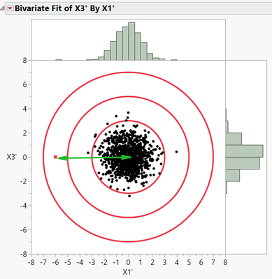
Figure 1 is a reproduction of one of the figures from Episode 1 and shows a two-dimensional plot of 1,000 data points with a clear outlier (marked with the red square):

The scatterplot in Figure 1 allows us to easily determine outliers visually in two dimensions, even when the outlier is not evident from the univariate histogram distributions. So, the Box & Whisker (quantile) techniques described in Episode 2 aren’t always reliable when analyzing multidimensional data. And visually identifying outliers (as in Episode 1) becomes difficult as the number of dimensions increases. So how can we more reliably detect these multidimensional outliers?
The Mahalanobis distance
The Mahalanobis distance (DM) gives us a numerical method for identifying multidimensional outliers. It is named for its creator, Indian statistician Prasanta Chandra Mahalanobis (1893-1972). For more information on Dr. Mahalanobis, I direct you to this Wikipedia article.
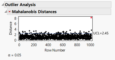
A DM plot for the data set shown in Figure 1 is shown below:

Figure 2 shows all data points in row order versus DM on the Y axis. The value of DM for each point represents the standardized “distance” of each point from the centroid of all data points. The red data point clearly stands out from the remaining points, so it would warrant further investigation as an outlier.
So how does this calculation work?
The general method
Let’s say we have a two-dimensional distribution of 1,000 points. In each dimension, 999 of the points are drawn from a normally distributed population with mean of zero and standard deviation is 1.0. Then I added an outlier point as the last point in the sample. If we make an X-Y scatterplot, we might have something like this:

Note the red point of interest in Figure 3. We can easily calculate the mean and standard deviation of the 1,000-point sample in each dimension, and we can calculate the Euclidean distance from the red point to the centroid of the points using the Pythagorean Theorem. For multidimensions:
In fact, we can draw circles centered on the centroid representing equal distances from the centroid, as in Figure 4:

In Figure 4, the circles represent distances of 1, 2, 3, and 4 units (from smallest to largest) to the centroid of the points. Here it is clear to see that the point in red is the furthest from the centroid of the points. Its distance is represented by “d”.
This works well if we have similarly scaled distributions (i.e., that the standard deviations are the same). But what if we have different scales, as shown in Figure 5?

Here we have two problems. First, the mean of the points in the X3 dimension is non-zero. That is simple enough to fix by just subtracting the mean from all data points.
The second problem is that the standard deviation in the X3 dimension is much larger than in the X1 dimension. This renders a distance calculation moot, unless we can compensate for the differences. This is also easily done. After correcting for the mean shift from zero, we simply divide in each dimension by its standard deviation. This normalizes for any mismatches in standard deviations. The multidimensional equation to evaluate this distance becomes:
where m and s represent the mean and standard deviation in each dimension. If we carry out these computations and replot the standardized data, we get the figure below:

So now we have a way to adjust the data for non-zero means and for unequal standard deviations. This works well as long as the data in each dimension are independent of each other (i.e., uncorrelated.) But if there is correlation like that shown in Figure 1, then what do we do?
One way to do this would be to employ principal components to establish new axes aligned with the trends in the data, and then perform the operations described above. But this requires a lot of clicks. (If interested in how this might work, see Appendix A.)
Fortunately, Dr. Mahalanobis gives us an easy and elegant way to calculate this distance!
Mahalanobis’ equation for calculating distances
Dr. Mahalanobis’ elegant equation for calculating the DM is:

is a vector of values of the N dimensions of the ith individual observed data point.
N = the number of dimensions (or columns) of interest.
T indicates the Transpose operation.
is a vector of the means of each of the N dimensions (or columns) of interest.
S-1 is the inverse of the NxN covariance matrix for all of the data points (available from the Multivariate platform in JMP).
Plugging appropriate values into the above equation gives the DM from the ith point to the centroid of all points in the data set. If you are interested in how this calculation works, Appendix B works through a small sample problem.
The Mahalanobis plot in JMP
DM by itself is of little use to us. It only has meaning when compared to other data points. The Mahalanobis plot in JMP shows these results.
We can generate the Mahalanobis plot by going to Analysis/Multivariate Methods/Multivariate, selecting the columns, then from the red dropdown select Outlier Analysis/Mahalanobis Distance. For the example data set of Figure 1, this gives:

Here we see that the data point in Row 1 of the data table has the largest distance (DM), indicating it is the furthest from the centroid of all 10 data points. The blue line represents a 95% upper confidence limit (UCL) on whether we believe the DM is significantly different from zero. The red point is clearly above the UCL, so it warrants further investigation as an outlier.
But the outliers aren’t always so obvious to detect, particularly with small data sets. In the example in Appendix B, I show sample calculations for a small data set (10 data points in three dimensions). This data set generates a DM plot as shown below:

The DM plot has identified Point 1 as an outlier. But we also see that DM for Row 1 is not all that different from DM for Row 7! Why is this? You’ll have to wait for the next episode for the answer to that question!
A quick note about T2
JMP also offers an option for a T2 calculation under Analysis/Multivariate Methods/Multivariate, and then Outlier Analysis. T2 is simply the square of DM. Some people like to use it to force more visual separation between the outliers and the bulk of the data, but T2 really contains the same information as DM.
Next episode
In the next episode, we’ll cover the Jackknife distance, which is another way of looking at outliers and which will make the outlier from the above example data set stand out.
See all posts in this series on understanding outliers.
Appendix A: Using principal components to identify outliers
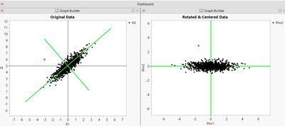
It would be nice if we had a way to rotate the axes in Figure 1 so that they lined up with the data trend, something like this:

Then we could use the techniques described earlier for standardizing the data to detect outliers.
One way to do this is Principal Component Analysis (PCA). PCA finds the set of orthogonal (mutually perpendicular) axes that best fits the data. You can have as many principal components as you have original dimensions (columns) in your data set. In JMP, PCA can be found in two places: either under Analyze/Multivariate Methods/Principal Components, or under Analyze/Multivariate Methods/Multivariate, and then from the red dropdown next to Multivariate, choose Principal Components/on Correlations. The red dropdown also gives an option to save the principal components back to the data table. Once you have done this, you can use the methods to correct for means and standard deviations outlined above to determine the distance from the centroid.
Appendix B: DM calculations for an example data set
Let’s say we have a sample data set with three columns and 10 rows:

In JMP, we can run Analysis/Multivariate Methods/Multivariate on these three columns to produce the following scatterplot matrix:

In Figure 11 we can see that Row 1 data (highlighted in red) appears to be an outlier when comparing in the X1-X2 dimensions, though it is not as clear in X1-X3 or X2-X3 plots.
We want to calculate the Mahalanobis distance for the first point. So, filling out the vectors and matrices in the above DM equation, we start with the point of interest:
The means of each column can be found in several different ways. Let’s use Cols/Column Viewer, then Show Summary:

So the vector of means becomes:
Next, we need the covariance matrix, which is found under Analysis/Multivariate Methods. Select Covariance Matrix from the red dropdown triangle:

We also need the inverse of the covariance matrix, S-1. JMP doesn’t give us that information from the menu system, but we can get it easily from a custom script as follows:

This results in:
S-1 =
Then we just plug in and solve the matrix equation:
The Mahalanobis distance (DM) is 2.814 for the data shown in Row 1 of the example data set.

You must be a registered user to add a comment. If you've already registered, sign in. Otherwise, register and sign in.
- © 2026 JMP Statistical Discovery LLC. All Rights Reserved.
- Terms of Use
- Privacy Statement
- Contact Us


