Welcome back to my blog series on Outliers. In previous episodes, we’ve looked at:
Today after a quick (but necessary) review of Mahalanobis, we will look at the jackknife distance.
Quick review of the Mahalanobis distance
Remember the three-dimensional, 10-point data set from Episode 3? The multivariate Scatterplot Matrix looked like this in JMP:
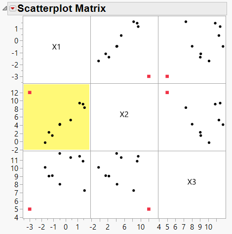 Figure 1: Scatterplot matrix of 10 data points with one outlier (red)
The red point appears to be an outlier when compared to the other nine points. This is particularly clear in the highlighted plot.
Yet when we performed a Mahalanobis distance calculation, the red point did not appear to be a “terrible” outlier:
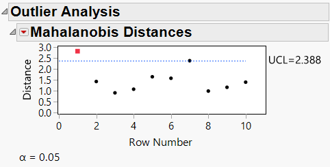 Figure 2: Mahalanobis distance for 10 data point sample shown in Figure 1
In Figure 2, the red point is above the line of significance, but not by much. This seems counterintuitive based on the Scatterplot Matrix of Figure 1 where the red point appears to be an obvious outlier.
But remember, the Mahalanobis calculation involves measuring the distance from the whole when taking the covariance structure of the data into account. If we take the highlighted scatterplot from Figure 1 and fit a straight line to it, we get something like this (from Graph Builder):
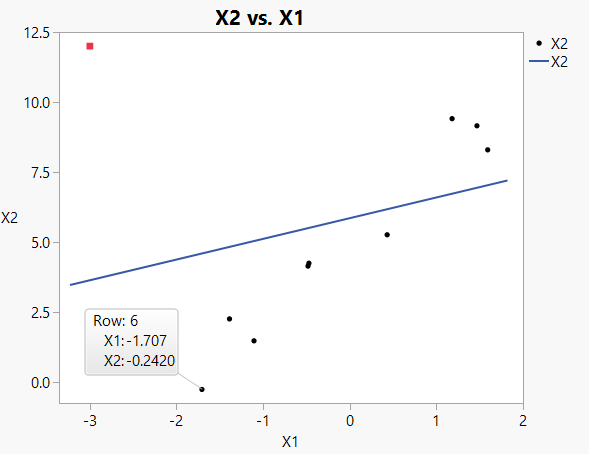 Figure 3: Simple plot of X1 vs X2, including best-fit line (from ordinary least squares)
The straight-line fit is a visual representation of the covariance structure between these two variables (X1 and X2). Note that the red outlier point is a heavy influence on the position of the line; it pulls the line up toward it, making the distance from itself to the line smaller than it should have been.
In addition, the poorly fitting line also makes it appear that other data points are farther from the line than they might really be if the red point hadn’t influenced it so strongly. For example, data point 6 (labeled in Figure 3) appears to be far from the line and might be on the border of being an outlier if this particular best fit line was chosen.
Is there a better way to detect the outlier?
The jackknife technique
The jackknife technique is very simple, yet very powerful, relying on calculations using the “leave one out” technique. Conceptually, if we left the red outlier out of the line fit calculations, it would generate a scatterplot with best fit line that looks like this:
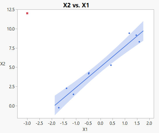 Figure 4: Simple plot of X1 vs X2, including best fit line based on all points EXCEPT for red outlier
Now it is clear that the red outlier is truly considered an outlier, warranting further investigation.
In general, recall this equation for computing the Mahalanobis Distance from Episode 3:

To compute the jackknife distance, use the “leave-one-out” technique and calculate the

vector and the

matrix for all points except for the point of interest. Next, simply put the point of interest into the

vector and compute the Mahalanobis distance, which is now called the jackknife distance.
Repeat the calculations for all points, each time leaving the point of interest

out of the calculations of

and
 .
.
The jackknife plot then looks like this:
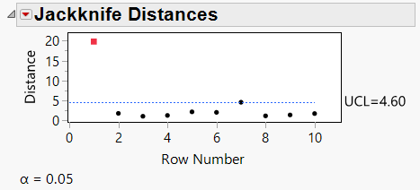 Figure 5: Jackknife distance plot for 10 point sample
Now it is quite clear that the red point is an outlier.
History of jackknife
Per Wikipedia, John Tukey came up with the name “jackknife” because it is a robust multipurpose tool that can be used in a variety of circumstances, though the technique was originally developed by Maurice Quenouille in the early-mid 1950s.
Parallels with other techniques
If you’re familiar with other validation schemes (like K-fold validation) or things like bootstrap forest and boosted tree techniques, you’ll recognize that leaving one (or more) observations out of an analysis is a very common and powerful way to get more out of your statistical analyses.
Next episode
Way back in Episode 1, I mentioned that the Episode 5 would involve T2 distances. However, I already pointed out in Episode 3 that T2 is simply the square of the Mahalanobis distance, so we don’t need another episode to discuss that.
Instead, my fifth and final blog post on outliers will address multivariate K-nearest neighbor detection of outliers. Stay tuned!