- New to JMP? Let the Data Analysis Director guide you through selecting an analysis task, an analysis goal, and a data type. Available now in the JMP Marketplace!
- See how to install JMP Marketplace extensions to customize and enhance JMP.
- Subscribe to RSS Feed
- Mark Topic as New
- Mark Topic as Read
- Float this Topic for Current User
- Bookmark
- Subscribe
- Mute
- Printer Friendly Page
Discussions
Solve problems, and share tips and tricks with other JMP users.- JMP User Community
- :
- Discussions
- :
- scatterplot 3D settings
- Mark as New
- Bookmark
- Subscribe
- Mute
- Subscribe to RSS Feed
- Get Direct Link
- Report Inappropriate Content
scatterplot 3D settings
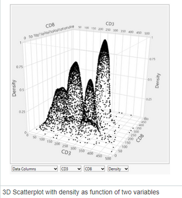
I am working on dataset (attached) in which I am trying to show if there are any patterns in the recovery at different settings of 'a' and 'b' at three different time points. I wanted to show this using scatterplot 3D and I looked up this plot Graph Builder contour plots in JMP 15
I am not sure how to set up my data to get this type of graph. I tried doing it and the results are I got are in the data table. Is it possible to show my data with this type of scatterplot 3D? I am not sure if looking at three time points at once is possible, if not then I can look at one time point and look at the pattern in recovery at setting a and b.
Accepted Solutions
- Mark as New
- Bookmark
- Subscribe
- Mute
- Subscribe to RSS Feed
- Get Direct Link
- Report Inappropriate Content
Re: scatterplot 3D settings
I'm not sure that your original pictures or pmroz's approach are different than your example.
The obvious differences are likely caused by the lack of data points and the fact that your a and b values have fewer levels than the example picture. With more realized levels in the a and b data, I think you would end up with similar pictures.
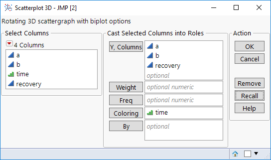
So, a few questions on what you are really trying to do. Would you want a, b, and recovery on the axes and the various time points "consolidated" on the same graph? Use Scatterplot 3D and drag a, b, and recovery to the Y, Columns role. This is similar to the script you saved in your example data, but it had "consolidated" points across b rather than time.
Instead, are you trying to plot a, b, and recovery for a specific time point? That is the solution pmroz provided.
- Mark as New
- Bookmark
- Subscribe
- Mute
- Subscribe to RSS Feed
- Get Direct Link
- Report Inappropriate Content
Re: scatterplot 3D settings
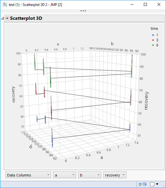
You don't have enough data to get a graph similar to the picture you showed. Another possibility: set time as the coloring variable and you'll see all the points at once, with each time in a different color. Also you can connect the points which will help somewhat.
Here are the steps. Note that you have to change time to be ordinal.
In the 3d scatterplot click the red triangle and select Connect Points
- Mark as New
- Bookmark
- Subscribe
- Mute
- Subscribe to RSS Feed
- Get Direct Link
- Report Inappropriate Content
Re: scatterplot 3D settings
You could try the following:
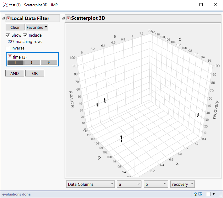
1. Right click on the time column header and select Column Info. Set the time column to be of type Numeric/Ordinal. That will allow you to use discrete values of time.
2. Run the Scatterplot 3D and drag a, b, recovery to the Y, columns role.
3. Double click the Recovery axis and set the minimum to 0, max to 100. This will insure that when you use the data filter the scales will not change
4. Click the red triangle and select Local Data Filter.
5. Select time.
Now you can click on the various values of time to cycle through the values. You can click the Local Data Filter red triangle and select animation as well.
- Mark as New
- Bookmark
- Subscribe
- Mute
- Subscribe to RSS Feed
- Get Direct Link
- Report Inappropriate Content
Re: scatterplot 3D settings
@pmroz Thank you for your response. Is there any way that I can show this data like it is shown in the picture I added to my question?
- Mark as New
- Bookmark
- Subscribe
- Mute
- Subscribe to RSS Feed
- Get Direct Link
- Report Inappropriate Content
Re: scatterplot 3D settings
I'm not sure that your original pictures or pmroz's approach are different than your example.
The obvious differences are likely caused by the lack of data points and the fact that your a and b values have fewer levels than the example picture. With more realized levels in the a and b data, I think you would end up with similar pictures.
So, a few questions on what you are really trying to do. Would you want a, b, and recovery on the axes and the various time points "consolidated" on the same graph? Use Scatterplot 3D and drag a, b, and recovery to the Y, Columns role. This is similar to the script you saved in your example data, but it had "consolidated" points across b rather than time.
Instead, are you trying to plot a, b, and recovery for a specific time point? That is the solution pmroz provided.
- Mark as New
- Bookmark
- Subscribe
- Mute
- Subscribe to RSS Feed
- Get Direct Link
- Report Inappropriate Content
Re: scatterplot 3D settings
You don't have enough data to get a graph similar to the picture you showed. Another possibility: set time as the coloring variable and you'll see all the points at once, with each time in a different color. Also you can connect the points which will help somewhat.
Here are the steps. Note that you have to change time to be ordinal.
In the 3d scatterplot click the red triangle and select Connect Points
Recommended Articles
- © 2026 JMP Statistical Discovery LLC. All Rights Reserved.
- Terms of Use
- Privacy Statement
- Contact Us


