- New to JMP? Let the Data Analysis Director guide you through selecting an analysis task, an analysis goal, and a data type. Available now in the JMP Marketplace!
- See how to install JMP Marketplace extensions to customize and enhance JMP.
- Subscribe to RSS Feed
- Mark Topic as New
- Mark Topic as Read
- Float this Topic for Current User
- Bookmark
- Subscribe
- Mute
- Printer Friendly Page
Discussions
Solve problems, and share tips and tricks with other JMP users.- JMP User Community
- :
- Discussions
- :
- Re: how to plot an overlay variability chart
- Mark as New
- Bookmark
- Subscribe
- Mute
- Subscribe to RSS Feed
- Get Direct Link
- Report Inappropriate Content
how to plot an overlay variability chart
I am a new one for JMP :)
For example, I have 4 columns
Name Gender Score1 Score2:
Jason M 98 87
Alice F 67 78
Emma F 89 79
John M 70 89
Jennifer 76 65
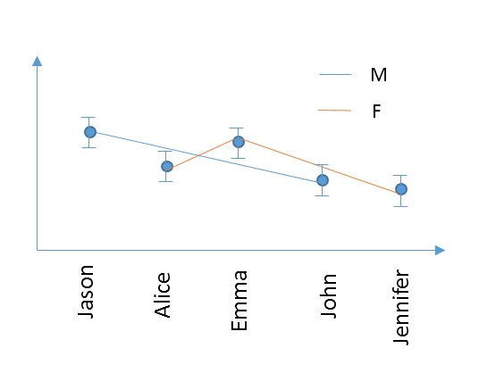
I would like to generate a varibility chart (although the example only has 1 data for each people). I want to plot 2 curves (in different color for example) in 1 figure grouped by Gender, and connect the data with a line for each group. The x axis names need to be the listing order, like this
Thanks a lot!
- Mark as New
- Bookmark
- Subscribe
- Mute
- Subscribe to RSS Feed
- Get Direct Link
- Report Inappropriate Content
Re: how to plot an overlay variability chart
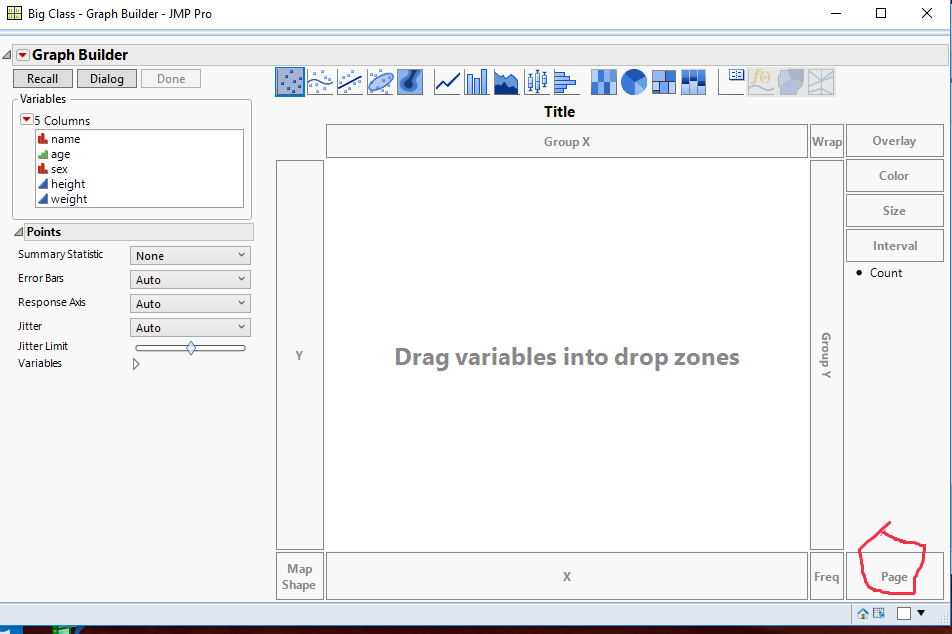
Thanks Jim, but could you please show where is the Page area?
- Mark as New
- Bookmark
- Subscribe
- Mute
- Subscribe to RSS Feed
- Get Direct Link
- Report Inappropriate Content
Re: how to plot an overlay variability chart
Assuming you are running JMP version 12 or later, here is where the Page drop area is
- Mark as New
- Bookmark
- Subscribe
- Mute
- Subscribe to RSS Feed
- Get Direct Link
- Report Inappropriate Content
Re: how to plot an overlay variability chart
hmm... I am usning JMP11, and doesn't have this area :(
any suggestion?
- Mark as New
- Bookmark
- Subscribe
- Mute
- Subscribe to RSS Feed
- Get Direct Link
- Report Inappropriate Content
Re: how to plot an overlay variability chart
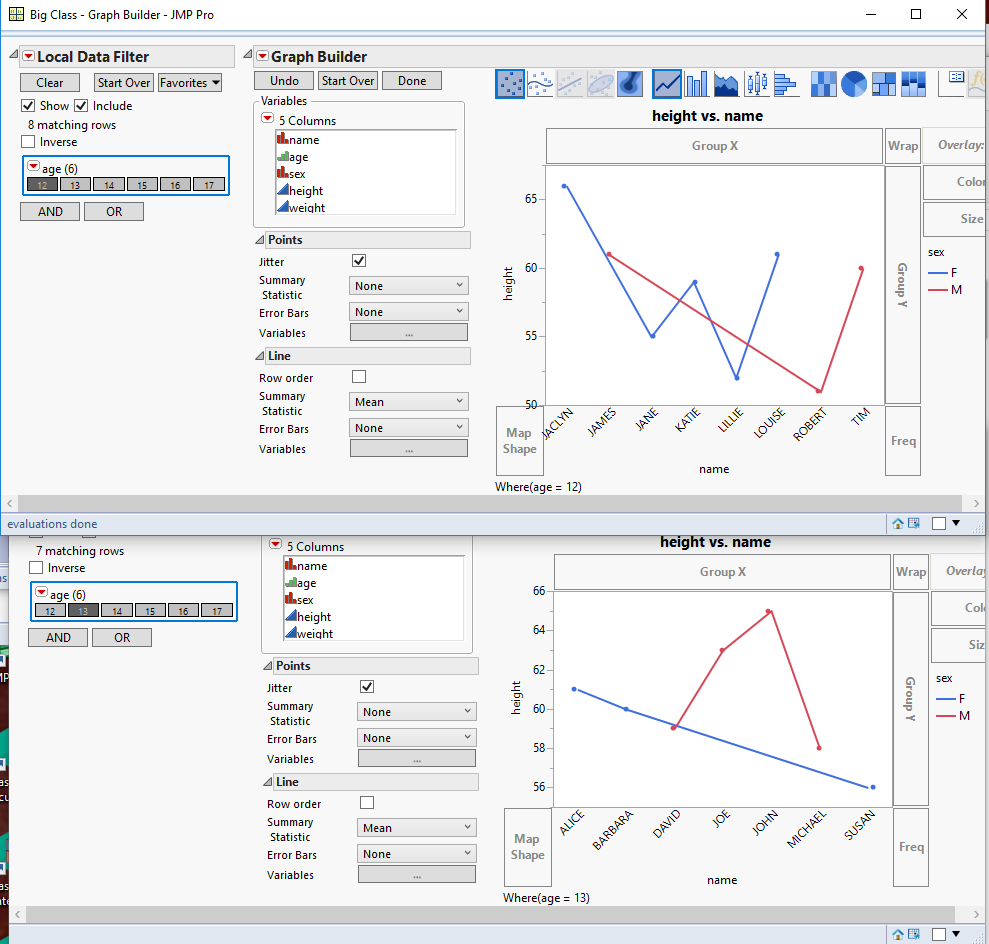
You can run the Graph Builder platform twice and within each run, add a Local Data Filter, and only select Class 1 for the first instance of Graph Builder, and selec Class 2 for the second instance. Here is an example using the Big Class Sample data table, and using the variable Age instead of the variable Class.
- Mark as New
- Bookmark
- Subscribe
- Mute
- Subscribe to RSS Feed
- Get Direct Link
- Report Inappropriate Content
Re: how to plot an overlay variability chart
Thanks! I updated the JMP to 12 from company software center so I can use Page now. However, it only allow me to drag 1 column into the page area. If I have 3 varaibles for group, how to generate 2x2x2=8 seperate plots?
- Mark as New
- Bookmark
- Subscribe
- Mute
- Subscribe to RSS Feed
- Get Direct Link
- Report Inappropriate Content
Re: how to plot an overlay variability chart
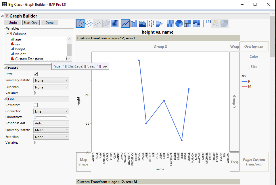
You can create a new virtual column by right clicking on one of the variables in the column names in the Columns area, you can select Formula to create a new column in which you can concatenate the 3 column's values into one column, and then use that column to drag into the Page drop area
- Mark as New
- Bookmark
- Subscribe
- Mute
- Subscribe to RSS Feed
- Get Direct Link
- Report Inappropriate Content
Re: how to plot an overlay variability chart
Thanks a lot! It works!
- « Previous
-
- 1
- 2
- Next »
Recommended Articles
- © 2026 JMP Statistical Discovery LLC. All Rights Reserved.
- Terms of Use
- Privacy Statement
- Contact Us


