- New to JMP? Let the Data Analysis Director guide you through selecting an analysis task, an analysis goal, and a data type. Available now in the JMP Marketplace!
- See how to install JMP Marketplace extensions to customize and enhance JMP.
- Subscribe to RSS Feed
- Mark Topic as New
- Mark Topic as Read
- Float this Topic for Current User
- Bookmark
- Subscribe
- Mute
- Printer Friendly Page
Discussions
Solve problems, and share tips and tricks with other JMP users.- JMP User Community
- :
- Discussions
- :
- Re: how do you generate this plot in JMP?
- Mark as New
- Bookmark
- Subscribe
- Mute
- Subscribe to RSS Feed
- Get Direct Link
- Report Inappropriate Content
how do you generate this plot in JMP?
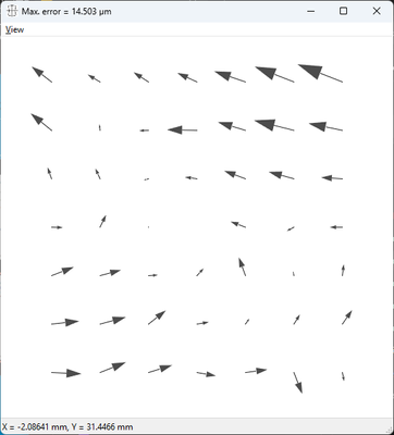
I have a grid of crosses that I measure. Each grid position has a nominal expected position, and I measure its actual position and calculate the error. I would like to plot the magnitude and direction of the error at each nominal position. Is there a way to do this in JMP? The plot I'm hoping for looks like the following (I did not generate this plot; I have software that does it):
I don't know what is needed to generate such a plot, so for now I've attached what I have: the nominal position at each cross, the actual measured position, and the errors.
Accepted Solutions
- Mark as New
- Bookmark
- Subscribe
- Mute
- Subscribe to RSS Feed
- Get Direct Link
- Report Inappropriate Content
Re: how do you generate this plot in JMP?
There is a blog post by @XanGregg where he explains how to generate Vector plots in Jmp:
Vector Plots in JMP
[different length, but not different size of arrow heads]
Besides that, Jmp developers plan to include Vector Plots directly in Graph Builder:
- Mark as New
- Bookmark
- Subscribe
- Mute
- Subscribe to RSS Feed
- Get Direct Link
- Report Inappropriate Content
Re: how do you generate this plot in JMP?
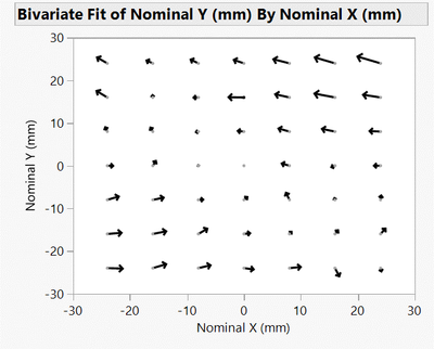
Hi hogi, that did the trick; thank you. Half the battle for us newbies is knowing what a plot is called (didn't know it was a "vector plot"). Using your info I was able to reproduce the plot in my original post using JMP:
For those who are interested, I have attached a second file with the script for this plot included. Run the script "Vector Plot", right click on the chart and select "Customize..." from the drop-down menu, select "Script" and you'll see what I had to add to make the arrows appear, namely:
Note that the first time I did this there was no Script option, so I pressed the "+" button, which made it appear. After making the addition I pressed OK and voila: the desired arrows.
- Mark as New
- Bookmark
- Subscribe
- Mute
- Subscribe to RSS Feed
- Get Direct Link
- Report Inappropriate Content
Re: how do you generate this plot in JMP?
JMP19: Vector plot is available now in Graph Builder.
-> It's very easy now to generate this type of plot via drag & drop.
Recommended Articles
- © 2026 JMP Statistical Discovery LLC. All Rights Reserved.
- Terms of Use
- Privacy Statement
- Contact Us


