- New to JMP? Let the Data Analysis Director guide you through selecting an analysis task, an analysis goal, and a data type. Available now in the JMP Marketplace!
- See how to install JMP Marketplace extensions to customize and enhance JMP.
- Subscribe to RSS Feed
- Mark Topic as New
- Mark Topic as Read
- Float this Topic for Current User
- Bookmark
- Subscribe
- Mute
- Printer Friendly Page
Discussions
Solve problems, and share tips and tricks with other JMP users.- JMP User Community
- :
- Discussions
- :
- Tips to improve control chart visualization
- Mark as New
- Bookmark
- Subscribe
- Mute
- Subscribe to RSS Feed
- Get Direct Link
- Report Inappropriate Content
Tips to improve control chart visualization
Hello,
I created several control charts out of a JMP data table and saved everything as a report, I would like to do the following:
- how can I modify the script in order to get plotted only the last 30 datapoints from the data table?
- how can I modify the script in order to set the correct size of the chart? Right now every time I open it the graph is compressed on the left side
Thanks for your support!
- Mark as New
- Bookmark
- Subscribe
- Mute
- Subscribe to RSS Feed
- Get Direct Link
- Report Inappropriate Content
Re: Tips to improve control chart visualization
There are a couple of ways to do this.
- Select all rows where Row() < N Rows(dt)-30 and then Hide and Exclude them
- Create a subset of the last by selecteding all rows where Row() >= N Rows(dt)-30 and then use Tables==>Subset to create a new data table, and run the Chart Builder against the new data table
Unless you have manually changed the chart size in the script, JMP will use the chart size defaults from the preferences. My suggestion is that you interactively run the chart. Then manually change the chart size to the size you want it to be, and then go to the red triangle and select "Save Script". It will have the script code embedded the script it produces, to change the chart size when you run it.
- Mark as New
- Bookmark
- Subscribe
- Mute
- Subscribe to RSS Feed
- Get Direct Link
- Report Inappropriate Content
Re: Tips to improve control chart visualization
Hello txnelson,
thanks for your suggestions, unfortunalety what I would like to do is to code in the script something to pickup from the data table only last 30 datapoints automatically without creating a subset of the current data table.
Thanks.
- Mark as New
- Bookmark
- Subscribe
- Mute
- Subscribe to RSS Feed
- Get Direct Link
- Report Inappropriate Content
Re: Tips to improve control chart visualization
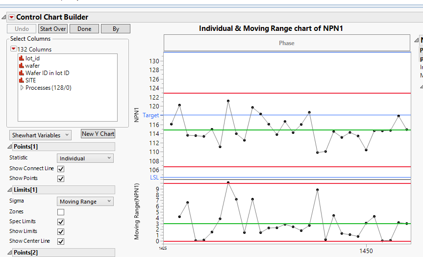
The first option that I suggested does not require subsetting! See the script below
names default to here(1);
dt=open("$SAMPLE_DATA/semiconductor capability.jmp");

// Hide and Exclude all rows except the last 30
dt << select where(Row() < N Rows( dt ) - 29 );
dt << Hide and Exclude;

// Unselect the rows
dt << clear select

// Run the control chart
cc = Control Chart Builder(
	Variables( Y( :NPN1 ) ),
	Chart( Position( 1 ), Limits( Sigma( "Moving Range" ) ) ),
	Chart( Position( 2 ), Limits( Sigma( "Moving Range" ) ) )
);

// Set the axis parameters
report(cc)[AxisBox(1)]<<min(nrows(dt)-30);- Mark as New
- Bookmark
- Subscribe
- Mute
- Subscribe to RSS Feed
- Get Direct Link
- Report Inappropriate Content
Re: Tips to improve control chart visualization
Hello,
so I tried to follow your hint, here below the script I'm getting after creating an Individual control chart out of a data table:
Control Chart(
	Sample Label( :Data ),
	Group Size( 1 ),
	KSigma( 3 ),
	Chart Col( :Si STD 3 ppb, Individual Measurement( Avg( 3 ), LCL( 2.25 ), UCL( 3.75 ) ) ),
	SendToReport( Dispatch( {"Individual Measurement of Si STD 3 ppb"}, "IR Chart of IM", FrameBox, {Frame Size( 1301, 208 )} ) )
);
Where should I paste the code?
Sorry but I'm really a beginner with scripting.
Thanks.
- Mark as New
- Bookmark
- Subscribe
- Mute
- Subscribe to RSS Feed
- Get Direct Link
- Report Inappropriate Content
Re: Tips to improve control chart visualization
Try this
dt = current data table();

// Hide and Exclude all rows except the last 30
dt << select where(Row() < N Rows( dt ) - 29 );
dt << Hide and Exclude;

// Unselect the rows
dt << clear select

cc = Control Chart(
	Sample Label( :Data ),
	Group Size( 1 ),
	KSigma( 3 ),
	Chart Col( :Si STD 3 ppb, Individual Measurement( Avg( 3 ), LCL( 2.25 ), UCL( 3.75 ) ) ),
	SendToReport(
		Dispatch(
			{"Individual Measurement of Si STD 3 ppb"},
			"IR Chart of IM",
			FrameBox,
			{Frame Size( 1301, 208 )}
		)
	)
);

// Set the axis parameters
report(cc)[AxisBox(1)]<<min(nrows(dt)-30);
To give you the best headstart into the world of scripting in JMP, I strongly suggest that you read the Scripting Guide.
Help==>Books==>Scripting Guide
and if you are not versed in computer programming in general, I suggest you find o onto the web and search for "free online introduction to programming".
- Mark as New
- Bookmark
- Subscribe
- Mute
- Subscribe to RSS Feed
- Get Direct Link
- Report Inappropriate Content
Re: Tips to improve control chart visualization
Hello,
the script is working fine to select last 30 datapoints but I think I'm getting a problem in setting the min and max on the X axis as per below screenshot:
- Mark as New
- Bookmark
- Subscribe
- Mute
- Subscribe to RSS Feed
- Get Direct Link
- Report Inappropriate Content
Re: Tips to improve control chart visualization
The line
report(cc)[AxisBox(1)]<<min(nrows(dt)-30);apparently is not finding the AxisBox() that it needs to change.
- Did the example that I included in my Dec 13th 3:23(my time) work correctly?
- Is the variable "dt" being assigned to point to your target data table?
- Is the "cc" pointing to the Control Chart Platform
cc = Control Chart(It would help to beable to see the actual code that you are using. Could you please provide that code?
- Mark as New
- Bookmark
- Subscribe
- Mute
- Subscribe to RSS Feed
- Get Direct Link
- Report Inappropriate Content
Re: Tips to improve control chart visualization
So the script I'm using is the following:
dt = current data table();

// Hide and Exclude all rows except the last 30
dt << select where(Row() < N Rows( dt ) - 29 );
dt << Hide and Exclude;

// Unselect the rows
dt << clear select

cc = Control Chart(
	Sample Label( :Data ),
	Group Size( 1 ),
	KSigma( 3 ),
	Chart Col( :Si STD 3 ppb, Individual Measurement( Avg( 3 ), LCL( 2.25 ), UCL( 3.75 ) ) ),
	SendToReport(
		Dispatch(
			{"Individual Measurement of Si STD 3 ppb"},
			"IR Chart of IM",
			FrameBox,
			{Frame Size( 1301, 208 )}
		)
	)
);

// Set the axis parameters
report(cc)[AxisBox(1)]<<min(nrows(dt)-30);
Regarding the first bullet point, we I rant that code I'm getting this
For points 2 and 3, how can I check this?
- Mark as New
- Bookmark
- Subscribe
- Mute
- Subscribe to RSS Feed
- Get Direct Link
- Report Inappropriate Content
Re: Tips to improve control chart visualization
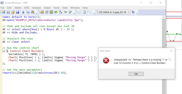
Oops....a couple of mistakes.
There needs to be a ";" after the dt << Select Clear;
The Chart you are using needs to have AxisBox(2) referenced, not AxisBox(1);
dt = current data table();

// Hide and Exclude all rows except the last 30
dt << select where(Row() < N Rows( dt ) - 29 );
dt << Hide and Exclude;

// Unselect the rows
dt << clear select;

cc = Control Chart(
	Sample Label( :Data ),
	Group Size( 1 ),
	KSigma( 3 ),
	Chart Col( :Si STD 3 ppb, Individual Measurement( Avg( 3 ), LCL( 2.25 ), UCL( 3.75 ) ) ),
	SendToReport(
		Dispatch(
			{"Individual Measurement of Si STD 3 ppb"},
			"IR Chart of IM",
			FrameBox,
			{Frame Size( 1301, 208 )}
		)
	)
);

// Set the axis parameters
report(cc)[AxisBox(2)]<<min(nrows(dt)-30);Recommended Articles
- © 2026 JMP Statistical Discovery LLC. All Rights Reserved.
- Terms of Use
- Privacy Statement
- Contact Us


