- New to JMP? Let the Data Analysis Director guide you through selecting an analysis task, an analysis goal, and a data type. Available now in the JMP Marketplace!
- See how to install JMP Marketplace extensions to customize and enhance JMP.
- Subscribe to RSS Feed
- Mark Topic as New
- Mark Topic as Read
- Float this Topic for Current User
- Bookmark
- Subscribe
- Mute
- Printer Friendly Page
Discussions
Solve problems, and share tips and tricks with other JMP users.- JMP User Community
- :
- Discussions
- :
- Re: Standard deviation Bars
- Mark as New
- Bookmark
- Subscribe
- Mute
- Subscribe to RSS Feed
- Get Direct Link
- Report Inappropriate Content
Standard deviation Bars
Hello,
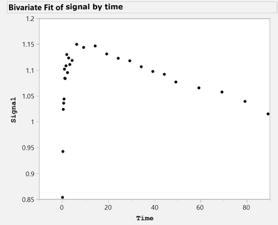
I would like to plot Y by X continous variables. X represent unit time., and Y is mean signal at each time point in X (please see below). I would like to add standard deviation bars to each point. How can I do it in JMP pro 14?
Your help and advices are highly appreciated!
john
Accepted Solutions
- Mark as New
- Bookmark
- Subscribe
- Mute
- Subscribe to RSS Feed
- Get Direct Link
- Report Inappropriate Content
Re: Standard deviation Bars
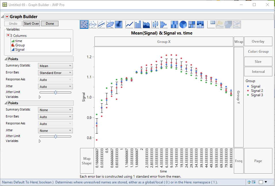
Here is the graph
I Stacked the columns
Tables==>Stack
Choosing the 3 Signal columns, Selecting to Keep the Time column, and changing the names of the output columns from Label to Group and Data to Signal
Then using Graph Builder, I dragged Signal to Y, Time to X. I changed the Summary Statistic to Mean and then set the Error Bars to Standard Error.
Next I Right Clicked on the graph and selected Add==>Points
Below is a script that performs these tasks in JSL
Names Default To Here( 1 );
dt = Data Table( "jmp_signals" );
dtStack = dt <<
Stack(
	columns( :Signal 2, :Signal 3, :Signal ),
	Source Label Column( "Group" ),
	Stacked Data Column( "Signal" )
);

dtStack << Graph Builder(
	Variables( X( :time ), Y( :Signal ), Color( :Group ) ),
	Elements(
		Points(
			X,
			Y,
			Legend( 10 ),
			Summary Statistic( "Mean" ),
			Error Bars( "Standard Error" )
		),
		Points( X, Y, Legend( 11 ), Jitter( "None" ) )
	)
);- Mark as New
- Bookmark
- Subscribe
- Mute
- Subscribe to RSS Feed
- Get Direct Link
- Report Inappropriate Content
Re: Standard deviation Bars
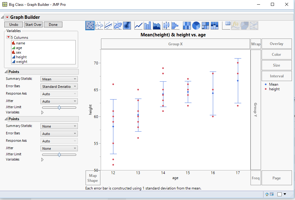
You can easily handle this using Graph Builder
- Mark as New
- Bookmark
- Subscribe
- Mute
- Subscribe to RSS Feed
- Get Direct Link
- Report Inappropriate Content
Re: Standard deviation Bars
Dear txnelson – thank you so much for the response! I think you were able to show the standard deviation bars because the modeling type for X (i.e. age) is ordinal not continous. Correct? Is there any differnce?
Kindly, how happened that you have multiple heights for each age group. I expect that your spreadsheet has three columns one for age, the other one for height, and the third one for weight?
Also the title of your figure was "mean (height) & height vs age". That means you ploted two Y variables against one X variable (i.e. age). Correct?
I coud not do it! In my spreadsheet I have only two columns one for X and the other one for Y. both are continous variables. I highly appreciate any guidance. Thanks!
- Mark as New
- Bookmark
- Subscribe
- Mute
- Subscribe to RSS Feed
- Get Direct Link
- Report Inappropriate Content
Re: Standard deviation Bars
Where are you expecting that you are going to get your standard deviation? If you X variable is continuious.....each individual point will be considered independently.
You can easily change the Modeling Type from Continuous to Ordinal, if you have multiple values at the differenx X's
- Mark as New
- Bookmark
- Subscribe
- Mute
- Subscribe to RSS Feed
- Get Direct Link
- Report Inappropriate Content
Re: Standard deviation Bars
Dear txnelson – I tried to change X to ordinal. When ploting X vs Y this will output one point in X for each point in Y. In the figure you provided there are multiple points in Y for each X. Kindly, why?
- Mark as New
- Bookmark
- Subscribe
- Mute
- Subscribe to RSS Feed
- Get Direct Link
- Report Inappropriate Content
Re: Standard deviation Bars
Just add a new Points entry for the chart.
Right click on the chart, and select "Add" and then select "Points"
- Mark as New
- Bookmark
- Subscribe
- Mute
- Subscribe to RSS Feed
- Get Direct Link
- Report Inappropriate Content
Re: Standard deviation Bars
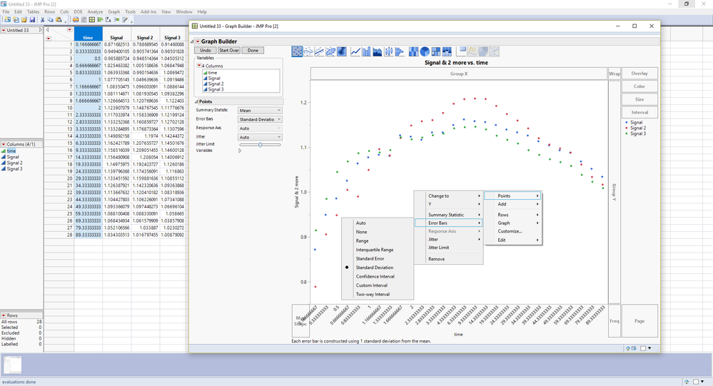
Kindly see bellow is my spreadsheet and the graph builder which failed to show the "Standard deviation Bars". I am not sure what I am doing wrong?!
- Mark as New
- Bookmark
- Subscribe
- Mute
- Subscribe to RSS Feed
- Get Direct Link
- Report Inappropriate Content
Re: Standard deviation Bars
You have separated your y column into 3 separate columns, which will not allow Graph Builder to group them for the calculation of the standard deviation.
If you Stack the 3 Signal columns, keeping the Time column too, then you can drag the stacked column to Y and Time to X, Color by the Label column from the Stack output, and then ask for the Error Bars, and add the new Points.
If this is too confusing, attach your data table, an I will take a go at it
- Mark as New
- Bookmark
- Subscribe
- Mute
- Subscribe to RSS Feed
- Get Direct Link
- Report Inappropriate Content
Re: Standard deviation Bars
Dear txnelson please see attached is the spreadsheet. Thank you so much for the help!
- Mark as New
- Bookmark
- Subscribe
- Mute
- Subscribe to RSS Feed
- Get Direct Link
- Report Inappropriate Content
Re: Standard deviation Bars
Here is the graph
I Stacked the columns
Tables==>Stack
Choosing the 3 Signal columns, Selecting to Keep the Time column, and changing the names of the output columns from Label to Group and Data to Signal
Then using Graph Builder, I dragged Signal to Y, Time to X. I changed the Summary Statistic to Mean and then set the Error Bars to Standard Error.
Next I Right Clicked on the graph and selected Add==>Points
Below is a script that performs these tasks in JSL
Names Default To Here( 1 );
dt = Data Table( "jmp_signals" );
dtStack = dt <<
Stack(
	columns( :Signal 2, :Signal 3, :Signal ),
	Source Label Column( "Group" ),
	Stacked Data Column( "Signal" )
);

dtStack << Graph Builder(
	Variables( X( :time ), Y( :Signal ), Color( :Group ) ),
	Elements(
		Points(
			X,
			Y,
			Legend( 10 ),
			Summary Statistic( "Mean" ),
			Error Bars( "Standard Error" )
		),
		Points( X, Y, Legend( 11 ), Jitter( "None" ) )
	)
);Recommended Articles
- © 2026 JMP Statistical Discovery LLC. All Rights Reserved.
- Terms of Use
- Privacy Statement
- Contact Us


