- New to JMP? Let the Data Analysis Director guide you through selecting an analysis task, an analysis goal, and a data type. Available now in the JMP Marketplace!
- See how to install JMP Marketplace extensions to customize and enhance JMP.
- Subscribe to RSS Feed
- Mark Topic as New
- Mark Topic as Read
- Float this Topic for Current User
- Bookmark
- Subscribe
- Mute
- Printer Friendly Page
Discussions
Solve problems, and share tips and tricks with other JMP users.- JMP User Community
- :
- Discussions
- :
- Re: Select issue
- Mark as New
- Bookmark
- Subscribe
- Mute
- Subscribe to RSS Feed
- Get Direct Link
- Report Inappropriate Content
Select issue
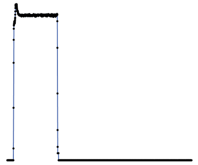
I create a graph, and when I go to select a portion of it, it highlights the entire excel sheet. I remember from demo that you should be able to select a segment and have it only highlight the data directly relating to that segment. What am I doing wrong here?
I would also like to know if there is any way to have JMP find the peak data from multiple points on the same line and display them in the graph?
Thank you for your time
Accepted Solutions
- Mark as New
- Bookmark
- Subscribe
- Mute
- Subscribe to RSS Feed
- Get Direct Link
- Report Inappropriate Content
Re: Select issue
Hi All,
Selecting a line will select all points that make up that line. You would have to have points on the line in order to only select that region of the line.
Hope That helps.
Chris
Data Scientist, Life Sciences - Global Technical Enablement
JMP Statistical Discovery, LLC. - Denver, CO
Tel: +1-919-531-9927 ▪ Mobile: +1-303-378-7419 ▪ E-mail: chris.kirchberg@jmp.com
www.jmp.com
- Mark as New
- Bookmark
- Subscribe
- Mute
- Subscribe to RSS Feed
- Get Direct Link
- Report Inappropriate Content
Re: Select issue
I reworked your code a bit.
1. I added in the code to change the marker size and transparency
2. You may not have noticed the following issue, however, in the new columns you were creating, the formulas had the values of dt and i in them. Those are memory variables that can possibly change. (i.e. you save the table, start up a JMP session in the future, open the data table, and the columns would cause an error, because the variables dt and i are no longer available). So I changed the code to make the formulas to have hardwired values.
Here is the code. I made a mockup data table to test the code out, so there still maybe as issue or two.
dt = Open();

col_list = dt << get column names( string );

Remove From( col_list, 1 );	// Remove time[sec] from list
cols_to_plot = {};
offset_list = {};
offset_cols = {};

// Define the graph builder commands in an expression for use by the OK button
graph_expr = Expr(
	For( i = 1, i <= N Items( cols_to_plot ), i++,
		new_name = cols_to_plot[i] || "-Chemical Cal";

		// If used before, delete the column and then recreate it
		If( Try( Column( dt, new_name ) << get name, "" ) != "",
			dt << delete columns( new_name )
		);
		Insert Into( offset_cols, new_name );
		// The variable i and the column name need to be changed to their
		// static value for the column formulas to be correct
		Eval(
			Substitute(
					Expr(
						dt << New Column( new_name,
							Numeric,
							"Continuous",
							Format( "Best", 12 ),
							Formula( __cols_to_plot__ * __offset_list__ )
						)
					),
				Expr( __cols_to_plot__ ), Parse( ":" || cols_to_plot[i] ),
				Expr( __offset_list__ ), offset_list[i]
			)
		);

	);
// Now for the graph - build a text string and then execute it
	gb_text = "\[gb = graph builder(
	show control panel(0),
	variables(
		X( :Name( "Time[sec]" ) ),]\";
	elements_txt = "	),
	Elements( Line( X, ";

	For( i = 1, i <= N Items( cols_to_plot ), i++,
		If( i == 1,
		// then
			gb_text = gb_text || Eval Insert( "\!N\[		Y( :Name( "^offset_cols[i]^" ) ), ]\" )
		,
		// else
			gb_text = gb_text || Eval Insert( "\!N\[		Y( :Name( "^offset_cols[i]^" ), Position( 1 ) ),]\" )
		);

		elements_txt = elements_txt || Eval Insert( "Y ( ^i^ ), " );
	);

// add in the marker and transparency code
	elements_txt = elements_txt ||
	"Legend( 7 ) ), Points( X, Y, Legend(8))),
SendToReport(
		Dispatch(
			{},
			\!"400\!",
			ScaleBox,
			{Legend Model(
				8,
				Properties( 0, {Marker Size( 0 ), Transparency( 0 )}, Item ID( \!""
	 || offset_cols[1] || "\!", 1 ) )
			)}
		)
	)";
	gb_text = gb_text || elements_txt || "); ";
	Eval( Parse( gb_text ) );

);


nw = New Window( "Graph Chemicals",
	Panel Box( "Select channels to graph",
		Lineup Box( N Col( 2 ),
			Text Box( "Column" ),
			Text Box( "Chemical Cal" ),
			cb1 = Check Box( "Ch1" ),
			ch1_neb = Number Edit Box(),
			cb2 = Check Box( "Ch2" ),
			ch2_neb = Number Edit Box(),
			cb3 = Check Box( "Ch3" ),
			ch3_neb = Number Edit Box(),
			cb4 = Check Box( "Ch4" ),
			ch4_neb = Number Edit Box(),
			cb5 = Check Box( "Ch5" ),
			ch5_neb = Number Edit Box(),
			cb6 = Check Box( "Ch6" ),
			ch6_neb = Number Edit Box(),
			cb7 = Check Box( "Ch7" ),
			ch7_neb = Number Edit Box(),
			cb8 = Check Box( "Ch8" ),
			ch8_neb = Number Edit Box(),
			cb9 = Check Box( "Ch9" ),
			ch9_neb = Number Edit Box(),

		),

	),
	Panel Box( "Actions",
		H List Box(
			okb = Button Box( "OK",
				If( cb1 << get( 1 ),
					Insert Into( cols_to_plot, col_list[8] );
					offset_value = ch1_neb << get;
					Insert Into( offset_list, offset_value );
				);
				If( cb2 << get( 1 ),
					Insert Into( cols_to_plot, col_list[9] );
					offset_value = ch2_neb << get;
					Insert Into( offset_list, offset_value );
				);
				If( cb3 << get( 1 ),
					Insert Into( cols_to_plot, col_list[10] );
					offset_value = ch3_neb << get;
					Insert Into( offset_list, offset_value );
				);
				If( cb4 << get( 1 ),
					Insert Into( cols_to_plot, col_list[11] );
					offset_value = ch4_neb << get;
					Insert Into( offset_list, offset_value );
				);
				If( cb5 << get( 1 ),
					Insert Into( cols_to_plot, col_list[12] );
					offset_value = ch5_neb << get;
					Insert Into( offset_list, offset_value );
				);
				If( cb6 << get( 1 ),
					Insert Into( cols_to_plot, col_list[13] );
					offset_value = ch6_neb << get;
					Insert Into( offset_list, offset_value );
				);
				If( cb7 << get( 1 ),
					Insert Into( cols_to_plot, col_list[14] );
					offset_value = ch7_neb << get;
					Insert Into( offset_list, offset_value );
				);
				If( cb8 << get( 1 ),
					Insert Into( cols_to_plot, col_list[15] );
					offset_value = ch8_neb << get;
					Insert Into( offset_list, offset_value );
				);
				graph_expr;
				nw << close window;
			),
			canb = Button Box( "Cancel", nw << close window ),

		)
	),

);

// Pre-check checkboxes if column exists
For( i = 1, i <= N Items( col_list ), i++,
	If(
		col_list[i] == "Ch1", cb1 << set( 1, 1 ),
		col_list[i] == "Ch2", cb2 << set( 1, 1 ),
		col_list[i] == "Ch3", cb3 << set( 1, 1 ),
		col_list[i] == "Ch4", cb4 << set( 1, 1 ),
		col_list[i] == "Ch5", cb5 << set( 1, 1 ),
		col_list[i] == "Ch6", cb6 << set( 1, 1 ),
		col_list[i] == "Ch7", cb7 << set( 1, 1 ),
		col_list[i] == "Ch8", cb8 << set( 1, 1 ),
		col_list[i] == "Ch9", cb9 << set( 1, 1 ),

	)
);
Graph Builder(
	Show Control Panel( 0 ),
	Variables( X( :Name( "Time[sec]" ) ), Y( :Name( "CH2-Offset" ) ) ),
	Elements( Line( X, Y, Legend( 7 ) ), Points( X, Y, Legend( 8 ) ) ),
	SendToReport(
		Dispatch(
			{},
			"400",
			ScaleBox,
			{Legend Model( 8, Properties( 0, {Marker Size( 0 )}, Item ID( "CH2-Offset", 1 ) ) )}
		)
	)
);

Graph Builder(
	Show Control Panel( 0 ),
	Variables( X( :Name( "Time[sec]" ) ), Y( :Name( "CH2-Offset" ) ) ),
	Elements( Line( X, Y, Legend( 7 ) ), Points( X, Y, Legend( 8 ) ) ),
	SendToReport(
		Dispatch(
			{},
			"400",
			ScaleBox,
			{Legend Model(
				8,
				Properties( 0, {Marker Size( 0 ), Transparency( 0 )}, Item ID( "^offset_cols[i]^", 1 ) )
			)}
		)
	)
);- Mark as New
- Bookmark
- Subscribe
- Mute
- Subscribe to RSS Feed
- Get Direct Link
- Report Inappropriate Content
Re: Select issue
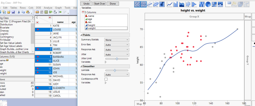
Below is a chart that has had some points selected, and as can be seen on both the chart and the data table, which points have been selected. However, you will need to provide more information about exactly what chart you were using, and what the data table contains for one to attempt to determine what the issues may be. I suggest as your first step, that you read the Essential Graphing book provided with the install of JMP
Help==>Books==>Essential Graphing
Concerning your second question, yes you could determine selected points from a line, and have their values be displayed on the chart. This can be done by specifying what columns should be used for the label, and then selecting the data points to be displayed. Again, this is covered in the Essential Graphing book
- Mark as New
- Bookmark
- Subscribe
- Mute
- Subscribe to RSS Feed
- Get Direct Link
- Report Inappropriate Content
Re: Select issue
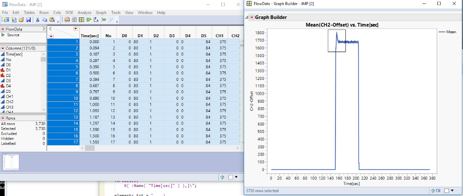
The second part I'm looking more for a way to script it into the script I currently have, if I have to hunt down the data points and select them the point is already defeated, variables I know is the column it occurs in, that there will always be a 0 before each peak of reference, and that I only care about the highest point of the peak for each occurance on the line.
I'll take a look at the book of course, but time waits for no man and the purpose of this project is to streamline the tasks we already do, don't need JMP to hunt for values we already have in Excel, ya know ^.^
- Mark as New
- Bookmark
- Subscribe
- Mute
- Subscribe to RSS Feed
- Get Direct Link
- Report Inappropriate Content
Re: Select issue
That's interesting - the same thing happens for me. I also notice that the lasso tool turns into a rectangle rather than a free-drawing polygon. But it only happens if the line option in Graph Builder is chosen rather than the points. I am guessing that with the line drawn for the mean of that variable, all points are highlighted because all the points are used to calculate the mean - but that is a guess and I'll be interested to see if someone can unravel the mystery. As for your other question, can you use some combination of ColMax and/or ColRank functions to get the points you are looking for?
- Mark as New
- Bookmark
- Subscribe
- Mute
- Subscribe to RSS Feed
- Get Direct Link
- Report Inappropriate Content
Re: Select issue
Hi All,
Selecting a line will select all points that make up that line. You would have to have points on the line in order to only select that region of the line.
Hope That helps.
Chris
Data Scientist, Life Sciences - Global Technical Enablement
JMP Statistical Discovery, LLC. - Denver, CO
Tel: +1-919-531-9927 ▪ Mobile: +1-303-378-7419 ▪ E-mail: chris.kirchberg@jmp.com
www.jmp.com
- Mark as New
- Bookmark
- Subscribe
- Mute
- Subscribe to RSS Feed
- Get Direct Link
- Report Inappropriate Content
Re: Select issue
Well that answers the question, but presents a new problem. On the other hand now I know a really quick way to find the peak value without a lot of effort, however I would really like to be able to just select the segment of the line. The line graph is the best way to represent the data in this case because it's fluid flow, we collect data points along a timeframe, but the fluid is still flowing between those points, and also because it mirrors the way it's displayed in other formats so it's easy to see if you're looking at the right data, or if the data is significantly out of desired parameters. I wonder if there's a way to display it as a line, but treat it as points... *ponder* Well, anyway thanks for the information!
- Mark as New
- Bookmark
- Subscribe
- Mute
- Subscribe to RSS Feed
- Get Direct Link
- Report Inappropriate Content
Re: Select issue
Addendum:
Okay, so I've modified my graph so it is also using points. However the points are enormous and clunk up my picture. Is there a way to graph the points smaller or even graph them but remove the visible points? I don't need the points, I just need the ability to select the specific segment of a line which doesn't let you do that. Thank you for your additional help!
- Mark as New
- Bookmark
- Subscribe
- Mute
- Subscribe to RSS Feed
- Get Direct Link
- Report Inappropriate Content
Re: Select issue
- Mark as New
- Bookmark
- Subscribe
- Mute
- Subscribe to RSS Feed
- Get Direct Link
- Report Inappropriate Content
Re: Select issue
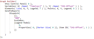
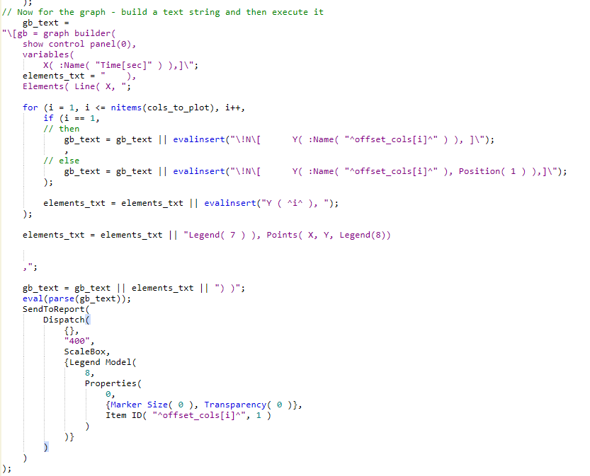
Beautiful, now we're getting somewhere, I'm having trouble inserting the dialogue that comes up for that into my script. When I make that adjustment the script looks like this
but I'm having trouble figuring out where and how to insert the modifiers into my base script.
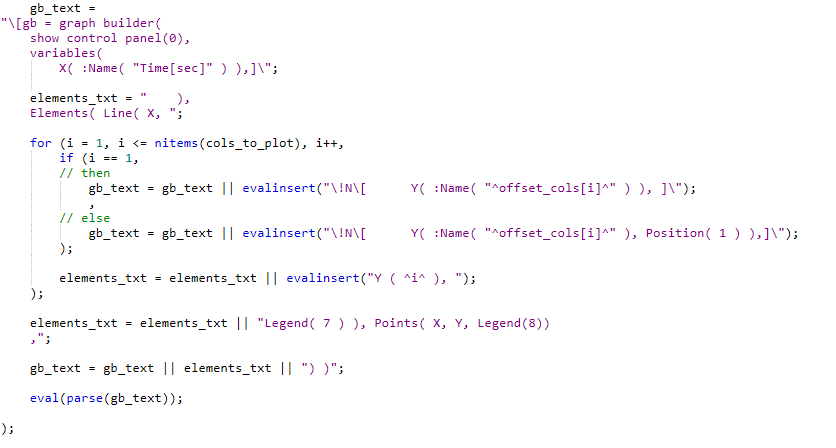
I'd love to better understand this, but understanding is less important than effect, for the moment ^.^ (saved as images instead of text because text was working strangely, text code to follow)
dt = Open ();
col_list = dt << get column names(string);
remove from(col_list, 1); // Remove time[sec] from list
cols_to_plot = {};
offset_list = {};
offset_cols = {};
// Define the graph builder commands in an expression for use by the OK button
graph_expr = expr(
for (i = 1, i <= nitems(cols_to_plot), i++,
new_name = cols_to_plot[i] || "-Offset";
insertinto(offset_cols, new_name);
dt << new column(new_name, Numeric, "Continuous", Format( "Best", 12 ),
Formula( as column(dt, cols_to_plot[i]) * offset_list[i] ) );
);
// Now for the graph - build a text string and then execute it
gb_text =
"\[gb = graph builder(
show control panel(0),
variables(
X( :Name( "Time[sec]" ) ),]\";
elements_txt = " ),
Elements( Line( X, ";
for (i = 1, i <= nitems(cols_to_plot), i++,
if (i == 1,
// then
gb_text = gb_text || evalinsert("\!N\[ Y( :Name( "^offset_cols[i]^" ) ), ]\");
,
// else
gb_text = gb_text || evalinsert("\!N\[ Y( :Name( "^offset_cols[i]^" ), Position( 1 ) ),]\");
);
elements_txt = elements_txt || evalinsert("Y ( ^i^ ), ");
);
elements_txt = elements_txt || "Legend( 7 ) ), Points( X, Y, Legend(8))
,";
gb_text = gb_text || elements_txt || ") )";
eval(parse(gb_text));
);
nw = new window("Graph Chemicals",
panel box("Select channels to graph",
lineup box(ncol(2),
text box("Column"), text box("Offset"),
cb1 = checkbox("Ch1"), ch1_neb = number edit box(),
cb2 = checkbox("Ch2"), ch2_neb = number edit box(),
cb3 = checkbox("Ch3"), ch3_neb = number edit box(),
cb4 = checkbox("Ch4"), ch4_neb = number edit box(),
cb5 = checkbox("Ch5"), ch5_neb = number edit box(),
cb6 = checkbox("Ch6"), ch6_neb = number edit box(),
cb7 = checkbox("Ch7"), ch7_neb = number edit box(),
cb8 = checkbox("Ch8"), ch8_neb = number edit box(),
cb9 = checkbox("Ch9"), ch9_neb = number edit box(),
),
),
panelbox("Actions",
hlistbox(
okb = button box("OK",
if (cb1 << get(1),
insertinto(cols_to_plot, col_list[8]);
offset_value = ch1_neb << get;
insertinto(offset_list, offset_value);
);
if (cb2 << get(1),
insertinto(cols_to_plot, col_list[9]);
offset_value = ch2_neb << get;
insertinto(offset_list, offset_value);
);
if (cb3 << get(1),
insertinto(cols_to_plot, col_list[10]);
offset_value = ch3_neb << get;
insertinto(offset_list, offset_value);
);
if (cb4 << get(1),
insertinto(cols_to_plot, col_list[11]);
offset_value = ch4_neb << get;
insertinto(offset_list, offset_value);
);
if (cb5 << get(1),
insertinto(cols_to_plot, col_list[12]);
offset_value = ch5_neb << get;
insertinto(offset_list, offset_value);
);
if (cb6 << get(1),
insertinto(cols_to_plot, col_list[13]);
offset_value = ch6_neb << get;
insertinto(offset_list, offset_value);
);
if (cb7 << get(1),
insertinto(cols_to_plot, col_list[14]);
offset_value = ch7_neb << get;
insertinto(offset_list, offset_value);
);
if (cb8 << get(1),
insertinto(cols_to_plot, col_list[15]);
offset_value = ch8_neb << get;
insertinto(offset_list, offset_value);
);
graph_expr;
nw << close window;
),
canb = button box("Cancel", nw << close window;
),
)
),
);
// Pre-check checkboxes if column exists
for (i = 1, i <= nitems(col_list), i++,
if (col_list[i] == "Ch1", cb1 << set(1, 1),
col_list[i] == "Ch2", cb2 << set(1, 1),
col_list[i] == "Ch3", cb3 << set(1, 1),
col_list[i] == "Ch4", cb4 << set(1, 1),
col_list[i] == "Ch5", cb5 << set(1, 1),
col_list[i] == "Ch6", cb6 << set(1, 1),
col_list[i] == "Ch7", cb7 << set(1, 1),
col_list[i] == "Ch8", cb8 << set(1, 1),
col_list[i] == "Ch9", cb9 << set(1, 1),
);
);
Full script for size adjust
Graph Builder(
Show Control Panel( 0 ),
Variables( X( :Name( "Time[sec]" ) ), Y( :Name( "CH2-Offset" ) ) ),
Elements( Line( X, Y, Legend( 7 ) ), Points( X, Y, Legend( 8 ) ) ),
SendToReport(
Dispatch(
{},
"400",
ScaleBox,
{Legend Model(
8,
Properties( 0, {Marker Size( 0 )}, Item ID( "CH2-Offset", 1 ) )
)}
)
)
);
- Mark as New
- Bookmark
- Subscribe
- Mute
- Subscribe to RSS Feed
- Get Direct Link
- Report Inappropriate Content
Re: Select issue
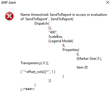
I -think- it should go at the end here, but I keep getting
Not sure what else to try, I've attempted several different logical names but no change.
Recommended Articles
- © 2026 JMP Statistical Discovery LLC. All Rights Reserved.
- Terms of Use
- Privacy Statement
- Contact Us


